英语
Windows XP Professional with Service Pack 3 (x86) – CD (English)
文件名:en_windows_xp_professional_with_service_pack_3_x86_cd_x14-80428.iso
SHA1:1C735B38931BF57FB14EBD9A9BA253CEB443D459
文件大小:589.14MB
发布时间:2008-05-01
ed2k://|file|en_windows_xp_professional_with_service_pack_3_x86_cd_x14-80428.iso|617756672|2A30BB63730F7887E1AC54363A8489C2|/中文-简体
Windows XP Professional with Service Pack 3 (x86) – CD VL (Chinese-Simplified)
文件名:zh-hans_windows_xp_professional_with_service_pack_3_x86_cd_vl_x14-74070.iso
SHA1:D142469D0C3953D8E4A6A490A58052EF52837F0F
文件大小:601.04MB
发布时间:2008-05-02
ed2k://|file|zh-hans_windows_xp_professional_with_service_pack_3_x86_cd_vl_x14-74070.iso|630237184|EC51916C9D9B8B931195EE0D6EE9B40E|/
↧
[Operating System]Windows XP 多国语言
↧
[Operating System]MS-DOS 多国语言
英语
MS-DOS 6.0 (English)
文件名:EN_MSDOS60.exe
SHA1:877B0B8E391ED07CB83214CB09E8F3B10C4B206F
文件大小:4.9MB
发布时间:2000-10-12
ed2k://|file|EN_MSDOS60.exe|5135248|8F78BD4143EE38DCBCFCECA063629EC1|/
MS-DOS 6.22 (English)
文件名:EN_MSDOS622.exe
SHA1:D01AA47A5D85908185F8987E972AFC66DC92A735
文件大小:11.23MB
发布时间:2000-10-12
ed2k://|file|EN_MSDOS622.exe|11780600|B9F44455AA980C790EF4426A14A838F5|/中文-简体
MS-DOS 6.22 (Simplified Chinese)
文件名:SC_MSDOS622sc.exe
SHA1:DD3C5CAD0FF837C38D5EB14B0D59E9A670792DCC
文件大小:9.56MB
发布时间:2000-03-02
ed2k://|file|SC_MSDOS622sc.exe|10020288|0B2B0878B8BBD2233D23022EE5339637|/法语
MS-DOS 6.22 (Simplified Chinese)
文件名:SC_MSDOS622sc.exe
SHA1:DD3C5CAD0FF837C38D5EB14B0D59E9A670792DCC
文件大小:9.56MB
发布时间:2000-03-02
ed2k://|file|SC_MSDOS622sc.exe|10020288|0B2B0878B8BBD2233D23022EE5339637|/日语
MS-DOS 6.2 (Japanese)
文件名:ja_msdos62.exe
SHA1:2855EB830F99395E79C86DF9E1DF85278F349A3D
文件大小:13.34MB
发布时间:2000-03-02
ed2k://|file|ja_msdos62.exe|13990264|CC9A7EDE6CDDCB343EAB4990B5020D00|/请使用迅雷下载,复制ed2k地址即可下载
↧
↧
[Operating System]Windows 2000 多国语言
英语
Windows 2000 Advanced Server with SP4 (English)
文件名:EN_WIN2000_ADVSRV_SP4.ISO
SHA1:863F4F267DB01615F917473A402E2B61CA9B0C00
文件大小:412.29MB
发布时间:2003-07-10
ed2k://|file|EN_WIN2000_ADVSRV_SP4.ISO|432314368|7A92CA0F58681AF270838E4250853099|/
Windows 2000 Professional with SP4 (English)
文件名:EN_WIN2000_PRO_SP4.ISO
SHA1:4A4569B303163A53927109954A9F30E89CFEAD29
文件大小:368.94MB
发布时间:2003-07-10
ed2k://|file|EN_WIN2000_PRO_SP4.ISO|386859008|9258929CB5FF86223E98CAB5331B176B|/
Windows 2000 Server with SP4 (English)
文件名:EN_WIN2000_SRV_SP4.ISO
SHA1:A87CB0001C171E37688662E3FCA8D2B3DF2878D2
文件大小:411.23MB
发布时间:2003-07-10
ed2k://|file|EN_WIN2000_SRV_SP4.ISO|431202304|40E1B99208D4B69D577ED2BB1B90E2E4|/中文-简体
Windows 2000 Professional with SP4 – SEL (Simplified Chinese)
文件名:ZRMPSEL_CN.iso
SHA1:82EB2EB7F145EBD0A23BC7E2767788BA88B91E69
文件大小:384.04MB
发布时间:2003-07-09
ed2k://|file|ZRMPSEL_CN.iso|402690048|00D1BDA0F057EDB8DA0B29CF5E188788|/
↧
[Operating System]Windows 7 多国语言
英语
Windows 7 Enterprise with Service Pack 1 (x64) - DVD (English)
文件名:en_windows_7_enterprise_with_sp1_x64_dvd_u_677651.iso
SHA1:A491F985DCCFB5863F31B728DDDBEDB2FF4DF8D1
文件大小:2.96GB
发布时间:2011-05-12
ed2k://|file|en_windows_7_enterprise_with_sp1_x64_dvd_u_677651.iso|3182604288|E4D1A2A7BB46706F6545E713EA32A5F3|/
Windows 7 Enterprise with Service Pack 1 (x86) - DVD (English)
文件名:en_windows_7_enterprise_with_sp1_x86_dvd_u_677710.iso
SHA1:4E0450AC73AB6F9F755EB422990CD9C7A1F3509C
文件大小:2.27GB
发布时间:2011-05-12
ed2k://|file|en_windows_7_enterprise_with_sp1_x86_dvd_u_677710.iso|2434502656|9B710D7876B754D5F96F72B4A7C9B9A8|/
Windows 7 Professional with Service Pack 1 (x64) - DVD (English)
文件名:en_windows_7_professional_with_sp1_x64_dvd_u_676939.iso
SHA1:0BCFC54019EA175B1EE51F6D2B207A3D14DD2B58
文件大小:3.09GB
发布时间:2011-05-12
ed2k://|file|en_windows_7_professional_with_sp1_x64_dvd_u_676939.iso|3320903680|B9DDE5CD750C844296DE44C688751290|/
Windows 7 Professional with Service Pack 1 (x86) - DVD (English)
文件名:en_windows_7_professional_with_sp1_x86_dvd_u_677056.iso
SHA1:D89937DF3A9BC2EC1A1486195FD308CD3DADE928
文件大小:2.39GB
发布时间:2011-05-12
ed2k://|file|en_windows_7_professional_with_sp1_x86_dvd_u_677056.iso|2564476928|6AFD92654E8069BCA6ADD680B141915A|/
Windows 7 Professional with Service Pack 1, VL Build (x64) - DVD (English)
文件名:en_windows_7_professional_with_sp1_vl_build_x64_dvd_u_677791.iso
SHA1:708E0338D4E2F094DFEB860347C84A6ED9E91D0C
文件大小:2.96GB
发布时间:2011-05-12
ed2k://|file|en_windows_7_professional_with_sp1_vl_build_x64_dvd_u_677791.iso|3183042560|5C51DCE0971810D2AE1E7B29E6ED61D7|/
Windows 7 Professional with Service Pack 1, VL Build (x86) - DVD (English)
文件名:en_windows_7_professional_with_sp1_vl_build_x86_dvd_u_677896.iso
SHA1:D5BD65E1B326D728F4FD146878EE0D9A3DA85075
文件大小:2.27GB
发布时间:2011-05-12
ed2k://|file|en_windows_7_professional_with_sp1_vl_build_x86_dvd_u_677896.iso|2434566144|8134167F30145F0C485DDC9E46535E66|/
Windows 7 Ultimate with Service Pack 1 (x64) - DVD (English)
文件名:en_windows_7_ultimate_with_sp1_x64_dvd_u_677332.iso
SHA1:36AE90DEFBAD9D9539E649B193AE573B77A71C83
文件大小:3.09GB
发布时间:2011-05-12
ed2k://|file|en_windows_7_ultimate_with_sp1_x64_dvd_u_677332.iso|3320903680|743598C64E635C72964CF02A3E0AD547|/
Windows 7 Ultimate with Service Pack 1 (x86) - DVD (English)
文件名:en_windows_7_ultimate_with_sp1_x86_dvd_u_677460.iso
SHA1:65FCE0F445D9BF7E78E43F17E441E08C63722657
文件大小:2.39GB
发布时间:2011-05-12
ed2k://|file|en_windows_7_ultimate_with_sp1_x86_dvd_u_677460.iso|2564476928|2593E390556C6CCB8630EDB599D57881|/
中文-简体
Windows 7 Enterprise with Service Pack 1 (x64) - DVD (Chinese-Simplified)
文件名:cn_windows_7_enterprise_with_sp1_x64_dvd_u_677685.iso
SHA1:9BA5E85596C2F25BE59F7E96139D83D4CB261A62
文件大小:3.04GB
发布时间:2011-05-12
ed2k://|file|cn_windows_7_enterprise_with_sp1_x64_dvd_u_677685.iso|3265574912|E9DB2607EA3B3540F3FE2E388F8C53C4|/
Windows 7 Enterprise with Service Pack 1 (x86) - DVD (Chinese-Simplified)
文件名:cn_windows_7_enterprise_with_sp1_x86_dvd_u_677716.iso
SHA1:C488B3D72DDC4AC63BCDCA36820BB986A1E670AC
文件大小:2.33GB
发布时间:2011-05-12
ed2k://|file|cn_windows_7_enterprise_with_sp1_x86_dvd_u_677716.iso|2502856704|B3C25EA4DD88D7E54F22D3C3E78C410B|/Windows 7 Professional with Service Pack 1 (x64) - DVD (Chinese-Simplified)
文件名:cn_windows_7_professional_with_sp1_x64_dvd_u_677031.iso
SHA1:9B57E67888434C24DD683968A3CE2C72755AB148
文件大小:3.19GB
发布时间:2011-05-12
ed2k://|file|cn_windows_7_professional_with_sp1_x64_dvd_u_677031.iso|3420557312|430BEDC0F22FA18001F717F7AF08C9D5|/
Windows 7 Professional with Service Pack 1 (x86) - DVD (Chinese-Simplified)
文件名:cn_windows_7_professional_with_sp1_x86_dvd_u_677162.iso
SHA1:7BB512B6AF82632D6B080C1E9C3C10CD0C738F0E
文件大小:2.47GB
发布时间:2011-05-12
ed2k://|file|cn_windows_7_professional_with_sp1_x86_dvd_u_677162.iso|2653276160|08F65018BD9B5BC8D77C1C7C5615A329|/
Windows 7 Professional with Service Pack 1, VL Build (x64) - DVD (Chinese-Simplified)
文件名:cn_windows_7_professional_with_sp1_vl_build_x64_dvd_u_677816.iso
SHA1:647B26479A3A46C078F5B1364A89003A31F4AADA
文件大小:3.04GB
发布时间:2011-05-12
ed2k://|file|cn_windows_7_professional_with_sp1_vl_build_x64_dvd_u_677816.iso|3266004992|5A52F4CCEFA71797D58389B397038B2F|/
Windows 7 Professional with Service Pack 1, VL Build (x86) - DVD (Chinese-Simplified)
文件名:cn_windows_7_professional_with_sp1_vl_build_x86_dvd_u_677939.iso
SHA1:27AE9FBAF9EE076F50F153353E42A3BE74A61FAB
文件大小:2.33GB
发布时间:2011-05-12
ed2k://|file|cn_windows_7_professional_with_sp1_vl_build_x86_dvd_u_677939.iso|2502909952|935E5B4B754527BE3C238FA6ABDD9B86|/
Windows 7 Ultimate with Service Pack 1 (x64) - DVD (Chinese-Simplified)
文件名:cn_windows_7_ultimate_with_sp1_x64_dvd_u_677408.iso
SHA1:2CE0B2DB34D76ED3F697CE148CB7594432405E23
文件大小:3.19GB
发布时间:2011-05-12
ed2k://|file|cn_windows_7_ultimate_with_sp1_x64_dvd_u_677408.iso|3420557312|B58548681854236C7939003B583A8078|/
Windows 7 Ultimate with Service Pack 1 (x86) - DVD (Chinese-Simplified)
文件名:cn_windows_7_ultimate_with_sp1_x86_dvd_u_677486.iso
SHA1:B92119F5B732ECE1C0850EDA30134536E18CCCE7
文件大小:2.47GB
发布时间:2011-05-12
ed2k://|file|cn_windows_7_ultimate_with_sp1_x86_dvd_u_677486.iso|2653276160|7503E4B9B8738DFCB95872445C72AEFB|/日语
Windows 7 Ultimate with Service Pack 1 (x64) - DVD (Japanese)
文件名:ja_windows_7_ultimate_with_sp1_x64_dvd_618242.iso
SHA1:2832FB01B054C9CA127BABD5BF59B82B2A9BA135
文件大小:3.09GB
发布时间:2011-02-18
ed2k://|file|ja_windows_7_ultimate_with_sp1_x64_dvd_618242.iso|3321335808|7A72D24CAC2A92BA2616B656304BC8BD|/
Windows 7 Ultimate with Service Pack 1 (x86) - DVD (Japanese)
文件名:ja_windows_7_ultimate_with_sp1_x86_dvd_619129.iso
SHA1:D93189099A785508BD0BA2793F110BDEF81FF954
文件大小:2.38GB
发布时间:2011-02-18
ed2k://|file|ja_windows_7_ultimate_with_sp1_x86_dvd_619129.iso|2552571904|84DCD0F7410ACD6AFDA57D103535832A|/
激活工具
WIN7主激活程序PCSKYS_Windows7Loader_v3.27OEM 工具
OME Hazar v1.4
请使用迅雷下载,复制ed2k地址即可下载
↧
[Operating System]Windows 8.1 多国语言
英语
Windows 8.1 (multiple editions) (x64) - DVD (English)
文件名:en_windows_8_1_x64_dvd_2707217.iso
SHA1:BC2F7FF5C91C9F0F8676E39E703085C65072139B
文件大小:3.63GB
发布时间:2013-09-09
ed2k://|file|en_windows_8_1_x64_dvd_2707217.iso|3899295744|8E604054013D21209B851E41DC19F6F5|/
Windows 8.1 (multiple editions) (x86) - DVD (English)
文件名:en_windows_8_1_x86_dvd_2707392.iso
SHA1:802CFCD3A411D99C097EA7E747F0B6697F9BDAC4
文件大小:2.71GB
发布时间:2013-09-09
ed2k://|file|en_windows_8_1_x86_dvd_2707392.iso|2915131392|CC72E0D238F94071A5104EAF8F0CEEC3|/
Windows 8.1 Enterprise (x64) - DVD (English)
文件名:en_windows_8_1_enterprise_x64_dvd_2971902.iso
SHA1:AE792B2EF982DAC7391224B624EAB8D6340D78AB
文件大小:3.59GB
发布时间:2013-10-17
ed2k://|file|en_windows_8_1_enterprise_x64_dvd_2971902.iso|3853993984|D98D0FC118C2A4471850970A779B4212|/
Windows 8.1 Enterprise (x86) - DVD (English)
文件名:en_windows_8_1_enterprise_x86_dvd_2972289.iso
SHA1:5EFB981C94E1223C85F3BB504D04E0642A85C1D4
文件大小:2.7GB
发布时间:2013-10-17
ed2k://|file|en_windows_8_1_enterprise_x86_dvd_2972289.iso|2902501376|51E0CD538DA0BB383A761888FDFE22FE|/
Windows 8.1 Pro VL (x64) - DVD (English)
文件名:en_windows_8_1_pro_vl_x64_dvd_2971948.iso
SHA1:CFCDF895679A5116F7F1C6406C20F99A1F850E49
文件大小:3.59GB
发布时间:2013-10-17
ed2k://|file|en_windows_8_1_pro_vl_x64_dvd_2971948.iso|3852142592|B64FF7902BA65E5DE803286FE5000EFE|/
Windows 8.1 Pro VL (x86) - DVD (English)
文件名:en_windows_8_1_pro_vl_x86_dvd_2972633.iso
SHA1:9F1FCEC3B267EDB6F3BD02566BC889BB4A372BFD
文件大小:2.7GB
发布时间:2013-10-17
ed2k://|file|en_windows_8_1_pro_vl_x86_dvd_2972633.iso|2900871168|3DC72F9673EAFA40AD9C62A5F96EE8CC|/
中文-简体
Windows 8.1 (multiple editions) (x64) - DVD (Chinese-Simplified)
文件名:cn_windows_8_1_x64_dvd_2707237.iso
SHA1:F79E0093DDEDD488F40D4AE6B6F0FA3C529051E1
文件大小:3.8GB
发布时间:2013-09-09
ed2k://|file|cn_windows_8_1_x64_dvd_2707237.iso|4076017664|839CBE17F3CE8411E8206B92658A91FA|/
Windows 8.1 (multiple editions) (x86) - DVD (Chinese-Simplified)
文件名:cn_windows_8_1_x86_dvd_2707405.iso
SHA1:D07E7CA99B455FFC0B58BE96333D1F554FE83D8A
文件大小:2.85GB
发布时间:2013-09-09
ed2k://|file|cn_windows_8_1_x86_dvd_2707405.iso|3055904768|B296A943F16FADFC5FFA2F1D583DCC49|/Windows 8.1 Enterprise (x64) - DVD (Chinese-Simplified)
文件名:cn_windows_8_1_enterprise_x64_dvd_2971863.iso
SHA1:FBC9DF261E6DBF3E0027A835C7A593D8B524BB73
文件大小:3.76GB
发布时间:2013-10-17
ed2k://|file|cn_windows_8_1_enterprise_x64_dvd_2971863.iso|4039327744|08BAF18320B8FFC58D4C35BCC7A32012|/
Windows 8.1 Enterprise (x86) - DVD (Chinese-Simplified)
文件名:cn_windows_8_1_enterprise_x86_dvd_2972257.iso
SHA1:CA89F9E297BF7E10D714E6316EAC85BED485D071
文件大小:2.84GB
发布时间:2013-10-17
ed2k://|file|cn_windows_8_1_enterprise_x86_dvd_2972257.iso|3050842112|6B60ABF8282F943FE92327463920FB67|/
Windows 8.1 Pro VL (x64) - DVD (Chinese-Simplified)
文件名:cn_windows_8_1_pro_vl_x64_dvd_2971907.iso
SHA1:62711AD210B7872A30C1CE188A60724CEB4D606B
文件大小:3.76GB
发布时间:2013-10-17
ed2k://|file|cn_windows_8_1_pro_vl_x64_dvd_2971907.iso|4032598016|1FDA520B3E8880E2FB00B20439E0826E|/
Windows 8.1 Pro VL (x86) - DVD (Chinese-Simplified)
文件名:cn_windows_8_1_pro_vl_x86_dvd_2972620.iso
SHA1:6AC5615556753D3EC163651645C69B169C802DBC
文件大小:2.84GB
发布时间:2013-10-17
ed2k://|file|cn_windows_8_1_pro_vl_x86_dvd_2972620.iso|3049981952|5B396C3A0BA99617647D9AFE8403AFA5|/
请使用迅雷下载,复制ed2k地址即可下载
↧
↧
[Operating System]Windows Server 2012 R2 多国语言
英语
Microsoft Hyper-V Server 2012 R2 (x64) - DVD (English)
文件名:en_microsoft_hyper-v_server_2012_r2_x64_dvd_2708236.iso
SHA1:1EEC2EE8DD77E8EB970B210C9B0E01986D7210DD
文件大小:1.87GB
发布时间:2013-09-09
ed2k://|file|en_microsoft_hyper-v_server_2012_r2_x64_dvd_2708236.iso|2010226688|BA115E7F23F42C54F32091BFAEF5668B|/
Windows Server 2012 R2 (x64) - DVD (English)
文件名:en_windows_server_2012_r2_x64_dvd_2707946.iso
SHA1:B6F063436056510357CB19CB77DB781ED9C11DF3
文件大小:3.98GB
发布时间:2013-09-09
ed2k://|file|en_windows_server_2012_r2_x64_dvd_2707946.iso|4268605440|5A75F9A12F5493228D916481CD83125E|/
Windows Server 2012 R2 VL (x64) - DVD (English)
文件名:en_windows_server_2012_r2_vl_x64_dvd_2979250.iso
SHA1:6823C34A84D22886BAEA88F60E08B73001C31BC8
文件大小:4GB
发布时间:2013-10-17
ed2k://|file|en_windows_server_2012_r2_vl_x64_dvd_2979250.iso|4297373696|8FB726F9135AE9BFB22E222D3CFFE0A9|/
Windows Storage Server 2012 R2 and Windows Server 2012 R2 Foundation (x64) - DVD (English)
文件名:en_windows_storage_server_2012_r2_and_windows_server_2012_r2_foundation_x64_dvd_2708426.iso
SHA1:E3F320EACACFC7F2B000D3E6B02872133BCA547C
文件大小:3.77GB
发布时间:2013-09-09
ed2k://|file|en_windows_storage_server_2012_r2_and_windows_server_2012_r2_foundation_x64_dvd_2708426.iso|404767
9488|E706FC07C86E88ADFB928A7B17AEDC3B|/
中文-简体
Microsoft Hyper-V Server 2012 R2 (x64) - DVD (Chinese-Simplified)
文件名:cn_microsoft_hyper-v_server_2012_r2_x64_dvd_2708277.iso
SHA1:E99AC484042B38126B8292C996114DE994712365
文件大小:2GB
发布时间:2013-09-09
ed2k://|file|cn_microsoft_hyper-v_server_2012_r2_x64_dvd_2708277.iso|2144010240|3BB6E1FB513204D8D2C6991B14B35D9B|/
Windows Server 2012 R2 (x64) - DVD (Chinese-Simplified)
文件名:cn_windows_server_2012_r2_x64_dvd_2707961.iso
SHA1:8F9A21C80B80D861E59F69D140E7F66E4C49289F
文件大小:4.11GB
发布时间:2013-09-09
ed2k://|file|cn_windows_server_2012_r2_x64_dvd_2707961.iso|4413020160|010CD94AD1F2951567646C99580DD595|/
Windows Server 2012 R2 VL (x64) - DVD (Chinese-Simplified)
文件名:cn_windows_server_2012_r2_vl_x64_dvd_2979220.iso
SHA1:E7D0944E7F7FB1977AEECA3C5DE65E01BC07DF3D
文件大小:4.15GB
发布时间:2013-10-17
ed2k://|file|cn_windows_server_2012_r2_vl_x64_dvd_2979220.iso|4453249024|1F71685C7E33ED30FDC439C7FE0E4E5A|/
请使用迅雷下载,复制ed2k地址即可下载
↧
Microsoft SQL Server 2008 R2 多国语言
英语
SQL Server 2008 R2 Datacenter (x86, x64, ia64) - DVD (English)
文件名:en_sql_server_2008_r2_datacenter_x86_x64_ia64_dvd_521548.iso
SHA1:126CF6C4FD8BD1C1305E0D54A90E5ED62076A609
文件大小:4.08GB
发布时间:2010-04-27
ed2k://|file|en_sql_server_2008_r2_datacenter_x86_x64_ia64_dvd_521548.iso|4380329984|F833E8AB4F47703561EFA1DF36FF4D4F|/
SQL Server 2008 R2 Developer (x86, x64, ia64) - DVD (English)
文件名:en_sql_server_2008_r2_developer_x86_x64_ia64_dvd_522665.iso
SHA1:10B990A86961D84C4D7D5E8C3A4C67F0D0456E63
文件大小:4.08GB
发布时间:2010-05-03
ed2k://|file|en_sql_server_2008_r2_developer_x86_x64_ia64_dvd_522665.iso|4380329984|D50121522B34BBE91564F51D167BAAB5|/
SQL Server 2008 R2 Enterprise (x86, x64, ia64) - DVD (English)
文件名:en_sql_server_2008_r2_enterprise_x86_x64_ia64_dvd_520517.iso
SHA1:18105DB70F0F0B23418F5005A6CE4B25317C6D03
文件大小:4.08GB
发布时间:2010-05-03
ed2k://|file|en_sql_server_2008_r2_enterprise_x86_x64_ia64_dvd_520517.iso|4380329984|311E5E62E84E07A1460312674EB158A7|/
SQL Server 2008 R2 Express (x64) - (English)
文件名:en_sql_server_2008_r2_express_x64.exe
SHA1:2FF1A50B2277987C9CD65B99812CEAF2A67EA362
文件大小:74.08MB
发布时间:2010-06-29
ed2k://|file|en_sql_server_2008_r2_express_x64.exe|77677408|A1F423A5310D39A4949FF5074DE13370|/
SQL Server 2008 R2 Express (x86) - (English)
文件名:en_sql_server_2008_r2_express_x86.exe
SHA1:ACF5494D18EDF117A2683D66A96FB8954F98D86D
文件大小:58.17MB
发布时间:2010-06-29
ed2k://|file|en_sql_server_2008_r2_express_x86.exe|60995936|10D282D69ABB1FFA6BB67E2D07BD3EDF|/
SQL Server 2008 R2 Express with Advanced Services (x64) - (English)
文件名:en_sql_server_2008_r2_express_with_advanced_services_x64.exe
SHA1:7D2D2457B854812BF66A23F7A690462460B69FF6
文件大小:795.89MB
发布时间:2010-06-29
ed2k://|file|en_sql_server_2008_r2_express_with_advanced_services_x64.exe|834553624|F8606BE1ECC1DBE830D24DC8B2CCAAC4|/
SQL Server 2008 R2 Express with Advanced Services (x86) - (English)
文件名:en_sql_server_2008_r2_express_with_advanced_services_x86.exe
SHA1:8C34E6856A4C4040F7A749DFD919049B8F1BECD7
文件大小:727.42MB
发布时间:2010-06-29
ed2k://|file|en_sql_server_2008_r2_express_with_advanced_services_x86.exe|762758936|5F6FAE2409EBFFA61474082562B07FCA|/
SQL Server 2008 R2 Express with Management Tools (x64) - (English)
文件名:en_sql_server_2008_r2_express_with_management_tools_x64.exe
SHA1:45AEE4E1F389971E8F398CA946740098049BA423
文件大小:247.52MB
发布时间:2010-06-29
ed2k://|file|en_sql_server_2008_r2_express_with_management_tools_x64.exe|259545952|DC1FB339AD1C875BF5D7530C1EC095D5|/
SQL Server 2008 R2 Express with Management Tools (x86) - (English)
文件名:en_sql_server_2008_r2_express_with_management_tools_x86.exe
SHA1:AFE1456F98437FF4510B88744A5375643A029A68
文件大小:235.49MB
发布时间:2010-06-29
ed2k://|file|en_sql_server_2008_r2_express_with_management_tools_x86.exe|246929248|97D2E23D881D0FA93CDD2ECB6E04C18C|/
SQL Server 2008 R2 Management Studio Express (x64) - (English)
文件名:en_sql_server_2008_r2_management_studio_express_x64.exe
SHA1:223261D57A5B147532529C4DAE516E8653198D76
文件大小:163.45MB
发布时间:2010-06-29
ed2k://|file|en_sql_server_2008_r2_management_studio_express_x64.exe|171391328|4F9E3349B6EEDCE3D8E3702EE3D4D5DB|/
SQL Server 2008 R2 Management Studio Express (x86) - (English)
文件名:en_sql_server_2008_r2_management_studio_express_x86.exe
SHA1:EC615068239A72BDE129326745B6922681EC2374
文件大小:154.51MB
发布时间:2010-06-29
ed2k://|file|en_sql_server_2008_r2_management_studio_express_x86.exe|162016096|92685ADBB07A798860282203BC21FBEF|/
SQL Server 2008 R2 Standard (x86, x64, ia64) - DVD (English)
文件名:en_sql_server_2008_r2_standard_x86_x64_ia64_dvd_521546.iso
SHA1:09CF52A4209CA96FF480537BB86786F79AE0E8A3
文件大小:4.08GB
发布时间:2010-05-03
ed2k://|file|en_sql_server_2008_r2_standard_x86_x64_ia64_dvd_521546.iso|4380329984|9554A2B17DE29ABF4743912535BC4B46|/
Windows Server 2008 R2 HPC Edition (x64) - DVD (English)
文件名:en_windows_server_2008_r2_hpc_x64_dvd_552761.iso
SHA1:B16D4AC2F997BC9E28ADFA7F53D9F2DB9DB00FBE
文件大小:2.59GB
发布时间:2010-07-30
ed2k://|file|en_windows_server_2008_r2_hpc_x64_dvd_552761.iso|2782734336|5186CEED2B0BB8FEB112E81821BD3CD9|/
中文-简体
SQL Server 2008 R2 Developer (x86, x64, ia64) - DVD (Chinese-Simplified)
文件名:cn_sql_server_2008_r2_developer_x86_x64_ia64_dvd_522724.iso
SHA1:AAE0E2D4E41AB7591634D53C7BC76A112F31B617
文件大小:4.34GB
发布时间:2010-05-03
ed2k://|file|cn_sql_server_2008_r2_developer_x86_x64_ia64_dvd_522724.iso|4662884352|E436F05BCB0165FDF7E5E61862AB6BE1|/
SQL Server 2008 R2 Enterprise (x86, x64, ia64) - DVD (Chinese-Simplified)
文件名:cn_sql_server_2008_r2_enterprise_x86_x64_ia64_dvd_522233.iso
SHA1:0EEFF017B21635DF33F33C47E31E911CB23390F7
文件大小:4.34GB
发布时间:2010-05-03
ed2k://|file|cn_sql_server_2008_r2_enterprise_x86_x64_ia64_dvd_522233.iso|4662884352|1DB025218B01B48C6B76D6D88630F541|/
SQL Server 2008 R2 Express (x64) - (Chinese-Simplified)
文件名:cn_sql_server_2008_r2_express_x64.exe
SHA1:4668425DF5B9A1BE1F67AE32CEBDB058C58D0F08
文件大小:83.57MB
发布时间:2010-06-29
ed2k://|file|cn_sql_server_2008_r2_express_x64.exe|87626592|7EBD2DE5681444AB7712B9432C610011|/
SQL Server 2008 R2 Express (x86) - (Chinese-Simplified)
文件名:cn_sql_server_2008_r2_express_x86.exe
SHA1:0F7A0D2B4BA4A3DA49CF3DA070860B8BDF1E0213
文件大小:64.91MB
发布时间:2010-06-29
ed2k://|file|cn_sql_server_2008_r2_express_x86.exe|68060512|E02E1E79C08491E1D1FE5CA16A8E5AB4|/
SQL Server 2008 R2 Express with Advanced Services (x64) - (Chinese-Simplified)
文件名:cn_sql_server_2008_r2_express_with_advanced_services_x64.exe
SHA1:784F741F5E6BBBAB0E7CFB62F5B7BBEF3F9DFA37
文件大小:853.22MB
发布时间:2010-06-29
ed2k://|file|cn_sql_server_2008_r2_express_with_advanced_services_x64.exe|894668056|C669BD6BAA3593D66A139EA341187376|/
SQL Server 2008 R2 Express with Advanced Services (x86) - (Chinese-Simplified)
文件名:cn_sql_server_2008_r2_express_with_advanced_services_x86.exe
SHA1:9B3428E9C4BD0DB885CDFB403F4163CCB929D88E
文件大小:780.96MB
发布时间:2010-06-29
ed2k://|file|cn_sql_server_2008_r2_express_with_advanced_services_x86.exe|818895128|89D72C11DA537CFB3DA5C2F625C1A9E3|/
SQL Server 2008 R2 Express with Management Tools (x64) - (Chinese-Simplified)
文件名:cn_sql_server_2008_r2_express_with_management_tools_x64.exe
SHA1:2120A6A60F9DBB94AEBD68F9269375DF57C4E6B9
文件大小:278.87MB
发布时间:2010-06-29
ed2k://|file|cn_sql_server_2008_r2_express_with_management_tools_x64.exe|292417376|42201B4213BADA9843A50B66DFFE57BA|/
SQL Server 2008 R2 Express with Management Tools (x86) - (Chinese-Simplified)
文件名:cn_sql_server_2008_r2_express_with_management_tools_x86.exe
SHA1:413E1167A73B2E5E529AA520DBB330011826DEF3
文件大小:263.8MB
发布时间:2010-06-29
ed2k://|file|cn_sql_server_2008_r2_express_with_management_tools_x86.exe|276618080|63906F95D625F03F899BF448345BA55F|/
SQL Server 2008 R2 Management Studio Express (x64) - (Chinese-Simplified)
文件名:cn_sql_server_2008_r2_management_studio_express_x64.exe
SHA1:8A858666D1456E758F508BC0142D589F404BF81A
文件大小:186.56MB
发布时间:2010-06-29
ed2k://|file|cn_sql_server_2008_r2_management_studio_express_x64.exe|195621728|FFE3F5E351D45B169097F4656F36B491|/
SQL Server 2008 R2 Management Studio Express (x86) - (Chinese-Simplified)
文件名:cn_sql_server_2008_r2_management_studio_express_x86.exe
SHA1:947E61ABDF161E7B4D2FCB3DEBF3C28879E0CC77
文件大小:177.6MB
发布时间:2010-06-29
ed2k://|file|cn_sql_server_2008_r2_management_studio_express_x86.exe|186225504|F487604ECDA061931EA31510A7220A35|/
SQL Server 2008 R2 Standard (x86, x64, ia64) - DVD (Chinese-Simplified)
文件名:cn_sql_server_2008_r2_standard_x86_x64_ia64_dvd_522239.iso
SHA1:B5A534094780CD915458344BD097F8203FD7C7CC
文件大小:4.34GB
发布时间:2010-05-03
ed2k://|file|cn_sql_server_2008_r2_standard_x86_x64_ia64_dvd_522239.iso|4662884352|18EB3AE3828811617488F2CE8E5B8420|/
SQL Server 2008 R2 Web (x86, x64, ia64) - DVD (Chinese-Simplified)
文件名:cn_sql_server_2008_r2_web_x86_x64_ia64_dvd_522629.iso
SHA1:F51756B72ACE2BC5B4D971C1907EBF58F53694C1
文件大小:4.34GB
发布时间:2010-05-03
ed2k://|file|cn_sql_server_2008_r2_web_x86_x64_ia64_dvd_522629.iso|4662884352|E36682BD638B7790F3AD1AAA3D7369FC|/
↧
Adobe CC 2014 全系列官方下载地址(含Windows及Mac版)
Adobe于6.18日析出了adobe Creative Cloud设计套件全线更新(Adobe CC 2014),包括Photoshop、Illustrator、InDesign、Dreamweaver、Lightroom、以及Premiere Pro等您最喜爱的14个全新应用程序版本,都将迎来可提升工作效率和增进性能的新特性与新功……
Adobe于6.18日析出了adobe Creative Cloud设计套件全线更新(Adobe CC 2014),包括Photoshop、Illustrator、InDesign、Dreamweaver、Lightroom、以及Premiere Pro等您最喜爱的14个全新应用程序版本,都将迎来可提升工作效率和增进性能的新特性与新功能。Adobe CC 2014从本质上而言完全是一个全新的版本(Adobe CC 2014版本号是18,而adobe CC是17)。Adobe CC 2014无论从功能上还是界面上都将给用户带来超酷的设计体验。
目前 Adobe Creative Cloud 2014 系列已经开放下载了。正版用户在更新 AAM (Adobe Application Manager) 之后(一打开就会自动更新)就能看见下载选项。
2014.6.21更新了Adobe CC 2014全系列通用补丁(转自雨淡无痕博客)。
所谓通用补丁,即和谐adobe CC的“amtlib.dll”文件,对于“amtlib.dll”有啥作用,用过adobe旧版的应该很清楚吧,这里就不多言了!采用通用补丁激活adobe CC 应该是最简单方便的方法了。
部分Adobe CC 2014系列软件更新功能说明
Photoshop CC此次更新将迎来用于选定聚焦区域和用浅景深来突出人像的Focus Mask功能,以及全新的“内容感知”(Content Aware)和用于调整图像特定角度的“透视弯曲”(Perspective Wrap)功能。
Photoshop CC本次更新还包含了“水星图形引擎”(Mercury Graphics Engine)的性能增强、可链接多文档共享的“智能对象”(Smart Objects)、并且改进了“图层复合”(Layer Comps)。
Illustrator CC迎来了Live Shapes,可将矩形转换成复杂的形状;
InDesign CC现也可选中表的行与列,并使用EPUB固定布局来创建数字图书。
视频应用方面,Adobe的应用现加入了“动态文本模板”(Live Text Templates)和“遮盖与追踪”(Masking and Tracking);而Premiere Pro CC则获得了图形性能的增强。
After Effects迎来了全新的键控特效(keying effects),;SpeedGrade CC迎来了更灵活的Direct Link色彩通道;Audition则增强了“多轨工具”(multi-track tools)。
最后,Adobe还进一步推动了移动应用和桌面应用直接的连通性。

Illustrator CC 2014启动界面
Adobe Creative Cloud 2014 为多国语言版本:中文,英文,韩文,日本等语言,在安装的时候可以选择自己需要的语言安装。
ADOBE CC 2014 官网下载地址(含Windows及Mac版):
注意:ADOBE CC 2014官方地址下载办法和以前旧CC系列一样,不能直接点击链接下载。建议采用迅雷下载,如果遇到迅雷也不能下载的情况,请按以下步骤下载:
- 1.首先注册一个Adobe ID(http://www.adobe.com/cn/)
- 2.然后点击这里,用注册的Abobe ID登陆,只需要点击下载按钮,弹出文件保存对话框,然后取消即可。此操作本质是为获得获得session cookie。
- 3.然后就可以通过浏览器自带下载功能下载以下软件,或者通过右击并选择“ 链接保存为…(因为文件比较大,推荐用下载工具下载)
Adobe Photoshop CC 2014
http://trials3.adobe.com/AdobeProducts/PHSP/15/win32/Photoshop_15_LS20_win32.7z
http://trials3.adobe.com/AdobeProducts/PHSP/15/win64/Photoshop_15_LS20_win64.7z
http://trials3.adobe.com/AdobeProducts/PHSP/15/osx10/Photoshop_15_LS20.dmg
http://ccmdl.adobe.com/AdobeProducts/PHSP/15/win32/Photoshop_15_LS20_win32.7z
http://ccmdl.adobe.com/AdobeProducts/PHSP/15/win64/Photoshop_15_LS20_win64.7z
http://ccmdl.adobe.com/AdobeProducts/PHSP/15/osx10/Photoshop_15_LS20.dmg
Adobe Illustrator CC 2014
http://trials3.adobe.com/AdobeProducts/ILST/18/win32/Illustrator_18_LS20_win32.7z
http://trials3.adobe.com/AdobeProducts/ILST/18/win64/Illustrator_18_LS20_win64.7z
http://trials3.adobe.com/AdobeProducts/ILST/18/osx10-64/Illustrator_18_LS20.dmg
http://ccmdl.adobe.com/AdobeProducts/ILST/18/win32/Illustrator_18_LS20_win32.7z
http://ccmdl.adobe.com/AdobeProducts/ILST/18/win64/Illustrator_18_LS20_win64.7z
http://ccmdl.adobe.com/AdobeProducts/ILST/18/osx10-64/Illustrator_18_LS20.dmg
Adobe InCopy CC 2014
http://trials3.adobe.com/AdobeProducts/AICY/10/win32/InCopy_10_LS20_Win32.7z
http://trials3.adobe.com/AdobeProducts/AICY/10/win32/InCopy_10_LS20_Win64.7z
http://trials3.adobe.com/AdobeProducts/AICY/10/osx10/InCopy_10_LS20.dmg
http://ccmdl.adobe.com/AdobeProducts/AICY/10/win32/InCopy_10_LS20_Win32.7z
http://ccmdl.adobe.com/AdobeProducts/AICY/10/win32/InCopy_10_LS20_Win64.7z
http://ccmdl.adobe.com/AdobeProducts/AICY/10/osx10/InCopy_10_LS20.dmg
Adobe Edge Animate CC 2014
http://trials3.adobe.com/AdobeProducts/EDGE/4/win32/Edge_Animate_4_LS17.exe
http://trials3.adobe.com/AdobeProducts/EDGE/4/osx10/Edge_Animate_4_LS17.dmg
http://ccmdl.adobe.com/AdobeProducts/EDGE/4/win32/Edge_Animate_4_LS17.exe
http://ccmdl.adobe.com/AdobeProducts/EDGE/4/osx10/Edge_Animate_4_LS17.dmg
Adobe SpeedGrade CC 2014
http://trials3.adobe.com/AdobeProducts/SPGD/8/win64/SpeedGrade_8_LS20.exe
http://trials3.adobe.com/AdobeProducts/SPGD/8/osx10-64/SpeedGrade_8_LS20.dmg
http://ccmdl.adobe.com/AdobeProducts/SPGD/8/win64/SpeedGrade_8_LS20.exe
http://ccmdl.adobe.com/AdobeProducts/SPGD/8/osx10-64/SpeedGrade_8_LS20.dmg
Adobe Prelude CC 2014
http://trials3.adobe.com/AdobeProducts/PRLD/3/win64/Prelude_3_LS20.exe
http://trials3.adobe.com/AdobeProducts/PRLD/3/osx10-64/Prelude_3_LS20.dmg
http://ccmdl.adobe.com/AdobeProducts/PRLD/3/win64/Prelude_3_LS20.exe
http://ccmdl.adobe.com/AdobeProducts/PRLD/3/osx10-64/Prelude_3_LS20.dmg
Adobe Audition CC 2014
http://trials3.adobe.com/AdobeProducts/AUDT/7/win64/Audition_7_LS20.exe
http://trials3.adobe.com/AdobeProducts/AUDT/7/osx10-64/Audition_7_LS20.dmg
http://ccmdl.adobe.com/AdobeProducts/AUDT/7/win64/Audition_7_LS20.exe
http://ccmdl.adobe.com/AdobeProducts/AUDT/7/osx10-64/Audition_7_LS20.dmg
Adobe Flash Pro CC 2014
http://trials3.adobe.com/AdobeProducts/FLPR/14/win64/Flash_Professional_14_LS20.exe
http://trials3.adobe.com/AdobeProducts/FLPR/14/osx10-64/Flash_Professional_14_LS20.dmg
http://ccmdl.adobe.com/AdobeProducts/FLPR/14/win64/Flash_Professional_14_LS20.exe
http://ccmdl.adobe.com/AdobeProducts/FLPR/14/osx10-64/Flash_Professional_14_LS20.dmg
Adobe After Effects CC 2014
http://trials3.adobe.com/AdobeProducts/AEFT/13/win64/AfterEffects_13_LS20.7z
http://trials3.adobe.com/AdobeProducts/AEFT/13/osx10-64/AfterEffects_13_LS20.dmg
http://ccmdl.adobe.com/AdobeProducts/AEFT/13/win64/AfterEffects_13_LS20.7z
http://ccmdl.adobe.com/AdobeProducts/AEFT/13/osx10-64/AfterEffects_13_LS20.dmg
Adobe Dreamweaver CC 2014
http://trials3.adobe.com/AdobeProducts/DRWV/14/win32/Dreamweaver_14_LS20.exe
http://trials3.adobe.com/AdobeProducts/DRWV/14/osx10/Dreamweaver_14_LS20.dmg
http://ccmdl.adobe.com/AdobeProducts/DRWV/14/win32/Dreamweaver_14_LS20.exe
http://ccmdl.adobe.com/AdobeProducts/DRWV/14/osx10/Dreamweaver_14_LS20.dmg
Adobe Premiere Pro CC 2014
http://trials3.adobe.com/AdobeProducts/PPRO/8/win64/PremierePro_8_LS20.7z
http://trials3.adobe.com/AdobeProducts/PPRO/8/osx10-64/PremierePro_8_LS20.dmg
http://ccmdl.adobe.com/AdobeProducts/PPRO/8/win64/PremierePro_8_LS20.7z
http://ccmdl.adobe.com/AdobeProducts/PPRO/8/osx10-64/PremierePro_8_LS20.dmg
Adobe InDesign CC 2014
http://trials3.adobe.com/AdobeProducts/IDSN/10/win32/InDesign_10_LS20_Win32.7z
http://trials3.adobe.com/AdobeProducts/IDSN/10/win64/InDesign_10_LS20_Win64.7z
http://trials3.adobe.com/AdobeProducts/IDSN/10/osx10/InDesign_10_LS20.dmg
http://ccmdl.adobe.com/AdobeProducts/IDSN/10/win32/InDesign_10_LS20_Win32.7z
http://ccmdl.adobe.com/AdobeProducts/IDSN/10/win64/InDesign_10_LS20_Win64.7z
http://ccmdl.adobe.com/AdobeProducts/IDSN/10/osx10/InDesign_10_LS20.dmg
Adobe Photoshop Lightroom 5.5
http://trials3.adobe.com/AdobeProducts/LTRM/5_5/win32/Lightroom_5_CCM_LS11.7z
http://trials3.adobe.com/AdobeProducts/LTRM/5_5/win64/Lightroom_5_CCM_LS11_win64.7z
http://trials3.adobe.com/AdobeProducts/LTRM/5_5/osx10/Lightroom_5_CCM_LS11.dmg
http://ccmdl.adobe.com/AdobeProducts/LTRM/5_5/win32/Lightroom_5_CCM_LS11.7z
http://ccmdl.adobe.com/AdobeProducts/LTRM/5_5/win64/Lightroom_5_CCM_LS11_win64.7z
http://ccmdl.adobe.com/AdobeProducts/LTRM/5_5/osx10/Lightroom_5_CCM_LS11.dmg
http://download.adobe.com/pub/adobe/lightroom/win/5.x/Lightroom_5_LS11_win_5_5.exe
http://download.adobe.com/pub/adobe/lightroom/mac/5.x/Lightroom_5_LS11_mac_5_5.dmg
Adobe Media Encoder CC 2014
http://trials3.adobe.com/AdobeProducts/AME/8/win64/AdobeMediaEncoder_8_LS20.exe
http://trials3.adobe.com/AdobeProducts/AME/8/osx10-64/AdobeMediaEncoder_8_LS20.dmg
http://ccmdl.adobe.com/AdobeProducts/AME/8/win64/AdobeMediaEncoder_8_LS20.exe
http://ccmdl.adobe.com/AdobeProducts/AME/8/osx10-64/AdobeMediaEncoder_8_LS20.dmg
Adobe Muse CC 2014
http://trials3.adobe.com/AdobeProducts/MUSE/2014/win64/Muse_2014_0_CC_LS24.7z
http://trials3.adobe.com/AdobeProducts/MUSE/2014/osx10-64/Muse_2014_0_CC_LS24.dmg
http://ccmdl.adobe.com/AdobeProducts/MUSE/2014/win64/Muse_2014_0_CC_LS24.7z
http://ccmdl.adobe.com/AdobeProducts/MUSE/2014/osx10-64/Muse_2014_0_CC_LS24.dmg
——————————————————————————————————————————————————
Adobe Bridge CC 6.1 update
http://swupdl.adobe.com/updates/oobe/aam20/win/AdobeBridgeCC-6.0/6.1/setup.zip
http://swupdl.adobe.com/updates/oobe/aam20/win/AdobeBridgeCC64Bit-6.0/6.1/setup.zip
http://swupdl.adobe.com/updates/oobe/aam20/mac/AdobeBridgeCC-6.0/6.1/setup.dmg
Camera Raw CC 8.5 update
http://swupdl.adobe.com/updates/oobe/aam20/win/PhotoshopCameraRaw8-8.0/8.5.50/setup.zip
http://swupdl.adobe.com/updates/oobe/aam20/mac/PhotoshopCameraRaw8-8.0/8.5.50/setup.dmg
Adobe Digital Publishing CC 2014 update
http://swupdl.adobe.com/updates/oobe/aam20/win/AdobeDigitalPublishingCC2014-2.0/31.0.0/setup.zip
http://swupdl.adobe.com/updates/oobe/aam20/mac/AdobeDigitalPublishingCC2014-2.0/31.0.0/setup.dmg
——————————————————————————————————————————————————
激活工具包下载
提取密码:1svp提取密码:kkex
——————————————————————————————————————————————————
已经更新了三种激活方法,大家视自己选择使用不同的方法。
ADOBE CC 2014正常安装及注册激活说明(方法1):
1、全程断网(拔掉网线,或者禁止网络连接)。
2、清理注册信息(只有当你安装过并且用旧版序列号注册不成功才考虑换SN,换SN的方法就是清理注册信息)注册信息保存位置:
x:\ProgramData\Adobe\SLStore\
x:\Program Files (x86)\Common Files\Adobe\SLCache\
x:\ProgramData\regid.1986-12.com.adobe\
3、安装软件,安装完一个软件,先进入一次软件,如果进入时出现反复的许可协议,就先退出软件,用 AAMv8_P7_for_cc2014OA_restore.exe恢复一次原来的许可文件,应该就可以进入软件了,进入时选“稍后激活”,然后不做其他操作退出软件。
4、运行AAMv8_P7_for_cc2014OA.exe(这个是 “离线许可文件”,这一步每装一个软件都要做一次,因为每新装一个软件,其许可文件都被新装的复盖了,要重新运行!)
5、再次进入软件,选“INTERNET连接有问题” –‘离线激活’,用注册工具算出激活码进行激活(有一点要注意的是:在你用注册工具算号时,请一次性完成,也就是说不能先算了号,然后关闭了注册工具下次又来算激活码,建议在激活过程,注册工具不要关闭,也不要手贱多次点击算号按钮)
6,离线激活后修改好HOST文件就可以联网了。
7、为防止离线激活后启动软件时出现无限的许可协议,请运行AAMv8_P7_for_cc2014OA_restore.exe恢复原来的许可文件(如果你启动时无此问题,可不恢复)。
lightroom 使用1160-xxxx-xxxx-xxxx-xxxx-xxxx(x为任意数字)离线激活
Edge Animate使用1582-xxxx-xxxx-xxxx-xxxx-xxxx(x为任意数字)离线激活
如果出现无限循环的接受许可和登录,请更换SN再离线激活!部分SN在黑名单中。
离线许可程序也可以用网盘中的“大师版离线许可v4.0b”,此款离线许可程序除了支持Adobe CS6~CC外还支持Adobe CC 2014。
========================================================
2014.6.21更新了Adobe CC 2014全系列通用补丁amtlib.dll
所谓通用补丁,即和谐adobe CC的“amtlib.dll”文件,对于“amtlib.dll”有啥作用,用过adobe旧版的应该很清楚吧,这里就不多言了!采用通用补丁激活adobe CC 应该是最简单方便的方法了。
amtlib.dll使用方法:
1,下载CC2014产品安装;
2,关闭网络连接(重要);
3,安装产品,接受许可条款和安装完成;
4, 启动安装好的软件→以后登录→开始试用,等它启动完成,然后关闭;
5,运行 Adobe CC 2014 通用补丁,点击补丁下拉列表,选择对应的产品应用;
6,以管理员身份运行BLOCKHosts.bat修改Host文件或使用防火墙阻止安装的对应产品;
7,现在已完成!你有Abole CC 2014该产品的完整版功能,可以启用网络连接,打开互联网!建议在打开启用网络链接前,查看一下C:\Windows\System32\drivers\etc\hosts的文件内容中是否有以下条目(有时由于某些原因,运行 BLOCKHosts.bat修改不了host),如果没有请手动添加在该文件末尾。
127.0.0.1 activate.adobe.com
127.0.0.1 ereg.adobe.com
127.0.0.1 hlrcv.stage.adobe.com
127.0.0.1 lm.licenses.adobe.com
127.0.0.1 lmlicenses.wip4.adobe.com
127.0.0.1 na1r.services.adobe.com
127.0.0.1 na2m-pr.licenses.adobe.com
127.0.0.1 practivate.adobe.com
127.0.0.1 wip.adobe.com全局代理环境下HOST不起作用,必须在防火墙中屏蔽adobe_licutil.exe的网络访问。
2014.6.24更新了最新的X-FORCE 注册工具(方法3)
全新的Adobe CC 2014注册工具,能够完美和谐 Adobe CC 2014 所有软件。
安装说明:(请仔细阅读!)大众脸翻译
1.断开互联网。
在 C:\windows\system32\drivers\etc\hosts 中删除hosts中屏蔽的如下网址(如果有的话):
127.0.0.1 lmlicenses.wip4.adobe.com
127.0.0.1 lm.licenses.adobe.com
2.打开 xf-adobecc.exe 注册工具,生成序列号(请勿关闭注册工具),
安装 ADOBE CC 软件:
点击“安装”(我已经购买),
点击登录 ADOBE ID,(请确保已经断网),
选择稍后连接,
接受许可协议,输入刚注册的序列号,
点击下一步,出现错误提示“请连接到互联网,然后重试”后,点击稍后连接。
3.启动安装好的 adobe 应用程序。(如 AE PS PR等)
4.点击“接到互联网时遇到麻烦吗?”
点击离线激活
5.复制界面中生成的requets代码,然后复制到注册工具的requets选项中,
点击注册工具generate按钮,在Activation选项中出现新的代码,
复制这段代码到Adobe软件中,然后点击激活。
6.点击启动或者关闭按钮。退出ADOBE 应用程序。
7.完成安装后,请双击 disable_activation.cmd (以管理员身份运行)。
或者手动添加如下网址到 C:\windows\system32\drivers\etc\hosts文件中:
127.0.0.1 lmlicenses.wip4.adobe.com
127.0.0.1 lm.licenses.adobe.com
127.0.0.1 na1r.services.adobe.com
127.0.0.1 hlrcv.stage.adobe.com
127.0.0.1 practivate.adobe.com
127.0.0.1 activate.adobe.com
8.完成注册,享受。
注意:如果在安装/激活过程遇到任何问题,请删除这些文件夹后重新安装:
C:\Program Files (x86)\Common Files\Adobe\SLCache
C:\ProgramData\Adobe\SLStore
【最后的注意事项】
请注意,无论是使用注册工具离线激活还是使用通用补丁激活,都谨记不要直接更新,要更新的话请通过 UMT 来打开 AAM 进行更新,否则很有可能会 break 掉验证。
不过话说,作为一个设计软件,你有必要这样经常性的更新么?
经过测试,上述三种方法均可以成功激活adobe cc 2014系列软件,相对而言,第一种和第三种方法比较麻烦,但这样激活的软件同正版无异,第二种方法最简单快捷。大家视自己的选择使用不同的激活方法以及下载相应的激活工具。
资料来源:http://www.yingzheng.com/forum.php?mod=viewthread&tid=2417988
http://zb0115.blog.163.com/blog/static/233670527201451893915828/
↧
Adobe CC 2014 全系列官方下载地址(Win/Mac)
 - 第1张 | CROWZO")
Adobe于6.18日析出了adobe Creative Cloud设计套件全线更新(Adobe CC 2014),包括Photoshop、Illustrator、InDesign、Dreamweaver、Lightroom、以及Premiere Pro等您最喜爱的14个全新应用程序版本,都将迎来可提升工作效率和增进性能的新特性与新功能。Adobe CC 2014从本质上而言完全是一个全新的版本(Adobe CC 2014版本号是18,而adobe CC是17)。Adobe CC 2014无论从功能上还是界面上都将给用户带来超酷的设计体验。
目前 Adobe Creative Cloud 2014 系列已经开放下载了。正版用户在更新 AAM (Adobe Application Manager) 之后(一打开就会自动更新)就能看见下载选项。
所谓通用补丁,即和谐adobe CC的“amtlib.dll”文件,对于“amtlib.dll”有啥作用,用过adobe旧版的应该很清楚吧,这里就不多言了!采用通用补丁激活adobe CC 应该是最简单方便的方法了。
部分Adobe CC 2014系列软件更新功能说明
Photoshop CC此次更新将迎来用于选定聚焦区域和用浅景深来突出人像的Focus Mask功能,以及全新的“内容感知”(Content Aware)和用于调整图像特定角度的“透视弯曲”(Perspective Wrap)功能。
Photoshop CC本次更新还包含了“水星图形引擎”(Mercury Graphics Engine)的性能增强、可链接多文档共享的“智能对象”(Smart Objects)、并且改进了“图层复合”(Layer Comps)。
Illustrator CC迎来了Live Shapes,可将矩形转换成复杂的形状;
InDesign CC现也可选中表的行与列,并使用EPUB固定布局来创建数字图书。
视频应用方面,Adobe的应用现加入了“动态文本模板”(Live Text Templates)和“遮盖与追踪”(Masking and Tracking);而Premiere Pro CC则获得了图形性能的增强。
After Effects迎来了全新的键控特效(keying effects),;SpeedGrade CC迎来了更灵活的Direct Link色彩通道;Audition则增强了“多轨工具”(multi-track tools)。
最后,Adobe还进一步推动了移动应用和桌面应用直接的连通性。
Illustrator CC 2014启动界面
Adobe Creative Cloud 2014 为多国语言版本:中文,英文,韩文,日本等语言,在安装的时候可以选择自己需要的语言安装。
ADOBE CC 2014 官网下载地址(含Windows及Mac版):
注意:ADOBE CC 2014官方地址下载办法和以前旧CC系列一样,不能直接点击链接下载。建议采用迅雷下载,如果遇到迅雷也不能下载的情况,请按以下步骤下载:
- 1.首先注册一个Adobe ID(http://www.adobe.com/cn/)
- 2.然后点击这里,用注册的Abobe ID登陆,只需要点击下载按钮,弹出文件保存对话框,然后取消即可。此操作本质是为获得获得session cookie。
- 3.然后就可以通过浏览器自带下载功能下载以下软件,或者通过右击并选择“ 链接保存为…(因为文件比较大,推荐用下载工具下载)
Adobe Photoshop CC 2014
http://trials3.adobe.com/AdobeProducts/PHSP/15/win32/Photoshop_15_LS20_win32.7z
http://trials3.adobe.com/AdobeProducts/PHSP/15/win64/Photoshop_15_LS20_win64.7z
http://trials3.adobe.com/AdobeProducts/PHSP/15/osx10/Photoshop_15_LS20.dmg
http://ccmdl.adobe.com/AdobeProducts/PHSP/15/win32/Photoshop_15_LS20_win32.7z
http://ccmdl.adobe.com/AdobeProducts/PHSP/15/win64/Photoshop_15_LS20_win64.7z
http://ccmdl.adobe.com/AdobeProducts/PHSP/15/osx10/Photoshop_15_LS20.dmg
Adobe Illustrator CC 2014
http://trials3.adobe.com/AdobeProducts/ILST/18/win32/Illustrator_18_LS20_win32.7z
http://trials3.adobe.com/AdobeProducts/ILST/18/win64/Illustrator_18_LS20_win64.7z
http://trials3.adobe.com/AdobeProducts/ILST/18/osx10-64/Illustrator_18_LS20.dmg
http://ccmdl.adobe.com/AdobeProducts/ILST/18/win32/Illustrator_18_LS20_win32.7z
http://ccmdl.adobe.com/AdobeProducts/ILST/18/win64/Illustrator_18_LS20_win64.7z
http://ccmdl.adobe.com/AdobeProducts/ILST/18/osx10-64/Illustrator_18_LS20.dmg
Adobe InCopy CC 2014
http://trials3.adobe.com/AdobeProducts/AICY/10/win32/InCopy_10_LS20_Win32.7z
http://trials3.adobe.com/AdobeProducts/AICY/10/win32/InCopy_10_LS20_Win64.7z
http://trials3.adobe.com/AdobeProducts/AICY/10/osx10/InCopy_10_LS20.dmg
http://ccmdl.adobe.com/AdobeProducts/AICY/10/win32/InCopy_10_LS20_Win32.7z
http://ccmdl.adobe.com/AdobeProducts/AICY/10/win32/InCopy_10_LS20_Win64.7z
http://ccmdl.adobe.com/AdobeProducts/AICY/10/osx10/InCopy_10_LS20.dmg
Adobe Edge Animate CC 2014
http://trials3.adobe.com/AdobeProducts/EDGE/4/win32/Edge_Animate_4_LS17.exe
http://trials3.adobe.com/AdobeProducts/EDGE/4/osx10/Edge_Animate_4_LS17.dmg
http://ccmdl.adobe.com/AdobeProducts/EDGE/4/win32/Edge_Animate_4_LS17.exe
http://ccmdl.adobe.com/AdobeProducts/EDGE/4/osx10/Edge_Animate_4_LS17.dmg
Adobe SpeedGrade CC 2014
http://trials3.adobe.com/AdobeProducts/SPGD/8/win64/SpeedGrade_8_LS20.exe
http://trials3.adobe.com/AdobeProducts/SPGD/8/osx10-64/SpeedGrade_8_LS20.dmg
http://ccmdl.adobe.com/AdobeProducts/SPGD/8/win64/SpeedGrade_8_LS20.exe
http://ccmdl.adobe.com/AdobeProducts/SPGD/8/osx10-64/SpeedGrade_8_LS20.dmg
Adobe Prelude CC 2014
http://trials3.adobe.com/AdobeProducts/PRLD/3/win64/Prelude_3_LS20.exe
http://trials3.adobe.com/AdobeProducts/PRLD/3/osx10-64/Prelude_3_LS20.dmg
http://ccmdl.adobe.com/AdobeProducts/PRLD/3/win64/Prelude_3_LS20.exe
http://ccmdl.adobe.com/AdobeProducts/PRLD/3/osx10-64/Prelude_3_LS20.dmg
Adobe Audition CC 2014
http://trials3.adobe.com/AdobeProducts/AUDT/7/win64/Audition_7_LS20.exe
http://trials3.adobe.com/AdobeProducts/AUDT/7/osx10-64/Audition_7_LS20.dmg
http://ccmdl.adobe.com/AdobeProducts/AUDT/7/win64/Audition_7_LS20.exe
http://ccmdl.adobe.com/AdobeProducts/AUDT/7/osx10-64/Audition_7_LS20.dmg
Adobe Flash Pro CC 2014
http://trials3.adobe.com/AdobeProducts/FLPR/14/win64/Flash_Professional_14_LS20.exe
http://trials3.adobe.com/AdobeProducts/FLPR/14/osx10-64/Flash_Professional_14_LS20.dmg
http://ccmdl.adobe.com/AdobeProducts/FLPR/14/win64/Flash_Professional_14_LS20.exe
http://ccmdl.adobe.com/AdobeProducts/FLPR/14/osx10-64/Flash_Professional_14_LS20.dmg
Adobe After Effects CC 2014
http://trials3.adobe.com/AdobeProducts/AEFT/13/win64/AfterEffects_13_LS20.7z
http://trials3.adobe.com/AdobeProducts/AEFT/13/osx10-64/AfterEffects_13_LS20.dmg
http://ccmdl.adobe.com/AdobeProducts/AEFT/13/win64/AfterEffects_13_LS20.7z
http://ccmdl.adobe.com/AdobeProducts/AEFT/13/osx10-64/AfterEffects_13_LS20.dmg
Adobe Dreamweaver CC 2014
http://trials3.adobe.com/AdobeProducts/DRWV/14/win32/Dreamweaver_14_LS20.exe
http://trials3.adobe.com/AdobeProducts/DRWV/14/osx10/Dreamweaver_14_LS20.dmg
http://ccmdl.adobe.com/AdobeProducts/DRWV/14/win32/Dreamweaver_14_LS20.exe
http://ccmdl.adobe.com/AdobeProducts/DRWV/14/osx10/Dreamweaver_14_LS20.dmg
Adobe Premiere Pro CC 2014
http://trials3.adobe.com/AdobeProducts/PPRO/8/win64/PremierePro_8_LS20.7z
http://trials3.adobe.com/AdobeProducts/PPRO/8/osx10-64/PremierePro_8_LS20.dmg
http://ccmdl.adobe.com/AdobeProducts/PPRO/8/win64/PremierePro_8_LS20.7z
http://ccmdl.adobe.com/AdobeProducts/PPRO/8/osx10-64/PremierePro_8_LS20.dmg
Adobe InDesign CC 2014
http://trials3.adobe.com/AdobeProducts/IDSN/10/win32/InDesign_10_LS20_Win32.7z
http://trials3.adobe.com/AdobeProducts/IDSN/10/win64/InDesign_10_LS20_Win64.7z
http://trials3.adobe.com/AdobeProducts/IDSN/10/osx10/InDesign_10_LS20.dmg
http://ccmdl.adobe.com/AdobeProducts/IDSN/10/win32/InDesign_10_LS20_Win32.7z
http://ccmdl.adobe.com/AdobeProducts/IDSN/10/win64/InDesign_10_LS20_Win64.7z
http://ccmdl.adobe.com/AdobeProducts/IDSN/10/osx10/InDesign_10_LS20.dmg
Adobe Photoshop Lightroom 5.5
http://trials3.adobe.com/AdobeProducts/LTRM/5_5/win32/Lightroom_5_CCM_LS11.7z
http://trials3.adobe.com/AdobeProducts/LTRM/5_5/win64/Lightroom_5_CCM_LS11_win64.7z
http://trials3.adobe.com/AdobeProducts/LTRM/5_5/osx10/Lightroom_5_CCM_LS11.dmg
http://ccmdl.adobe.com/AdobeProducts/LTRM/5_5/win32/Lightroom_5_CCM_LS11.7z
http://ccmdl.adobe.com/AdobeProducts/LTRM/5_5/win64/Lightroom_5_CCM_LS11_win64.7z
http://ccmdl.adobe.com/AdobeProducts/LTRM/5_5/osx10/Lightroom_5_CCM_LS11.dmg
http://download.adobe.com/pub/adobe/lightroom/win/5.x/Lightroom_5_LS11_win_5_5.exe
http://download.adobe.com/pub/adobe/lightroom/mac/5.x/Lightroom_5_LS11_mac_5_5.dmg
Adobe Media Encoder CC 2014
http://trials3.adobe.com/AdobeProducts/AME/8/win64/AdobeMediaEncoder_8_LS20.exe
http://trials3.adobe.com/AdobeProducts/AME/8/osx10-64/AdobeMediaEncoder_8_LS20.dmg
http://ccmdl.adobe.com/AdobeProducts/AME/8/win64/AdobeMediaEncoder_8_LS20.exe
http://ccmdl.adobe.com/AdobeProducts/AME/8/osx10-64/AdobeMediaEncoder_8_LS20.dmg
Adobe Muse CC 2014
http://trials3.adobe.com/AdobeProducts/MUSE/2014/win64/Muse_2014_0_CC_LS24.7z
http://trials3.adobe.com/AdobeProducts/MUSE/2014/osx10-64/Muse_2014_0_CC_LS24.dmg
http://ccmdl.adobe.com/AdobeProducts/MUSE/2014/win64/Muse_2014_0_CC_LS24.7z
http://ccmdl.adobe.com/AdobeProducts/MUSE/2014/osx10-64/Muse_2014_0_CC_LS24.dmg
——————————————————————————————————————————————————
Adobe Bridge CC 6.1 update
http://swupdl.adobe.com/updates/oobe/aam20/win/AdobeBridgeCC-6.0/6.1/setup.zip
http://swupdl.adobe.com/updates/oobe/aam20/win/AdobeBridgeCC64Bit-6.0/6.1/setup.zip
http://swupdl.adobe.com/updates/oobe/aam20/mac/AdobeBridgeCC-6.0/6.1/setup.dmg
Camera Raw CC 8.5 update
http://swupdl.adobe.com/updates/oobe/aam20/win/PhotoshopCameraRaw8-8.0/8.5.50/setup.zip
http://swupdl.adobe.com/updates/oobe/aam20/mac/PhotoshopCameraRaw8-8.0/8.5.50/setup.dmg
Adobe Digital Publishing CC 2014 update
http://swupdl.adobe.com/updates/oobe/aam20/win/AdobeDigitalPublishingCC2014-2.0/31.0.0/setup.zip
http://swupdl.adobe.com/updates/oobe/aam20/mac/AdobeDigitalPublishingCC2014-2.0/31.0.0/setup.dmg
已经更新了三种激活方法,大家视自己选择使用不同的方法。
ADOBE CC 2014正常安装及注册激活说明(方法1):
1、全程断网(拔掉网线,或者禁止网络连接)。
2、清理注册信息(只有当你安装过并且用旧版序列号注册不成功才考虑换SN,换SN的方法就是清理注册信息)注册信息保存位置:
x:\ProgramData\Adobe\SLStore\
x:\Program Files (x86)\Common Files\Adobe\SLCache\
x:\ProgramData\regid.1986-12.com.adobe\
3、安装软件,安装完一个软件,先进入一次软件,如果进入时出现反复的许可协议,就先退出软件,用 AAMv8_P7_for_cc2014OA_restore.exe恢复一次原来的许可文件,应该就可以进入软件了,进入时选“稍后激活”,然后不做其他操作退出软件。
4、运行AAMv8_P7_for_cc2014OA.exe(这个是 “离线许可文件”,这一步每装一个软件都要做一次,因为每新装一个软件,其许可文件都被新装的复盖了,要重新运行!)
5、再次进入软件,选“INTERNET连接有问题” –‘离线激活’,用注册工具算出激活码进行激活(有一点要注意的是:在你用注册工具算号时,请一次性完成,也就是说不能先算了号,然后关闭了注册工具下次又来算激活码,建议在激活过程,注册工具不要关闭,也不要手贱多次点击算号按钮)
6,离线激活后修改好HOST文件就可以联网了。
7、为防止离线激活后启动软件时出现无限的许可协议,请运行AAMv8_P7_for_cc2014OA_restore.exe恢复原来的许可文件(如果你启动时无此问题,可不恢复)。
lightroom 使用1160-xxxx-xxxx-xxxx-xxxx-xxxx(x为任意数字)离线激活
Edge Animate使用1582-xxxx-xxxx-xxxx-xxxx-xxxx(x为任意数字)离线激活
如果出现无限循环的接受许可和登录,请更换SN再离线激活!部分SN在黑名单中。
离线许可程序也可以用网盘中的“大师版离线许可v4.0b”,此款离线许可程序除了支持Adobe CS6~CC外还支持Adobe CC 2014。
========================================================
2014.6.21更新了Adobe CC 2014全系列通用补丁amtlib.dll
所谓通用补丁,即和谐adobe CC的“amtlib.dll”文件,对于“amtlib.dll”有啥作用,用过adobe旧版的应该很清楚吧,这里就不多言了!采用通用补丁激活adobe CC 应该是最简单方便的方法了。
amtlib.dll使用方法:
1,下载CC2014产品安装;
2,关闭网络连接(重要);
3,安装产品,接受许可条款和安装完成;
4, 启动安装好的软件→以后登录→开始试用,等它启动完成,然后关闭;
5,运行 Adobe CC 2014 通用补丁,点击补丁下拉列表,选择对应的产品应用;
6,以管理员身份运行BLOCKHosts.bat修改Host文件或使用防火墙阻止安装的对应产品;
7,现在已完成!你有Abole CC 2014该产品的完整版功能,可以启用网络连接,打开互联网!建议在打开启用网络链接前,查看一下C:\Windows\System32\drivers\etc\hosts的文件内容中是否有以下条目(有时由于某些原因,运行 BLOCKHosts.bat修改不了host),如果没有请手动添加在该文件末尾。
127.0.0.1 activate.adobe.com
127.0.0.1 ereg.adobe.com
127.0.0.1 hlrcv.stage.adobe.com
127.0.0.1 lm.licenses.adobe.com
127.0.0.1 lmlicenses.wip4.adobe.com
127.0.0.1 na1r.services.adobe.com
127.0.0.1 na2m-pr.licenses.adobe.com
127.0.0.1 practivate.adobe.com
127.0.0.1 wip.adobe.com全局代理环境下HOST不起作用,必须在防火墙中屏蔽adobe_licutil.exe的网络访问。
2014.6.24更新了最新的X-FORCE 注册工具(方法3)
全新的Adobe CC 2014注册工具,能够完美和谐 Adobe CC 2014 所有软件。
安装说明:(请仔细阅读!)大众脸翻译
1.断开互联网。
在 C:\windows\system32\drivers\etc\hosts 中删除hosts中屏蔽的如下网址(如果有的话):
127.0.0.1 lmlicenses.wip4.adobe.com
127.0.0.1 lm.licenses.adobe.com
2.打开 xf-adobecc.exe 注册工具,生成序列号(请勿关闭注册工具),
安装 ADOBE CC 软件:
点击“安装”(我已经购买),
点击登录 ADOBE ID,(请确保已经断网),
选择稍后连接,
接受许可协议,输入刚注册的序列号,
点击下一步,出现错误提示“请连接到互联网,然后重试”后,点击稍后连接。
3.启动安装好的 adobe 应用程序。(如 AE PS PR等)
4.点击“接到互联网时遇到麻烦吗?”
点击离线激活
5.复制界面中生成的requets代码,然后复制到注册工具的requets选项中,
点击注册工具generate按钮,在Activation选项中出现新的代码,
复制这段代码到Adobe软件中,然后点击激活。
6.点击启动或者关闭按钮。退出ADOBE 应用程序。
7.完成安装后,请双击 disable_activation.cmd (以管理员身份运行)。
或者手动添加如下网址到 C:\windows\system32\drivers\etc\hosts文件中:
127.0.0.1 lmlicenses.wip4.adobe.com
127.0.0.1 lm.licenses.adobe.com
127.0.0.1 na1r.services.adobe.com
127.0.0.1 hlrcv.stage.adobe.com
127.0.0.1 practivate.adobe.com
127.0.0.1 activate.adobe.com
8.完成注册,享受。
注意:如果在安装/激活过程遇到任何问题,请删除这些文件夹后重新安装:
C:\Program Files (x86)\Common Files\Adobe\SLCache
C:\ProgramData\Adobe\SLStore
——————————————————————————————————————————————————
激活工具包下载
Adobe CC 2014 激活工具包 百度云盘 提取密码:1svp
Adobe CC 2014 破解补丁 百度云盘 提取密码:kkex
——————————————————————————————————————————————————
【最后的注意事项】
请注意,无论是使用注册工具离线激活还是使用通用补丁激活,都谨记不要直接更新,要更新的话请通过 UMT 来打开 AAM 进行更新,否则很有可能会 break 掉验证。
不过话说,作为一个设计软件,你有必要这样经常性的更新么?
经过测试,上述三种方法均可以成功激活adobe cc 2014系列软件,相对而言,第一种和第三种方法比较麻烦,但这样激活的软件同正版无异,第二种方法最简单快捷。大家视自己的选择使用不同的激活方法以及下载相应的激活工具。
资料来源:http://www.yingzheng.com/forum.php?mod=viewthread&tid=2417988
↧
↧
CentOS Yum Install Tomcat Modify Configuration
Install Tomcat 7 on CentOS, RHEL, or Fedora This post will cover installing and basic configuration of Tomcat 7 on CentOS 5.x. or CentOS 6.x Tomcat 7 implements the JavaServer Pages 2.2 and Servlet 3.0 specifications and a number of new features. The Manager application also has a new look and finer-grain roles and access than 6.x In this post, we’ll install Tomcat 7,
the new JDK 7, configure Tomcat as a service, create a start/stop script, and (optionally) configure Tomcat to run under a non-root user. We will also configure basic access to Tomcat Manager and take a quick look at memory management using JAVA_OPTS Finally, we will look at running Tomcat on port 80 as well as some strategies for running Tomcat behind Apache.
I have just updated this post with Tomcat 7.0.29, the current stable release of Tomcat 7. If you are using a different release, simply change the file names below accordingly.
To begin, we’ll need to install the Java Development Kit (JDK) 7 JDK 1.6 is the minimum JDK version for Tomcat 7.
Step 1: Install JDK 1.7 You can download the latest JDK here:http://www.oracle.com/technetwork/java/javase/downloads/index.htmlWe’ll install the latest JDK, which is JDK 7, Update 5. The JDK is specific to 32 and 64 bit versions. My CentOS box is 64 bit, so I’ll need: jdk-7u5-linux-x64.tar.gz. If you are on 32 bit, you’ll need: jdk-7u5-linux-i586.tar.gz Start by creating a new directory /usr/java: view plaincopy to clipboardprint?
[root@srv6 ~]# mkdir /usr/java
Change to the /usr/java directory we created
view plaincopy to clipboardprint?
[root@srv6 ~]# cd /usr/java
[root@srv6 java ]#Download the appropriate JDK and save it to /usr/java directory we created above.
Unpack jdk-7u5-linux-x64.tar.gz in the /usr/java directory using tar -xzf:
view plaincopy to clipboardprint?[root@srv6 java]# tar -xzf jdk-7u5-linux-x64.tar.gz
This will create the directory /usr/java/jdk1.7.0_05. This will be our JAVA_HOME.
We can now set JAVA_HOME and put Java into the path of our users.
To set it for your current session, you can issue the following from the CLI:
view plaincopy to clipboardprint?
[root@srv6 java]# JAVA_HOME=/usr/java/jdk1.7.0_05
[root@srv6 java]# export JAVA_HOME
[root@srv6 java]# PATH=$JAVA_HOME/bin:$PATH
[root@srv6 java]# export PATHTo set the JAVA_HOME permanently, however, we need to add below to the ~/.bash_profile of the user (in this case, root).
We can also add it /etc/profile and then source it to give to all users.
view plaincopy to clipboardprint?
JAVA_HOME=/usr/java/jdk1.7.0_05
export JAVA_HOME
PATH=$JAVA_HOME/bin:$PATH
export PATH
Once you have added the above to ~/.bash_profile, you should log out, then log back in and check that the JAVA_HOME is set correctly.view plaincopy to clipboardprint?
[root@srv6 ~]# echo $JAVA_HOME
/usr/java/jdk1.7.0_05Note: If you decided to use JDK 6 rather than 7 as we did above, simply save the JDK 6 bin file to /opt (or another location), then navigate to
/usr/java and issue: ‘sh /opt/jdk-6u33-linux-x64.bin’. This will create a JAVA Home of /usr/java/jdk1.6.0.33
Step 2: Download and Unpack Tomcat 7.0.29 (or latest)
We will install Tomcat 7 under /usr/share.
Switch to the /usr/share directory:
view plaincopy to clipboardprint?[root@srv6 ~]# cd /usr/share
[root@srv6 share ]#
Download apache-tomcat-7.0.29.tar.gz (or the latest version) here
and save it to /usr/share
Once downloaded, you should verify the MD5 Checksum for your Tomcat download using the md5sum command.
view plaincopy to clipboardprint?
[root@srv6 share ]# md5sum apache-tomcat-7.0.29.tar.gz
307076fa3827e19fa9b03f3ef7cf1f3f *apache-tomcat-7.0.29.tar.gz
Compare the output above to the MD5 Checksum provided next to the download link and you used above and check that it matches.
unpack the file using tar -xzf:
view plaincopy to clipboardprint?
[root@srv6 share ]# tar -xzf apache-tomcat-7.0.29.tar.gz
This will create the directory /usr/share/apache-tomcat-7.0.29
Step 3: Configure Tomcat to Run as a Service.We will now see how to run Tomcat as a service and create a simple Start/Stop/Restart script, as well as to start Tomcat at boot.
Change to the /etc/init.d directory and create a script called ‘tomcat’ as shown below.
view plaincopy to clipboardprint?
[root@srv6 share]# cd /etc/init.d
[root@srv6 init.d]# vi tomcat
And here is the script we will use.view plaincopy to clipboardprint?
#!/bin/bash
# description: Tomcat Start Stop Restart
# processname: tomcat
# chkconfig: 234 20 80
JAVA_HOME=/usr/java/jdk1.7.0_05
export JAVA_HOME
PATH=$JAVA_HOME/bin:$PATH
export PATH
CATALINA_HOME=/usr/share/apache-tomcat-7.0.29case $1 in
start)
sh $CATALINA_HOME/bin/startup.sh
;;
stop)
sh $CATALINA_HOME/bin/shutdown.sh
;;
restart)
sh $CATALINA_HOME/bin/shutdown.sh
sh $CATALINA_HOME/bin/startup.sh
;;
esac
exit 0
The above script is simple and contains all of the basic elements you will need to get going.As you can see, we are simply calling the startup.sh and shutdown.sh scripts located in the Tomcat bin directory (/usr/share/apache-tomcat-7.0.29/bin).
You can adjust your script according to your needs and, in subsequent posts, we’ll look at additional examples.
CATALINA_HOME is the Tomcat home directory (/usr/share/apache-tomcat-7.0.29)
Now, set the permissions for your script to make it executable:
view plaincopy to clipboardprint?
[root@srv6 init.d]# chmod 755 tomcat
We now use the chkconfig utility to have Tomcat start at boot time. In my script above, I am using chkconfig: 234 20 80. 2345 are the run levels and 20 and 80 are the stop and start priorities respectively. You can adjust as needed.view plaincopy to clipboardprint?
[root@srv6 init.d]# chkconfig –add tomcat
[root@srv6 init.d]# chkconfig –level 234 tomcat on
Verify it:view plaincopy to clipboardprint?
[root@srv6 init.d]# chkconfig –list tomcat
tomcat 0:off 1:off 2:on 3:on 4:on 5:off 6:off
Now, let’s test our script.Start Tomcat:
view plaincopy to clipboardprint?
[root@srv6 ~]# service tomcat start
Using CATALINA_BASE: /usr/share/apache-tomcat-7.0.29
Using CATALINA_HOME: /usr/share/apache-tomcat-7.0.29
Using CATALINA_TMPDIR: /usr/share/apache-tomcat-7.0.29/temp
Using JRE_HOME: /usr/java/jdk1.7.0_05
Using CLASSPATH: /usr/share/apache-tomcat-7.0.29/bin/bootstrap.jar:/usr/share/apache-tomcat-7.0.29/bin/tomcat-juli.jar
Stop Tomcat:view plaincopy to clipboardprint?
[root@srv6 ~]# service tomcat stop
Using CATALINA_BASE: /usr/share/apache-tomcat-7.0.29
Using CATALINA_HOME: /usr/share/apache-tomcat-7.0.29
Using CATALINA_TMPDIR: /usr/share/apache-tomcat-7.0.29/temp
Using JRE_HOME: /usr/java/jdk1.7.0_05
Using CLASSPATH: /usr/share/apache-tomcat-7.0.29/bin/bootstrap.jar:/usr/share/apache-tomcat-7.0.29/bin/tomcat-juli.jar
Restarting Tomcat (Must be started first):view plaincopy to clipboardprint?
[root@srv6 ~]# service tomcat restart
Using CATALINA_BASE: /usr/share/apache-tomcat-7.0.29
Using CATALINA_HOME: /usr/share/apache-tomcat-7.0.29
Using CATALINA_TMPDIR: /usr/share/apache-tomcat-7.0.29/temp
Using JRE_HOME: /usr/java/jdk1.7.0_05
Using CLASSPATH: /usr/share/apache-tomcat-7.0.29/bin/bootstrap.jar:/usr/share/apache-tomcat-7.0.29/bin/tomcat-juli.jar
We should review the Catalina.out log located at /usr/share/apache-tomcat-7.0.29/logs/catalina.out and check for any errors.view plaincopy to clipboardprint?
[root@srv6 init.d]# more /usr/share/apache-tomcat-7.0.29/logs/catalina.out
We can now access the Tomcat Manager page at:http://yourdomain.com:8080 or http://yourIPaddress:8080 and we should see the Tomcat home page.
Step 4: Configuring Tomcat Manager Access.
Tomcat 7 contains a number of changes that offer finer-grain roles.
For security reasons, no users or passwords are created for the Tomcat manager roles by default. In a production deployment, it is always best to remove the Manager application.
To set roles, user name(s) and password(s), we need to configure the tomcat-users.xml file located at $CATALINA_HOME/conf/tomcat-users.xml.
In the case of our installation, $CATALINA_HOME is located at /usr/share/apache-tomcat-7.0.29.
By default the Tomcat 7 tomcat-users.xml file will have the elements between the and tags commented-out. .
New roles for Tomcat 7 offer finer-grained access and The following roles are now available:
manager-gui
manager-status
manager-jmx
manager-script
admin-gu
admin-script.We can set the manager-gui role, for example as below:
view plaincopy to clipboardprint?
Caution should be exercised in granting multiple roles so as not to under-mind security.Step 5 (Oprtional): Manage Memory Usage Using JAVA_OPTS.
Getting the right heap memory settings for your installation will depend on a number of factors.
For simplicity, we will set our inital heap size, Xms, and our maximum heap size, Xmx, to the same value of 128 Mb
Simliarly, there are several approaches you can take as to where and how you set your JAVA_OPTS
Again, for simplicity, we will add our JAVA_OPTS memory parameters in our Catalina.sh file.
So, open the Catalina.sh file located under /usr/share/apache-tomcat-7.0.29/bin with a text editor or vi.
Since we are using 128 Mb for both initial and maximum heap size, add the following line to Catalina.sh
view plaincopy to clipboardprint?
JAVA_OPTS=”-Xms128m -Xmx128m”I usually just add this in the second line of the file so it looks as so:
view plaincopy to clipboardprint?
#!/bin/sh
JAVA_OPTS=”-Xms128m -Xmx128m”
# Licensed to the Apache Software Foundation (ASF) under one or more
# contributor license agreements. See the NOTICE file distributed with
# this work for additional information regarding copyright ownership.
# The ASF licenses this file to You under the Apache License, Version 2.0
# (the “License”); you may not use this file except in compliance with
# the License. You may obtain a copy of the License atStep 6 (Optional): How to Run Tomcat using Minimally Privileged (non-root) User.
In our Tomcat configuration above, we are running Tomcat as Root.
For security reasons, it is always best to run services with the only those privileges that are necessary.
There are some who make a strong case that this is not required, but it’s always best to err on the side of caution.
To run Tomcat as non-root user, we need to do the following:
1. Create the group ‘tomcat’:
view plaincopy to clipboardprint?
[root@srv6 ~]# groupadd tomcat
2. Create the user ‘tomcat’ and add this user to the tomcat group we created above.view plaincopy to clipboardprint?
[root@srv6 ~]# useradd -s /bin/bash -g tomcat tomcat
The above will create a home directory for the user tomcat in the default user home as /home/tomcatIf we want the home directory to be elsewhere, we simply specify so using the -d switch.
view plaincopy to clipboardprint?
[root@srv6 ~]# useradd -g tomcat -d /usr/share/apache-tomcat-7.0.29/tomcat tomcat
The above will create the user tomcat’s home directory as /usr/share/apache-tomcat-7.0.29/tomcat3. Change ownership of the tomcat files to the user tomcat we created above:
view plaincopy to clipboardprint?
[root@srv6 ~]# chown -Rf tomcat.tomcat /usr/share/apache-tomcat-7.0.29/
Note: it is possible to enhance our security still further by making certain files and directories read-only. This will not be covered in this post and care should be used when setting such permissions.4. Adjust the start/stop service script we created above. In our new script, we need to su to the user tomcat:
view plaincopy to clipboardprint?
#!/bin/bash
# description: Tomcat Start Stop Restart
# processname: tomcat
# chkconfig: 234 20 80
JAVA_HOME=/usr/java/jdk1.7.0_05
export JAVA_HOME
PATH=$JAVA_HOME/bin:$PATH
export PATH
CATALINA_HOME=/usr/share/apache-tomcat-7.0.29/bincase $1 in
start)
/bin/su tomcat $CATALINA_HOME/startup.sh
;;
stop)
/bin/su tomcat $CATALINA_HOME/shutdown.sh
;;
restart)
/bin/su tomcat $CATALINA_HOME/shutdown.sh
/bin/su tomcat $CATALINA_HOME/startup.sh
;;
esac
exit 0Step 7 (Optional): How to Run Tomcat on Port 80 as Non-Root User.
Note: the following applies when you are running Tomcat in “stand alone” mode with Tomcat running under the minimally privileged user Tomcat we created in the previous step.
To run services below port 1024 as a user other than root, you can add the following to your IP tables:
view plaincopy to clipboardprint?
[root@srv6 ~]# iptables -t nat -A PREROUTING -p tcp -m tcp –dport 80 -j REDIRECT –to-ports 8080
[root@srv6 ~]# iptables -t nat -A PREROUTING -p udp -m udp –dport 80 -j REDIRECT –to-ports 8080Be sure to save and restart your IP Tables.
Step 8 (Optional): Running Tomcat behind Apache
As an alternative to running Tomcat on port 80, if you have Apache in front of Tomcat, you can use mod_proxy as well as ajp connector to map your domain to your Tomcat application(s) using an Apache vhost as shown below.
While Tomcat has improved it’s ‘standalone performance’, I still prefer to have Apace in front of it for a number of reasons.
In your Apache config, be sure to set KeepAlive to ‘on’. Apache tuning, of course, is a whole subject in itself…
Example 1: VHOST with mod_proxy:
view plaincopy to clipboardprint?
ServerAdmin admin@yourdomain.com
ServerName yourdomain.com
ServerAlias www.yourdomain.comProxyRequests Off
ProxyPreserveHost On
Order allow,deny
Allow from allProxyPass / http://localhost:8080/
ProxyPassReverse / http://localhost:8080/ErrorLog logs/yourdomain.com-error_log
CustomLog logs/yourdomain.com-access_log common
Example 2: VHOST with ajp connector and mod_proxy:
view plaincopy to clipboardprint?
ServerAdmin admin@yourdomain.com
ServerName yourdomain.com
ServerAlias www.yourdomain.comProxyRequests Off
ProxyPreserveHost On
Order allow,deny
Allow from allProxyPass / ajp://localhost:8009/
ProxyPassReverse / ajp://localhost:8009/ErrorLog logs/yourdomain.com-error_log
CustomLog logs/yourdomain.com-access_log commonIn both vhost examples above, we are “mapping” the domain to Tomcat’s ROOT directory.
If we wish to map to an application such as yourdomain.com/myapp, we can add some rewrite as shown below.
This will rewrite all requests for yourdomain.com to yourdomain.com/myapp.
Example 3: VHOST with rewrite:
view plaincopy to clipboardprint?
ServerAdmin admin@yourdomain.com
ServerName yourdomain.com
ServerAlias www.yourdomain.comRewriteEngine On
RewriteRule ^/$ myapp/ [R=301]ProxyRequests Off
ProxyPreserveHost On
Order allow,deny
Allow from allProxyPass / ajp://localhost:8009/
ProxyPassReverse / ajp://localhost:8009/ErrorLog logs/yourdomain.com-error_log
CustomLog logs/yourdomain.com-access_log common
↧
移动端WEB网站前端开发布局技巧
在此所说的移动平台前端开发是指针对高端智能手机(如Iphone、Android)做站点适配也就是WebApp,并非是针对普通手机开发Wap 2.0,所以在阅读本篇文章以前,你需要对webkit内核的浏览器有一定的了解,你需要对HTML5和CSS3有一定的了解。如果你已经对此有所了解, 那现在就开始往下阅读吧……
1、webkit内核中的一些私有的meta标签,这些meta标签在开发webapp时起到非常重要的作用
<meta content=”width=device-width, initial-scale=1.0, maximum-scale=1.0, user-scalable=0;” name=”viewport” />
<meta name=”viewport” content=”width=device-width, initial-scale=1.0, user-scalable=no, minimum-scale=1.0, maximum-scale=1.0″/>
<meta content=”yes” name=”apple-mobile-web-app-capable” />
<meta content=”black” name=”apple-mobile-web-app-status-bar-style” />
<meta content=”telephone=no” name=”format-detection” />
第一个meta标签表示:强制让文档的宽度与设备的宽度保持1:1,并且文档最大的宽度比例是1.0,且不允许用户点击屏幕放大浏览;
第二个meta标签是iphone设备中的safari私有meta标签,它表示:允许全屏模式浏览;
第三个meta标签也是iphone的私有标签,它指定的iphone中safari顶端的状态条的样式;
第四个meta标签表示:告诉设备忽略将页面中的数字识别为电话号码
2、HTML5标签的使用
在开始编写webapp时,哥建议前端工程师使用HTML5,而放弃HTML4,因为HTML5可以实现一些HTML4中无法实现的丰富的WEB应用程序 的体验,可以减少开发者很多的工作量,当然了你决定使用HTML5前,一定要对此非常熟悉,要知道HTML5的新标签的作用。比如定义一块内容或文章区域 可使用section标签,定义导航条或选项卡可以直接使用nav标签等等。
3、放弃CSS float属性
在项目开发过程中可以会遇到内容排列排列显示的布局(见下图),假如你遇见这样的视觉稿,哥建议你放弃float,可以直接使用display:block;
4、利用CSS3边框背景属性
看看这样一个按钮,这个按钮有圆角效果,有内发光效果还有高光效果,这样的按钮使用CSS3写是无法写出来的,当然圆角可以使用CSS3来写,但高光和内发光却无法使用CSS3编写,这个时候你不妨使用-webkit-border-image来定义这个按钮的样式。
-webkit-border-image就个很复杂的样式属性,你一开始可以无法快速理解,建议你看下一篇关于border-image的文章
5、块级化a标签
请保证将每条数据都放在一个a标签中,为何这样做?因为在触控手机上,为提升用户体验,尽可能的保证用户的可点击区域较大。
6、自适应布局模式
在编写CSS时,我不建议前端工程师把容器(不管是外层容器还是内层)的宽度定死。为达到适配各种手持设备,我建议前端工程师使用自适应布局模式(支付宝 采用了自适应布局模式),因为这样做可以让你的页面在ipad、itouch、ipod、iphone、android、web safarik、chrome都能够正常的显示,你无需再次考虑设备的分辨率。
↧
Good UI
Try A One Column Layout instead of multicolumns.

 A one column layout will give you more control over your narrative. It should be able to guide your readers in a more predictable way from top to bottom. Whereas a multi column approach runs some additional risk of being distracting to the core purpose of a page. Guide people with a story and a prominent call to action at the end.
Try Giving a Gift instead of closing a sale right away.
A friendly gesture such as providing a customer with a gift can be just that. Deeper underneath however, gifting is also an effective persuasion tactic that is based on the rule of reciprocity. As obvious as it sounds, being nice to someone by offering a small token of appreciation can come back in your favour down the road.
Try Merging Similar Functions instead of fragmenting the UI.
Over the course of time, it’s easy to unintentionally create multiple sections, elements and features which all perform the same function. It’s basic entropy – things start falling apart over time. Keep an eye out for duplicate functionality labelled in various ways, as it puts a strain on your customers. Often, the more UI fragmentation there is, the higher the learning curve which your customers will have to deal with. Consider refactoring your UI once in a while by merging similar functions together.
Want Even More Good Insights For Your Business? Get
We are sharing our conversion optimization stories just for you, with real data.
We are sharing our conversion optimization stories just for you, with real data.
Try Social Proof instead of talking about yourself.
Social proof is another great persuasion tactic directly applicable to increasing conversion rates. Seeing that others are endorsing you and talking about your offering, can be a great way to reinforce a call to action. Try a testimonial or showing data which proves that others are present.
Try Repeating Your Primary Action instead of showing it just once.
Repeating your call to action is a strategy that is more applicable to longer pages, or repeating across numerous pages. Surely you don’t want to have your offer displayed 10 times all on the same screen and frustrate people. However, long pages are becoming the norm and the idea of squeezing everything “above the fold” is fading. It doesn’t hurt to have one soft actionable item at the top, and another prominent one at the bottom. When people reach the bottom, they pause and think what to do next – a potential solid place to make an offer or close a deal.
Try Distinct Clickable/Selected Styles instead of blurring them.
Visual styling such as color, depth, and contrast may be used as a reliable cue to help people understand the fundamental language of navigating your interface: where am I, and where can I go. In order to communicate this clearly to your users, the styles of your clickable actions (links, buttons), selected elements (chosen items), and plain text should be clearly distinct from one another and then applied consistently across an interface. In the visual example, I’ve chosen a blue color to suggest anything that can be clicked on, and black as anything that has been selected or indicates where someone is. When applied properly, people will more easily learn and use these cues to navigate your interface. Don’t make it harder for people by blurring these three functional styles.
Try Recommending instead of showing equal choices.
When showing multiple offers, then an emphasized product suggestion might be a good idea as some people need a little nudge. I believe there are some psychology studies out there which suggest that the more choice there is, then the lower the chances of a decision actually being made and acted upon. In order to combat such analysis paralysis, try emphasizing and highlighting certain options above others.
Try Undos instead of prompting for confirmation.
Imagine that you just pressed an action button or link. Undos respect the initial human intent by allowing the action to happen smoothly first and foremost. Prompts on the other hand suggest to the user that he or she does not know what they are doing by questioning their intent at all times. I would assume that most of the time human actions are intended and only in small situations are they accidental. The inefficiency and ugliness of prompts is visible when users have to perform actions repeatedly and are prompted numerously over and over – a dehumanizing experience. Consider making your users feel more in control by enabling the ability to undo actions and not asking for confirmation where possible.
Try Telling Who It’s For instead of targeting everyone.
Are you targeting everyone or are you precise with your audience? This is a conversion idea where you could be explicit about who exactly your product or service is intended for. By communicating the qualifying criteria of your customers, you might be able to actually connect more with them while at the same time hinting at a feeling of exclusivity. The risk with this strategy of course is that you might be cutting yourself short and restricting potential customers. Then again, transparency builds trust.
(Side note: Enjoying the little characters style? Please be sure to check out MicroPersonas.)
Try Being Direct instead of indecisive.
You can send your message with uncertainty trembling in your voice, or you can say it with confidence. If you’re ending your messaging with question marks, using terms such as “perhaps”, “maybe”, “interested?” and “want to?”, then most likely you have some opportunity to be a bit more authoritative. Who knows, maybe there is a bit more room for telling people what to do next in the world of conversion optimization.
Try More Contrast instead of similarity.
Making your calls to action be a bit more prominent and distinguishable in relation to the elements surrounding them, will make your UI stronger. You can easily increase the contrast of your primary calls to action in a number of ways. Using tone, you can make certain elements appear darker vs. lighter. With depth, you can make an item appear closer while the rest of the content looks like it’s further (talking drop shadows and gradients here). Finally, you can also pick complementary colors from the color wheel (ex: yellow and violet) to raise contrast even further. Taken together, a higher contrast between your call to action and the rest of the page should be considered.
Try Showing Where It’s Made instead of being generic.
Indicating where you, your product or service is from says quite a bit subliminally while at the same time moves your communication to a more personal level. Mentioning the country, state or city of origin is surely a very human like way to introduce oneself. If you can do the same virtually then you just might be perceived as a bit more friendly. Often, stating where your product is being made at also has a pretty good chance of making it feel of slightly higher quality. It’s a win win.
Try Fewer Form Fields instead of asking for too many.
Human beings are inherently resistant to labor intensive tasks and this same idea also applies to filling out form fields. Each field you ask for runs the risk of making your visitors turn around and give up. Not everyone types at the same speed, while typing on mobile devices is still a chore in general. Question if each field is really necessary and remove as many fields as possible. If you really have numerous optional fields, then also consider moving them after form submission on a separate page or state. It’s so easy to bloat up your forms, yet fewer fields will convert better.
Try Exposing Options instead of hiding them.
Each pull down menu that you use, hides a set of actions within which require effort to be discovered. If those hidden options are central along the path to getting things done by your visitors, then you might wish to consider surfacing them a bit more up front. Try to reserve pull down menus for options that are predictable and don’t require new learning as in sets of date and time references (ex: calendars) or geographic sets. Occasionally pull down menu items can also work for those interfaces that are highly recurring in terms of use – actions that a person will use repeatedly over time (ex: action menus). Be careful of using drop downs for primary items that are on your path to conversion. 
Try Suggesting Continuity instead of false bottoms.
A false bottom is a conversion killer. Yes, scrolling long pages are great, but be careful of giving your visitors a sense that the page has come to an end somewhere in between sections where it really hasn’t. If your pages will scroll, try to establish a visual pattern or rhythm that the user can learn and rely on to read further down. Secondarily, be careful of big gaps in around the areas of where the fold can appear (of course I’m referring to a area range here with so many device sizes out there).
Get The Results Minus The Effort With
Let us do the hard work of conversion optimization and share our insights with you.
Let us do the hard work of conversion optimization and share our insights with you.
Try Keeping Focus instead of drowning with links.
It’s easy to create a page with lots of links going left and right in the hope of meeting as many customer needs as possible. If however you’re creating a narrative page which is building on towards a specific call to action at the bottom, then think twice. Be aware that any link above the primary CTA runs the risk of taking your customers away from what you’ve been hoping them to do. Keep an eye out on the number of links on your pages and possibly balance discovery style pages (a bit heavier on the links) with tunnel style pages (with fewer links and higher conversions). Removing extraneous links can be a sure way to increase someone’s chances of reaching that important button.
Try Showing State instead of being state agnostic.
In any user interface we quite often show elements which can have different states. Emails can be read or unread, invoices can be paid or not, etc. Informing users about the particular state in which an item is in, is a good way of providing feedback. Interface states can help people understand whether or not their past actions have been successfully carried out, as well as whether an action should be taken.
Try Benefit Buttons instead of just task based ones.
Imagine two simple buttons displayed on a page. One button tells you that it will “Save You Money”, while the other one asks you to “Sign Up”. I’d place my bets that the first one might have a higher chance of being acted on, as a sign up on it’s own has no inherent value. Instead, a sign up process takes effort and is often associated with lengthy forms of some sort. The hypothesis set here is that buttons which reinforce a benefit might lead to higher conversions. Alternatively, the benefit can also be placed closely to where the action button is in order to remind people why they are about to take that action. Surely, there is still room for task based actions buttons, but those can be reserved for interface areas that require less convincing and are more recurring in use.

Try Direct Manipulation instead of contextless menus.
Occasionally it makes sense to allow certain UI elements to be acted upon directly as opposed to listing unassociated generic actions. When displaying lists of data for example, we typically want to allow the user to do something with the items in the list. Clicking on, or hovering over an item in this list can be used to express that a particular item is to be manipulated (deleted, renamed, etc.). Another example of common direct manipulation would be clicking on a data item (say a text based address) which then turns into an editable field. Enabling such interactions cuts through the number of required steps, compared to if the same task was started more generally without the context of the item – since selection is already taken care of. Do keep in mind of course that for generic item-agnostic actions, there is nothing wrong with contextless menus.
Try Exposing Fields instead of creating extra pages.
When creating landing pages that convey value, it can be beneficial to show the actual form fields on the conversion page itself. Merging the sign up form with the landing page comes with a number of benefits in comparison to creating separate multi-page sign ups. First, we are cutting out extra steps from the flow in general and the task at hand takes less time. Secondly, by showing the number of form fields right there, we are also providing the customer with a sense of how long the sign up actually is. This of course is a little easier when our forms are shorter in the first place (which of course they should be if possible).
Try Transitions instead of showing changes instantly.
Interface elements often appear, hide, move, shift, and resize as users do their thing. As elements respond to our interactions, it sometimes is a little easier to comprehend what just happened when we sprinkle in the element of time. A built in intentional delay in the form of an animation or transition, respects cognition and gives people the required time to understand a change in size or position. Keep in mind of course that as we start increasing the duration of such transitions beyond 0.5 seconds, there will be situations where people might start feeling the pain. For those who just wish to get things done quickly, too long of a delay of course can be a burden.
Try Gradual Engagement instead of a hasty sign up.
Instead of asking visitors to sign up immediately, why not ask them to first perform a task through which something of value is demonstrated. During such initial interactions the product can both show off its benefits, as well as can lend itself to personalization. Once users begin to see your product’s value and see how they can make it their own, they will then be more open to sharing with you additional information. Gradual engagement is really a way to postpone the sign up process as much as possible and still allow users to use and customize your application or product.
Try Fewer Borders instead of wasting attention.
Borders compete for attention with real content. Attention of course is a precious resource since we can only grasp so much at any given time. Surely borders can be used to define a space very clearly and precisely, but they also do cost us cognitive energy as they are perceived as explicit lines. In order to define relationships between screen elements which use less attention, elements can also be just grouped together through proximity, be aligned, have distinct backgrounds, or even just share a similar typographic style. When working in abstract UI tools, it’s easy to drop a bunch of boxes everywhere. Boxes however come with a false sense of being immune from the order and unity which governs the rest of the screen. Hence pages with lots of boxes sometimes may tend to look noisy or misaligned. Sometimes it is helpful to throw in a line here and there, but do consider alternative ways of defining visual relationships that are less taxing to attention and your content will come through.
Try Selling Benefits instead of features.
I think this is Marketing 101. People tend to care less about features than they do about benefits. Benefits carry with them more clearly defined value. Chris Guillebeau in “The $100 Startup” writes that people really care about having more of: Love, Money, Acceptance and Free Time, while at the same time wishing for less Stress, Conflict, Hassle and Uncertainty. When showing features, and I do believe that there is still room for them occasionally, be sure to tie them back to benefits where possible.
Try Designing For Zero Data instead of just data heavy cases.
There are cases when you will have 0, 1, 10, 100, or 10,000+ data results which might need to be displayed somehow in various ways. The most common of these scenarios is probably the transition from first time use with zero data towards future use with a lot more data. We often forget to design for this initial case when there is still nothing to display whatsoever, and by doing so we run the risk of neglecting users. A zero data world is a cold place. When first time users look at your app and all it does is show a blank slate without any guidance then you’re probably missing out on an opportunity. Zero data states are perfect candidates for getting users across the initial hurdle of learning by showing them what to do next. Good things scale and user interfaces are no exception.

Try Opt-Out instead of opt-in.
An opt-out strategy implies that users or customers are defaulted to take part in something without having to take any action. Alternatively, there is also the more traditional opt-in strategy that requires people to first take an action in order to take part in or receive something. There are two good reasons why opt-out works better than opt-in. First it alleviates resistance on the path of action, as the user does not have to do anything. Secondly, it’s also a form of recommendation which implies some kind of a norm – “since everyone else takes this as it is, I might also do the same”. Of course the opt-out strategy is often perceived as controversial as there are those sleazy marketers which will abuse it. One such evil is to diminish the readability of the opt-out text, while another is to use confusing text, such as double negatives. Both examples will result in users being less aware of actually signing up for something. Hence to keep the ethics in check, if you do decide to go with an opt-out approach, do make it very clear and understandable to your customers what they are being defaulted into. After all, this tactic has also been used in Europe to save lives.

Try Consistency instead of making people relearn.
Striving for consistency in user interface design is probably one of the most well known principles since Donald Norman’s awesome books. Having a more consistent UI or interaction is simply a great way to decrease the amount of learning someone has to go through as they use an interface or product. As we press buttons and shift sliders, we learn to expect these interaction elements to look, behave and be found in the same way repeatedly. Consistency solidifies the way we learn to interact and as soon as it is taken away, we are then forced back into learning mode all over again. Consistent interfaces can be achieved through a wide possible range of things such as: colors, directions, behaviors, positioning, size, shape, labelling and language. Before we make everything consistent however, please let’s bear in mind that keeping things inconsistent still has value. Inconsistent elements or behaviors come out into attention from the depths of our habitual subconscious – which can be a good thing when you want to have things get noticed. Try it, but know when to break it.
Try Smart Defaults instead of asking to do extra work.
Using smart defaults or pre-filling form fields with educated guesses removes the amount of work users have to do. This is a common technique for helping users move through forms faster by being respectful of their limited time. One of the worst things from an experience and conversion stand point is to ask people for data that they have already provided in the past, repeatedly over and over again. Try to display fields that are preloaded with values to be validated as opposed to asking for values to be retyped each time. The less work, the better.
Try Conventions instead of reinventing the wheel.
Convention is the big brother of consistency. If we keep things similar across an interface, people won’t have to obviously struggle as hard. If on the other hand, we all keep things as similar as possible across multiple interfaces, that decreases the learning curve even further. With the help of established UI conventions we learn to close screen windows in the upper right hand corner (more often than not), or expect a certain look from our settings icons. Of course there will be times when a convention no longer serves purpose and gives way to a newer pattern. When breaking away, do make sure it’s purposefully thought out and with good intention.
Try Loss Aversion instead of emphasizing gains.
We like to win, but we hate to lose. According to the rules of persuasive psychology, we are more likely to prefer avoiding losses than to acquiring gains. This can be applied to how product offerings are framed and communicated. By underlying that a product is protective of a customer’s existing well-being, wealth or social status, such strategy might be more effective than trying to provide a customer with something additional which they don’t already have. Do insurance companies sell the payout that can be gained after the accident or the protection of the things we hold dear to us?
Try Visual Hierarchy instead of dullness.
A good visual hierarchy can be used to separate out your important elements from the less important ones. A visual hierarchy results from varying such things as alignment, proximity, colour, tone, indentation, font size, element size, padding, spacing, etc. When these visual language elements are applied correctly, they can work together to direct and pause people’s attention within a page – improving general readability. A visual hierarchy can be said to generate friction and slows us down from skimming through the full page top to bottom – for the better that is. With a good visual hierarchy, although we might spend a bit more time on the page, the end result should be that we register more items and characteristics. Think of it as as road trip. You can take the highway and get to your destination quicker (bottom of page), or you can take the scenic route and remember more interesting things along the way. Give the eye a place to stop.
Try Grouping Related Items instead of disordering.
Grouping related items together is a basic way of increasing fundamental usability. Most of us tend to know that a knife and a fork, or open and save functions can typically be found more or less together. Related items are just meant to be placed in proximity of each other in order to respect a degree of logic and lower overall cognitive friction. Wasting time looking for stuff usually isn’t fun for people.

Try Inline Validation instead of delaying errors.
When dealing with forms and errors, it’s usually better to try to detect if something isn’t correct and show it sooner rather than later. The famous interaction pattern highlighted here of course is inline validation. By showing an error message as it happens (say to the right of the input field), it can be corrected right then and there as it appears in context. On the other hand, when error messages are displayed later on (say after a submit), it forces people to do some additional cognitive work of having to recall what they were doing from a few steps back.
Get Even Better UI Ideas With
Learn directly from our best a/b tests, successes and failures.
Learn directly from our best a/b tests, successes and failures.
Try Forgiving Inputs instead of being strict with data.
Being more forgiving in terms of user entered data, computers can move one step closer towards becoming a bit more humane. Forgiving inputs anticipates and understands a variety of data formats and thereby makes your UI more friendly. A perfect example of this is when we ask people for a phone number which can be entered in so many different ways – with brackets, extensions, dashes, area codes, and on. Have your code work a bit harder so that your users won’t have to.
Try Urgency instead of timelessness.
Urgency is a persuasion tactic which can be applied in order to make people act now rather than later (or possibly never). It works because it often implies some degree of scarcity, as the thing which is available now might not be available tomorrow. It also works because it touches upon loss aversion in the same way – as we don’t like losing out on opportunities. Urgency might also be one of those strategies that some look down upon as a pushy and dirty way of getting people to act. Nevertheless it’s available as a strategy to use and as long as it’s honest it’s valid. Be careful of creating a false sense of urgency, since when your audience calls you on it, it will backfire.
Try Scarcity instead of abundance.
When there is less of anything, we tend to value it more. Scarcity suggests there was once more of something, today there is less of it, and tomorrow it might shrink yet even further. Think of a wholesale store vs. a boutique one and then look at how their pricing often compares. Then think back to the wholesaler and notice one scarcity strategy that they apply nevertheless, in light of having a wider product offering. Some wholesalers or mega retailers will actually do limited products that are only available until they are bought out, without replenishing the supply. In software, we often forget about scarcity because more often than not, bits and bytes can be so easily duplicated and there is so much abundance with the help of copy-paste. Nevertheless, in the world of UI, scarcity can still be used to show limits or bottlenecks that relate to the real world. Think of the limits behind the number of tickets you can sell to a webinar, the number of clients you can service in a month, or the number physical products you might have before the next batch is produced. All these things can be shown to the user to evoke action while being more informed. Think supply and demand. Think less is more.
Try Recognition instead of recall.
This is a classic principle of design tied strongly to psychology which suggests that it is easier to recognize something existing, as opposed to having to recall it purely from one’s own memory. Recognition relies on some kind of cues or hints which help us by touching our past experience. Recall requires us to probe the depths of our memory all on our own. This might be the reason why sometimes multiple choice questions on exams can be faster to complete than open ended ones. Consider giving users the ability to recognize items which they have been exposed to before, instead of expecting them to remember everything on their own.
Try Bigger Click Areas instead of tiny ones.
Links, forms and buttons can all be made easier to click on if their size is increased. According toFitt’s Law, we need more time to click on something with a pointing device, the further away it is and/or smaller it is. For this very reason, do consider increasing your form fields, calls to action, and links. Alternatively, it’s also possible to keep the visual element looking as is, but instead only increasing its hotspot or clickable area. A popular example of this are text links on mobile devices or within navigation menus, that are stretched with padding.
Try Faster Load Times instead of making people wait.
Speed matters. Be it how quickly a screen loads initially, or how fast it responds to a user action can both affect whether people will wait or not. It has been suggested that each second longer affects drop off, bounce and conversion rates. Hence one tactic is to decrease the load times of our screens technically by optimizing code and images. Another tactic is to decrease the perception of load times by applying some psychology. Two tricks can be applied in order to make people feel like they aren’t waiting for so long. Showing progress bars which set expectations is one. Keeping users occupied while something is loading, is another (think walking to the conveyor belt a bit longer instead of standing beside it and tapping your foot).
Try Keyboard Shortcuts instead of buttons only.
When you have a high use product, it’s always good to consider those advanced users who keep coming back and spend much time with your application. People will often seek ways which allow them to perform repetitive task quicker and keyboard shortcuts are one such way of providing this. Hot keys, once remembered, can speed up task performance over point and click graphical user interfaces dramatically. One example of this is the use of the J and K hot keys for next and previous which have been popularize by applications such as Gmail, Google Reader (now history), Twitter and Tumblr. Buttons aren’t bad, but they can be complemented with shortcuts for those fast fingers.
Try Anchoring instead of starting with the price.
Humans come loaded with cognitive biases, and as Kahneman observed, anchoring is one such bias that is hard to resist. It suggests that our decision making is affected by the first quantities which come to our attention. When we start with a larger number and roll down towards a smaller price, all of a sudden that price doesn’t feel as large any longer. If I understand correctly, what many people miss however, is that the anchored number also doesn’t have to be a price. It can be a number which doesn’t need a dollar value. A common example of marketers exploiting the anchoring effect is showing the Manufacturer’s Suggested Retail Price followed by a lower price.
Try Upfront Progress instead of starting with a blank.
There is more motivation for getting things done the closer we are to completion. For this reason, some companies give away prestamped coffee cards. Or in the virtual world, others reward the signup process as a completed item on the list of things to do. Stephen Anderson labeled this similar pattern as Set Completion in his Mental Notes, while more formally, it can be also referred to as the Goal Gradient Effect. Either way, do make people progress or feel like they are progressing sooner rather than later.

Try Progressive Disclosure instead of overwhelming.
Progressive Disclosure protects the user from too much irrelevant information. It’s a pattern which only shows information gradually if it makes sense to do so – often in the context of forms. Typically, progressive disclosure’s gradual unveiling is also accompanied by some form of inline expansion or slide out animation. If too many fields increase effort and scare people away, then this is another tactic of avoiding having to enter unnecessary fields. Only show/ask for what is relevant to the situation at hand.

Try Smaller Commitments instead of one big one.
Ask people to start off with a smaller upfront commitment followed by some larger ones down the road. Big commitments can scare people off. Borrowing from Robert Cialdini’s work, using commitment is a powerful persuasion strategy which taps into people’s desire to be seen as having a consistent self image. That quest for consistency suggests that generally people can climb a series of smaller and connected actions more easily than one larger one. An application stemming from this is known as the foot in the door technique which works by “getting a small ‘yes’ and then getting an even bigger ‘yes.’”. One example of this would be a dating site that is asking people to just look around, followed by an introduction task, followed by a couple ideas for a date, etc. This is opposite of course to asking the same users to lock into a marriage right away (nothing wrong with getting married).  In the context of pricing, another example can be seen when we ask customers to pay a series of monthly fees instead of an annual one. A related tactic of lowering upfront commitment might also show a “no contract” messaging in order to make customers feel that they can leave anytime which further decreases the barrier to entry.
Try Softer Prompts instead of modal windows.
The modal window or dialog box is an attention hog, like it or not. Grabbing someone’s attention can be a good thing, but modal windows often come with some nasty problems. First of all, modal windows can block users from performing other functions or referencing information from behind the modal. They can also be difficult to get out of for some users. Dialog boxes are also at fault for often halting the computer from completing given work which can be irritating if the user is away. Finally, modals may frustrate with interruption if someone is deep in their task and not ready to take other actions. Why not consider more subtle inline or slide out methods which might be less obtrusive and can equally capture people’s attention?
Try Multifunctional Controls instead of more parts.
Simplicity is often valued in design as it somewhat correlates with ease of use. Too much clutter may burn through our limited attention pools and the more parts there are, the more room for usability issues to creep up. One way for the user interface to achieve the same with less is to make UI controls more multifunctional. That is, you take one control and you squeeze two or more functions into it. As one example, we can combine a search input field with a filtering mechanism that affects a list below right as you type. This removes the need for additional filters. We can also combine a ranking display with a rating onhover function to further avoid additional parts. Multifunctionalism isn’t all that golden though. Although it simplifies, it does so at the cost of discoverability. Functions which are less visible up front run the risk of not being found. It’s therefore probably better to reserve the multifunctional approach for repeat visitors which can deal with a slightly higher learning curve. Also, use it wisely and don’t over do it.

Try Icon Labels instead of opening for interpretation.
Icons can be wide open to interpretation and combining them with words can remove some of the ambiguity. Take a down arrow icon for example. Does it mean to move something down, lower its priority, or download? Or does an “x” icon mean to delete, disable, or close? The problem becomes larger for light use interfaces where there isn’t much time for the person to learn the meaning of the icons. To make the icons more understandable, they can be augmented with textual labels. If space is truly an issue, some user interfaces compromise by showing all of their icon labels on a single hover (less painful than having to hover on each individual icon).

Try Natural Language instead of dry text.
Natural language is a more informal and conversational interaction style than just short, strict and formal words. This style is often associated with computers being able to understand (or seem like they understand) humans better, forgive where necessary, and vice versa. The expectation is two fold. First, a person types in a phrase which the computer would ideally comprehend the full meaning of. Second, the responses by the computer are also more conversational and friendly in return. Although we might not be fully there yet with the first part, there are some basic and promising examples such as: searching for “toronto weather” in Google, Ubiquity for Firefox and Siri commands. As for interfaces which display their messages as conversations there are some hints that they might convert just a bit better (some more testing required).
Try Curiosity instead of being reserved.
Stirring curiosity is a conversion tactic which tries to drive up desire for something by providing a bit of teasing information. It could be a sample chapter, a demo, a trial, or some free genuine content which leads up to a call to action sounding like “in order to see the rest, do XYZ”. Teasing your users, customers and/or leads with samples and hooks is a good way for people to want to continue on the path of action. As obvious as it sounds, another sure shot way to fail at stirring curiosity (aside of not having it at all in the first place) is of course by providing the complete range of information or offering upfront. Perhaps giving people a full trial, or all of X out of Y before they are customers, isn’t the best way to motivate them. Keep them hungry for more – at least for a bit. 
本文章出自 http://www.goodui.org/ 查看中文版本
↧
Tomcat的JVM内存溢出解决方法
在生产环境中,tomcat内存设置不好很容易出现JVM内存溢,解决方法就是修改Tomcat中的catalina.sh文件。
1.
在catalina.sh文件中,找到cygwin=false,在这一行的前面加入参数,具体如下
# vi TOMCAT_HOME/bin/catalina.sh
JAVA_OPTS=”-server -Xms800m -Xmx800m -XX:PermSize=256m -XX:MaxPermSize=512m -XX:MaxNewSize=512m”
JAVA_OPTS=”-Xmx1920m -Xmn512m -XX:PermSize=1920m -XX:MaxPermSize=2048m -XX:CMSInitiatingOccupancyFraction=50 -XX:CMSMaxAbortablePrecleanTime=500 -XX:CMSFullGCsBeforeCompaction=4″
2.
安装版tomcat没有catalina.sh 文件。
yum 安装版本修改配置
#vim /etc/tomcat6/tomcat6.conf
JAVA_OPTS=”-Xmx3000M
-Xms3000M
-Xmn600M
-XX:PermSize=500M
-XX:MaxPermSize=500M
-Xss256K
-XX:+DisableExplicitGC
-XX:SurvivorRatio=1
-XX:+UseConcMarkSweepGC
-XX:+UseParNewGC
-XX:+CMSParallelRemarkEnabled
-XX:+UseCMSCompactAtFullCollection
-XX:CMSFullGCsBeforeCompaction=0
-XX:+CMSClassUnloadingEnabled
-XX:LargePageSizeInBytes=128M
-XX:+UseFastAccessorMethods
-XX:+UseCMSInitiatingOccupancyOnly
-XX:CMSInitiatingOccupancyFraction=70
-XX:SoftRefLRUPolicyMSPerMB=0
-XX:+PrintClassHistogram
-XX:+PrintGCDetails
-XX:+PrintGCTimeStamps
-XX:+PrintHeapAtGC
-Xloggc:log/gc.log
”
#vim /etc/sysconfig/tomcat6
JAVA_OPTS=”-Djava.awt.headless=true -Dfile.encoding=UTF-8 -server -Xms1536m -Xmx1536m -XX:NewSize=256m -XX:MaxNewSize=256m -XX:PermSize=256m -XX:MaxPermSize=256m -XX:+DisableExplicitGC”
↧
↧
Adobe Creative Cloud 2015 Adobe CC 2015 下载(Mac/Win)
 - 第1张 | CROWZO")
【软件介绍】
激动人心的时刻终于到来了,Adobe 宣布 Creative Cloud 设计套件全线更新,Adobe Creative Cloud 2015 震撼上市
您最喜爱的应用程序2015全新版本,包括Photoshop、Illustrator、InDesign、Dreamweaver、Lightroom、After Effects 、以及 Premiere Pro 等都将迎来可提升工作效率和增进性能的新特性与新功能。
Adobe CC 2015新功能包括: 大脸小归纳,其他更新以官网为准
Premiere Pro CC 2015:增加一个新的颜色空间和新的 Lumetri 颜色面板,提供了一个全新的调色工作流编辑器,可在 Premiere Pro CC 2015 软件中打开 Adobe Premiere Clip,支持创意云库(Creative Cloud Libraries),提升了移动应用和集成过程,简化工作流……
Adobe Media Encoder CC 2015:新时间线更新升级
Project Candy:新增一个新的移动捕捉技术,用于捕获和分享
Adobe Character Animator:新增角色动画软件,Premiere Pro CC 2015 新的卡通角色变形工具,采用新移动捕捉技术,可结合 Adobe Photoshop CC 2015 或者 Adobe Illustrator CC 2015 节省更多的创作时间
Adobe After Effects CC 2015:提供新的平滑效果功能,更强的交互,实时预览增强。加入新的面部追踪功能 Face Tracker
Adobe Audition CC 2015 ,Adobe Anywhere 2015 ,Adobe Photoshop CC 2015 ,SpeedGrade CC 2015 等软件均有更新
Adobe Creative Cloud 2014 为多国语言版本:中文,英文,韩文,日本等语言,
在安装的时候可以选择自己需要的语言安装
官网地址:https://www.adobe.com/
【 Mac/Win 软件下载】
单独下载
After Effects CC 2015 Windows 版本 Mac 苹果版
SpeedGrade CC 2015 Windows 版本 Mac 苹果版
Photoshop CC 2015 Windows 版本 Mac 苹果版
Audition CC 2015 Windows 版本 Mac 苹果版
Premiere Pro CC 2015 Windows 版本 Mac 苹果版
Illustrator CC 2015 Windows 版本 Mac 苹果版
Prelude CC 2015 Windows 版本 Mac 苹果版
Flash Pro CC 2015 Windows 版本 Mac 苹果版
Adobe Bridge CC 6.1.1 Windows 版本 Mac 苹果版
Dreamweaver CC 2015 Windows 版本 Mac 苹果版
InDesign CC 2015 Windows 版本 Mac 苹果版
Adobe ACCC Windows 版本 Mac 苹果版
Camera Raw 9.0.592 Windows 版本 Mac 苹果版
Photoshop Lightroom 6.0.1 Windows 版本 Mac 苹果版
Photoshop Elements 14 Windows 版本 Mac 苹果版
Premiere Elements 14 Windows 版本 Mac 苹果版
Adobe Muse CC 2015 Windows 版本 Mac 苹果版
Media Encoder CC 2015 Windows 版本 Mac 苹果版
Adobe InCopy CC 2015 Windows 版本 Mac 苹果版
Edge Animate CC 2015 Windows 版本 Mac 苹果版
Adobe Captivate 8.0.1 Windows 版本 Mac 苹果版
官方服务器地址下载:(复制地址到下载器或用其他特殊手段下载)
Adobe Premiere Pro CC 2015
http://trials3.adobe.com/AdobeProducts/PPRO/9/win64/PremierePro_9_LS20.7z
http://trials3.adobe.com/AdobeProducts/PPRO/9/osx10-64/PremierePro_9_LS20.dmg
http://ccmdl.adobe.com/AdobeProducts/PPRO/9/win64/PremierePro_9_LS20.7z
http://ccmdl.adobe.com/AdobeProducts/PPRO/9/osx10-64/PremierePro_9_LS20.dmg
Adobe Photoshop Lightroom 6 (CC 2015)
http://trials3.adobe.com/AdobeProducts/LTRM/6/win64/Lightroom_6_LS11.exe
http://trials3.adobe.com/AdobeProducts/LTRM/6/osx10/Lightroom_6_LS11.dmg
http://ccmdl.adobe.com/AdobeProducts/LTRM/6/win64/Lightroom_6_LS11.exe
http://ccmdl.adobe.com/AdobeProducts/LTRM/6/osx10/Lightroom_6_LS11.dmg
Adobe After Effects CC 2015
http://trials3.adobe.com/AdobeProducts/AEFT/13_5/win64/AfterEffects_13_5_LS20.7z
http://trials3.adobe.com/AdobeProducts/AEFT/13_5/osx10-64/AfterEffects_13_5_LS20.dmg
http://ccmdl.adobe.com/AdobeProducts/AEFT/13_5/win64/AfterEffects_13_5_LS20.7z
http://ccmdl.adobe.com/AdobeProducts/AEFT/13_5/osx10-64/AfterEffects_13_5_LS20.dmg
Adobe SpeedGrade CC 2015
http://trials3.adobe.com/AdobeProducts/SPGD/9/win64/SpeedGrade_9_LS20.exe
http://trials3.adobe.com/AdobeProducts/SPGD/9/osx10-64/SpeedGrade_9_LS20.dmg
http://ccmdl.adobe.com/AdobeProducts/SPGD/9/win64/SpeedGrade_9_LS20.exe
http://ccmdl.adobe.com/AdobeProducts/SPGD/9/osx10-64/SpeedGrade_9_LS20.dmg
Adobe Prelude CC 2015
http://trials3.adobe.com/AdobeProducts/PRLD/4/win64/Prelude_4_LS20.exe
http://trials3.adobe.com/AdobeProducts/PRLD/4/osx10-64/Prelude_4_LS20.dmg
http://ccmdl.adobe.com/AdobeProducts/PRLD/4/win64/Prelude_4_LS20.exe
http://ccmdl.adobe.com/AdobeProducts/PRLD/4/osx10-64/Prelude_4_LS20.dmg
Adobe Audition CC 2015
http://trials3.adobe.com/AdobeProducts/AUDT/8/win64/Audition_8_LS20.exe
http://trials3.adobe.com/AdobeProducts/AUDT/8/osx10-64/Audition_8_LS20.dmg
http://ccmdl.adobe.com/AdobeProducts/AUDT/8/win64/Audition_8_LS20.exe
http://ccmdl.adobe.com/AdobeProducts/AUDT/8/osx10-64/Audition_8_LS20.dmg
Adobe InCopy CC 2015
http://trials3.adobe.com/AdobeProducts/AICY/11/win32/InCopy_11_LS20_Win32.7z
http://trials3.adobe.com/AdobeProducts/AICY/11/win64/InCopy_11_LS20_Win64.7z
http://trials3.adobe.com/AdobeProducts/AICY/11/osx10/InCopy_11_LS20.dmg
http://ccmdl.adobe.com/AdobeProducts/AICY/11/win32/InCopy_11_LS20_Win32.7z
http://ccmdl.adobe.com/AdobeProducts/AICY/11/win64/InCopy_11_LS20_Win64.7z
http://ccmdl.adobe.com/AdobeProducts/AICY/11/osx10/InCopy_11_LS20.dmg
Adobe Edge Animate CC 2015
http://trials3.adobe.com/AdobeProducts/EDGE/6/win64/Edge_Animate_6_0_0_LS17.exe
http://trials3.adobe.com/AdobeProducts/EDGE/6/osx10-64/Edge_Animate_6_0_0_LS17.dmg
http://ccmdl.adobe.com/AdobeProducts/EDGE/6/win64/Edge_Animate_6_0_0_LS17.exe
http://ccmdl.adobe.com/AdobeProducts/EDGE/6/osx10-64/Edge_Animate_6_0_0_LS17.dmg
Adobe Flash Pro CC 2015
http://trials3.adobe.com/AdobeProducts/FLPR/15/win64/Flash_Professional_15_LS20.exe
http://trials3.adobe.com/AdobeProducts/FLPR/15/osx10-64/Flash_Professional_15_LS20.dmg
http://ccmdl.adobe.com/AdobeProducts/FLPR/15/win64/Flash_Professional_15_LS20.exe
http://ccmdl.adobe.com/AdobeProducts/FLPR/15/osx10-64/Flash_Professional_15_LS20.dmg
Adobe Dreamweaver CC 2015
http://trials3.adobe.com/AdobeProducts/DRWV/16/win32/Dreamweaver_16_LS20.exe
http://trials3.adobe.com/AdobeProducts/DRWV/16/win64/Dreamweaver_16_LS20.exe
http://trials3.adobe.com/AdobeProducts/DRWV/16/osx10-64/Dreamweaver_16_LS20.dmg
http://ccmdl.adobe.com/AdobeProducts/DRWV/16/win32/Dreamweaver_16_LS20.exe
http://ccmdl.adobe.com/AdobeProducts/DRWV/16/win64/Dreamweaver_16_LS20.exe
http://ccmdl.adobe.com/AdobeProducts/DRWV/16/osx10-64/Dreamweaver_16_LS20.dmg
Adobe Illustrator CC 2015
http://trials3.adobe.com/AdobeProducts/ILST/19/win32/Illustrator_19_LS20_win32.7z
http://trials3.adobe.com/AdobeProducts/ILST/19/win64/Illustrator_19_LS20_win64.7z
http://trials3.adobe.com/AdobeProducts/ILST/19/osx10-64/Illustrator_19_LS20.dmg
http://ccmdl.adobe.com/AdobeProducts/ILST/19/win32/Illustrator_19_LS20_win32.7z
http://ccmdl.adobe.com/AdobeProducts/ILST/19/win64/Illustrator_19_LS20_win64.7z
http://ccmdl.adobe.com/AdobeProducts/ILST/19/osx10-64/Illustrator_19_LS20.dmg
Adobe InDesign CC 2015
http://trials3.adobe.com/AdobeProducts/IDSN/11/win32/InDesign_11_LS20_Win32.7z
http://trials3.adobe.com/AdobeProducts/IDSN/11/win64/InDesign_11_LS20_Win64.7z
http://trials3.adobe.com/AdobeProducts/IDSN/11/osx10/InDesign_11_LS20.dmg
http://ccmdl.adobe.com/AdobeProducts/IDSN/11/win32/InDesign_11_LS20_Win32.7z
http://ccmdl.adobe.com/AdobeProducts/IDSN/11/win64/InDesign_11_LS20_Win64.7z
http://ccmdl.adobe.com/AdobeProducts/IDSN/11/osx10/InDesign_11_LS20.dmg
Adobe Photoshop CC 2015
http://trials3.adobe.com/AdobeProducts/PHSP/16/win32/Photoshop_16_LS20_win32.7z
http://trials3.adobe.com/AdobeProducts/PHSP/16/win64/Photoshop_16_LS20_win64.7z
http://trials3.adobe.com/AdobeProducts/PHSP/16/osx10/Photoshop_16_LS20.dmg
http://ccmdl.adobe.com/AdobeProducts/PHSP/16/win32/Photoshop_16_LS20_win32.7z
http://ccmdl.adobe.com/AdobeProducts/PHSP/16/win64/Photoshop_16_LS20_win64.7z
http://ccmdl.adobe.com/AdobeProducts/PHSP/16/osx10/Photoshop_16_LS20.dmg
Adobe Media Encoder CC 2015
http://trials3.adobe.com/AdobeProducts/AME/9/win64/AdobeMediaEncoder_9_LS20.exe
http://trials3.adobe.com/AdobeProducts/AME/9/osx10-64/AdobeMediaEncoder_9_LS20.dmg
http://ccmdl.adobe.com/AdobeProducts/AME/9/win64/AdobeMediaEncoder_9_LS20.exe
http://ccmdl.adobe.com/AdobeProducts/AME/9/osx10-64/AdobeMediaEncoder_9_LS20.dmg
Adobe Muse CC 2015
http://trials3.adobe.com/AdobeProducts/MUSE/2015/win64/Muse_2015_0_CC_LS24.7z
http://trials3.adobe.com/AdobeProducts/MUSE/2015/osx10-64/Muse_2015_0_CC_LS24.dmg
http://ccmdl.adobe.com/AdobeProducts/MUSE/2015/win64/Muse_2015_0_CC_LS24.7z
http://ccmdl.adobe.com/AdobeProducts/MUSE/2015/osx10-64/Muse_2015_0_CC_LS24.dmg
Adobe Photoshop Elements 14
http://trials3.adobe.com/AdobeProducts/PSE/14/win32/PhotoshopElements_14_LS25_win32.7z
http://trials3.adobe.com/AdobeProducts/PSE/14/win64/PhotoshopElements_14_LS25_win64.7z
http://trials3.adobe.com/AdobeProducts/PSE/14/osx10/PhotoshopElements_14_WWEFDJ.dmg
http://ccmdl.adobe.com/AdobeProducts/PSE/14/win32/PhotoshopElements_14_LS25_win32.7z
http://ccmdl.adobe.com/AdobeProducts/PSE/14/win64/PhotoshopElements_14_LS25_win64.7z
http://ccmdl.adobe.com/AdobeProducts/PSE/14/osx10/PhotoshopElements_14_WWEFDJ.dmg
Adobe Premiere Elements 14
http://trials3.adobe.com/AdobeProducts/PRE/14/win32/PremiereElements_14_LS26_win32.7z
http://trials3.adobe.com/AdobeProducts/PRE/14/win64/PremiereElements_14_LS26_win64.7z
http://trials3.adobe.com/AdobeProducts/PRE/14/osx10/PremiereElements_14_WWEFDJ.dmg
http://ccmdl.adobe.com/AdobeProducts/PRE/14/win32/PremiereElements_14_LS26_win32.7z
http://ccmdl.adobe.com/AdobeProducts/PRE/14/win64/PremiereElements_14_LS26_win64.7z
http://ccmdl.adobe.com/AdobeProducts/PRE/14/osx10/PremiereElements_14_WWEFDJ.dmg
Adobe Captivate 9
http://trials3.adobe.com/AdobeProducts/CPTV/9/win32/Captivate_9_LS21.7z
http://trials3.adobe.com/AdobeProducts/CPTV/9/win64/Captivate_9_x64_LS21.7z
http://trials3.adobe.com/AdobeProducts/CPTV/9/osx10/Captivate_9_LS21.dmg
http://ccmdl.adobe.com/AdobeProducts/CPTV/9/win32/Captivate_9_LS21.7z
http://ccmdl.adobe.com/AdobeProducts/CPTV/9/win64/Captivate_9_x64_LS21.7z
http://ccmdl.adobe.com/AdobeProducts/CPTV/9/osx10/Captivate_9_LS21.dmg
↧
CentOS 6.5 重装 sshd 服务
1、准备工作,相应的包自己到官方下载,另外需要下载依赖包openssl以及zlib包。
openssh下载地址:http://www.openssh.com/portable.html#http
openssl下载地址:http://www.openssl.org/source/
zlib下载地址:http://zlib.net/zlib-1.2.8.tar.gz
2、卸载系统自带的openssh,卸载之前先停止sshd服务,再用rpm删除,同时清除系统/etc/ssh目录
[root@CentOS tmp]# service sshd stop
Stopping sshd: [ OK ]
[root@CentOS tmp]# rpm -qa openssh
openssh-5.3p1-94.el6.x86_64
[root@CentOS tmp]# rpm -e openssh-server
[root@CentOS tmp]# rpm -e openssh-clients
[root@CentOS tmp]# rpm -e openssh-askpass
[root@CentOS tmp]# rpm -e openssh
[root@CentOS tmp]# rm -rf /etc/ssh
3、安装zlib
[root@CentOS tmp]# tar -xvf zlib-1.2.8.tar.gz
[root@CentOS tmp]# cd zlib-1.2.8
[root@CentOS zlib-1.2.8]# ./configure –prefix=/usr/local/zlib && make && make install
4、安装openssl
[root@CentOS tmp]# tar -xvf openssl-1.0.1i.tar.gz
[root@CentOS tmp]# cd openssl-1.0.1i
[root@CentOS openssl-1.0.1i]# ./config –prefix=/usr/local/openssl && make && make install
5、安装openssh
[root@CentOS tmp]# tar -xvf openssh-6.6p1.tar.gz
[root@CentOS tmp]# cd openssh-6.6p1
[root@CentOS openssh-6.6p1]# ./configure –prefix=/usr/local/openssh –sysconfdir=/etc/ssh –with-ssl-dir=/usr/local/openssl –with-zlib=/usr/local/zlib –with-md5-passwords –without-hardening && make && make install
6、修改配置文件
[root@CentOS openssh-6.6p1]# cp contrib/redhat/sshd.init /etc/init.d/sshd
[root@CentOS openssh-6.6p1]# chmod +x /etc/init.d/sshd
[root@CentOS openssh-6.6p1]# vi /etc/init.d/sshd
修改对应指令的安装目录
=============================
25行 SSHD=/usr/sbin/sshd 为 SSHD=/usr/local/openssh/sbin/sshd
41行 /usr/bin/ssh-keygen -A 为 /usr/local/openssh/bin/ssh-keygen -A
=============================
保存退出
7、加入到系统服务
[root@CentOS openssh-6.6p1]# chkconfig –add sshd
[root@CentOS openssh-6.6p1]# service sshd start
↧
Centos iptables 防火墙配置
虽说阿里云推出了云盾服务,但是自己再加一层防火墙总归是更安全些,下面是我在阿里云vps上配置防火墙的过程,目前只配置INPUT。OUTPUT和FORWORD都是ACCEPT的规则
一、检查iptables服务状态
首先检查iptables服务的状态
[root@woxplife ~]# service iptables status
iptables: Firewall is not running.
说明iptables服务是有安装的,但是没有启动服务。
如果没有安装的话可以直接yum安装
yum install -y iptables
启动iptables
[root@woxplife ~]# service iptables start
iptables: Applying firewall rules: [ OK ]
看一下当前iptables的配置情况
[root@woxplife ~]# iptables -L -n
二、清除默认的防火墙规则
#首先在清除前要将policy INPUT改成ACCEPT,表示接受一切请求。
#这个一定要先做,不然清空后可能会悲剧
iptables -P INPUT ACCEPT
#清空默认所有规则
iptables -F
#清空自定义的所有规则
iptables -X
#计数器置0
iptables -Z
三、配置规则
#允许来自于lo接口的数据包
#如果没有此规则,你将不能通过127.0.0.1访问本地服务,例如ping 127.0.0.1
iptables -A INPUT -i lo -j ACCEPT
#ssh端口22
iptables -A INPUT -p tcp –dport 22 -j ACCEPT
#FTP端口21
iptables -A INPUT -p tcp –dport 21 -j ACCEPT
#web服务端口80
iptables -A INPUT -p tcp –dport 80 -j ACCEPT
#tomcat
iptables -A INPUT -p tcp –dport xxxx -j ACCEPT
#mysql
iptables -A INPUT -p tcp –dport xxxx -j ACCEPT
#允许icmp包通过,也就是允许ping
iptables -A INPUT -p icmp -m icmp –icmp-type 8 -j ACCEPT
#允许所有对外请求的返回包
#本机对外请求相当于OUTPUT,对于返回数据包必须接收啊,这相当于INPUT了
iptables -A INPUT -m state –state ESTABLISHED -j ACCEPT
#如果要添加内网ip信任(接受其所有TCP请求)
iptables -A INPUT -p tcp -s 45.96.174.68 -j ACCEPT
#过滤所有非以上规则的请求
iptables -P INPUT DROP
#要封停一个IP,使用下面这条命令:
iptables -I INPUT -s ***.***.***.*** -j DROP
#要解封一个IP,使用下面这条命令:
iptables -D INPUT -s ***.***.***.*** -j DROP
四、保存
首先iptables -L -n看一下配置是否正确。
没问题后,先不要急着保存,因为没保存只是当前有效,重启后就不生效,这样万一有什么问题,可以后台强制重启服务器恢复设置。
另外开一个ssh连接,确保可以登陆。
确保没问题之后保存
#保存
[root@woxplife ~]# service iptables save
#添加到自启动chkconfig
[root@woxplife ~]# chkconfig iptables on
修改防火墙端口:修改/etc/sysconfig/iptables 文件
↧
CSS3 圆角详解 Replace Those Images with CSS: Rounded Corners
To me, one of the most exciting aspects of CSS3 is the ability to eliminate images from my CSS code. There are now multiple new CSS properties that can effectively replace the small, sliced-up images we all used to need to create visually stunning designs on the web. Gone are the days of spending time aligning the disparate pieces of a design involving rounded corners with drop shadows and gradients. Replacing these images with CSS has several advantages:
- Decreased maintenance overhead – There’s no need to create, update, and keep track of these image files. Instead of spending time figuring out how to logically arrange images onto a sprite, you can spend time on the next project.
- Improved performance – Without additional HTTP requests, your design (as well as the entire page) loads faster.
- Fewer visual “errors” – Relying on images for key visuals introduces the potential that the images might not download. This can happen for any number of reasons: a dropped network connection, high latency, server errors, etc. With CSS defining more of your design there are fewer points of failure to deliver a great user experience.
While CSS3 can’t ensure that you’ll never need any images ever again, there are enough options that you can likely eliminate a lot of the “helper” images used to create the details of today’s beautiful web sites.
The border-radius Property
The CSS property name for rounded corners is border-radius. By providing a single value, you can specify the border radius of an element in all four corners. The values used for setting the horizontal and vertical border radius may be any valid CSS measurement, including ems, exs, points, pixels, percentages, etc. For example:
border-radius: 15px;
When applied to an element, this specifies each corner to have a horizontal border radius of 15px as well as a vertical border radius of 15px (see the image below).

Similar to the border property, you can provide one, two, three, or four measurements to border-radius. In this case, the first value is for the top-left corner and each subsequent value is for the next corner going clockwise (so the second is top-right, and so on). If there are only two values, the first applies to the top-left and bottom-right while the second applies to the top-right and bottom-left. If three values are provided, the fourth value is copied from the second. Some examples:
border-radius: 15px 5px;
border-radius: 15px 5px 25px;
border-radius: 15px 5px 25px 0px;
There is an optional second set of values that border-radius uses, which are the vertical radius measurements. These are included after a slash in the property value and behave the same as the first set of values, accepting at least one and at maximum four measurements to be applied to the corners beginning with the top-left. If there’s only one extra value, it’s considered the vertical radius for all four corners; two values means the first is applied to the top-left and bottom-right while the second applies to the top-right and bottom-left. For example:
border-radius: 15px 5px / 3px;
border-radius: 15px 5px 25px / 3px 5px;
border-radius: 15px 5px 25px 5px / 3px 5px 10px 15px;
Keep in mind that setting either a horizontal or vertical radius to 0 results in the corner becoming a square.
Individual Border Radii
In addition to the shorthand border-radius property that sets the border radius for all four corners, there are also four individual properties:
border-top-left-radiusborder-top-right-radiusborder-bottom-right-radiusborder-bottom-left-radius
Each of these properties sets the border radius for a specific corner, and each can accept one or two values. When one value is provided, it’s considered to be both the horizontal and vertical radius measurement. For example:
border-top-left-radius: 15px;
By providing a second value, the first becomes the horizontal radius and the second is the vertical radius:
border-top-left-radius: 15px 5px;
Note that you don’t need to provide a slash in between the values when using one of the corner-specific properties.
Support and Usage
Internet Explorer 9, Opera 10.5, Safari 5, Chrome 4, and Firefox 4 all support border-radius without any vendor prefix. Earlier versions of Safari and Chrome require a –webkit- prefix while earlier versions of Firefox require a –moz- prefix. At this time, it’s recommended to use just the Firefox-specific property in addition to the standard one for optimal browser coverage:
-moz-border-radius: 15px;
border-radius: 15px;
Keep in mind that the standard declaration should come last when included together with a vendor-specific declaration.
Firefox prior to version 4 also has a slightly different syntax for the individual border radii:
-moz-border-radius-topleftis the equivalent ofborder-top-left-radius-moz-border-radius-toprightis the equivalent ofborder-top-right-radius-moz-border-radius-bottomleftis the equivalent ofborder-bottom-left-radius-moz-border-radius-bottomrightis the equivalent ofborder-bottom-right-radius
If you are using individual border radii properties and want to support earlier versions of Firefox, then you’ll need to include these in addition to the standard property names.
Caveats
Although rounded corners are fairly well supported across all major browsers, there are still some problems with compatibility. All browsers perform very well when all four borders are the same color, same width, same style (solid, dashed, etc.), and measurements are specified in whole units (not percentages). As soon as borders have different characteristics on different sides and border radii are applied, browsers start to behave very differently. Also, not all browsers accurately support percentages for border radius measurements. The following example illustrates some of the problems (trying viewing in a few different browsers):
border-color: black;
border-style: solid dashed;
border-width: 1px 2px 3px;
border-top-color: red;
border-radius: 5%;
Microsoft has a fairly exhaustive test suite for border-radius around which they are hoping browsers can standardize on the less-common use cases. Until browsers converge on a solution for complex cases, it’s safest to stick to borders of the same style and width on each side and without percentage measurements when using border-radius.
Conclusion
Rounded corners on the web are now easily created using the CSS3 border-radius property. In the next article in this series, I’ll look at another part of CSS3 that allows you to eliminate images: box-shadow.
________________________________________________________________________________________
一、CSS3圆角的优点
传统的圆角生成方案,必须使用多张图片作为背景图案。CSS3的出现,使得我们再也不必浪费时间去制作这些图片了,而且还有其他多个优点:
* 减少维护的工作量。图片文件的生成、更新、编写网页代码,这些工作都不再需要了。
* 提高网页性能。由于不必再发出多余的HTTP请求,网页的载入速度将变快。
* 增加视觉可靠性。某些情况下(网络拥堵、服务器出错、网速过慢等等),背景图片会下载失败,导致视觉效果不佳。CSS3就不会发生这种情况。
二、border-radius属性
CSS3圆角只需设置一个属性:border-radius(含义是”边框半径”)。你为这个属性提供一个值,就能同时设置四个圆角的半径。所有合法的CSS度量值都可以使用:em、ex、pt、px、百分比等等。
比如,下面是一个div方框:

现在设置它的圆角半径为15px:
border-radius: 15px;

这条语句同时将每个圆角的”水平半径”(horizontal radius)和”垂直半径”(vertical radius)都设置为15px。

border-radius可以同时设置1到4个值。如果设置1个值,表示4个圆角都使用这个值。如果设置两个值,表示左上角和右下角使用第一个值,右上角和左下角使用第二个值。如果设置三个值,表示左上角使用第一个值,右上角和左下角使用第二个值,右下角使用第三个值。如果设置四个值,则依次对应左上角、右上角、右下角、左下角(顺时针顺序)。
border-radius: 15px 5px;

border-radius: 15px 5px 25px;

border-radius: 15px 5px 25px 0px;

(左下角的半径为0,就变成直角了。)
border-radius还可以用斜杠设置第二组值。这时,第一组值表示水平半径,第二组值表示垂直半径。第二组值也可以同时设置1到4个值,应用规则与第一组值相同。
border-radius: 15px 5px / 3px;

border-radius: 15px 5px 25px / 3px 5px;

border-radius: 15px 5px 25px 5px / 3px 5px 10px 15px;

三、单个圆角的设置
除了同时设置四个圆角以外,还可以单独对每个角进行设置。对应四个角,CSS3提供四个单独的属性:
* border-top-left-radius
* border-top-right-radius
* border-bottom-right-radius
* border-bottom-left-radius
这四个属性都可以同时设置1到2个值。如果设置1个值,表示水平半径与垂直半径相等。如果设置2个值,第一个值表示水平半径,第二个值表示垂直半径。
border-top-left-radius: 15px;

border-top-left-radius: 15px 5px;

四、浏览器支持
IE 9、Opera 10.5、Safari 5、Chrome 4和Firefox 4,都支持上述的border-radius属性。早期版本的Safari和Chrome,支持-webkit-border-radius属性,早期版本的Firefox支持-moz-border-radius属性。
目前来看,为了保证兼容性,只需同时设置-moz-border-radius和border-radius即可。
-moz-border-radius: 15px;
border-radius: 15px;
(注意:border-radius必须放在最后声明,否则可能会失效。)
另外,早期版本Firefox的单个圆角的语句,与标准语法略有不同。
* -moz-border-radius-topleft(标准语法:border-top-left-radius)
* -moz-border-radius-topright(标准语法:border-top-right-radius)
* -moz-border-radius-bottomleft(标准语法:border-bottom-left-radius)
* -moz-border-radius-bottomright(标准语法:border-bottom-right-radius)
五、注意事项
虽然各大浏览器都支持border-radius,但是在某些细节上,实现都不一样。当四个角的颜色、宽度、风格(实线框、虚线框等)、单位都相同时,所有浏览器的渲染结果基本一致;一旦四个角的设置不相同,就会出现很大的差异。比如,下面这段代码在不同的浏览器中,渲染结果就相差很大。
border-color: black;
border-style: solid dashed;
border-width: 1px 2px 3px;
border-top-color: red;
border-radius: 5%;

另外,并非所有浏览器,都支持将圆角半径设为一个百分比值。
因此,目前最安全的做法,就是将每个圆角边框的风格和宽度,都设为一样的值,并且避免使用百分比值。
↧
↧
CentOS Apache install HTTP Server
对于大多数的网络服务器,最广泛的功能就是开通HTTP服务,达到开放和发布网站的目的。目前绝大多数的网络交互程序,例如论坛、社区等等也是基于HTTP而建立的。
在这里,我们通过Web服务器软件中使用量超过半数的自由软件Apache,来构建一台能够满足实际要求的多功能Web服务器,使它能够在我们发布网页的基础上,实现可以运行Perl、PHP的等等语言编写的交互程序,以及在虚拟主机、保密方面的功能。
首先来安装Apache服务器及相关组件。这里使用yum命令来在线安装。
(1) 安装Apache
# yum install httpd –y
(2) 设置Apache 开机启动
# chkconfig httpd on
(3) 启动httpd服务
# service httpd start
(4) 测试是否成功
打开浏览器 输入 本机IP (ifconfig //查看本机IP) 出现Apache 界面表示成功。
(5) 重定向
# vim /etc/httpd/conf/httpd.conf
在最下方添加以下内容,修改对应信息
<VirtualHost *:80>
    				ProxyPass /gopher http://localhost:8080/gopher
   				ProxyPassReverse /gopher http://localhost:8080/gopher
</VirtualHost>
[root@sample ~]# yum -y install httpd ← 在线安装httpd Setting up Install Process Setting up repositories dag 100% |=========================| 1.1 kB 00:00 update 100% |=========================| 951 B 00:00 base 100% |=========================| 1.1 kB 00:00 addons 100% |=========================| 951 B 00:00 extras 100% |=========================| 1.1 kB 00:00 Reading repository metadata in from local files Reducing Dag RPM Repository for Red Hat Enterprise Linux to included packages only Finished Parsing package install arguments Resolving Dependencies --> Populating transaction set with selected packages. Please wait. ---> Downloading header for httpd to pack into transaction set. httpd-2.0.52-28.ent.cento 100% |=========================| 62 kB 00:00 ---> Package httpd.i386 0:2.0.52-28.ent.centos4 set to be updated --> Running transaction check --> Processing Dependency: libaprutil-0.so.0 for package: httpd --> Processing Dependency: apr >= 0.9.4-24.2 for package: httpd --> Processing Dependency: libapr-0.so.0 for package: httpd --> Processing Dependency: httpd-suexec for package: httpd --> Restarting Dependency Resolution with new changes. --> Populating transaction set with selected packages. Please wait. ---> Downloading header for apr to pack into transaction set. apr-0.9.4-24.5.c4.1.i386. 100% |=========================| 7.5 kB 00:00 ---> Package apr.i386 0:0.9.4-24.5.c4.1 set to be updated ---> Downloading header for httpd-suexec to pack into transaction set. httpd-suexec-2.0.52-28.en 100% |=========================| 22 kB 00:00 ---> Package httpd-suexec.i386 0:2.0.52-28.ent.centos4 set to be updated ---> Downloading header for apr-util to pack into transaction set. apr-util-0.9.4-21.i386.rp 100% |=========================| 5.2 kB 00:00 ---> Package apr-util.i386 0:0.9.4-21 set to be updated --> Running transaction check Dependencies Resolved ============================================================================= Package Arch Version Repository Size ============================================================================= Installing: httpd i386 2.0.52-28.ent.centos4 update 888 k Installing for dependencies: apr i386 0.9.4-24.5.c4.1 base 88 k apr-util i386 0.9.4-21 base 51 k httpd-suexec i386 2.0.52-28.ent.centos4 update 28 k Transaction Summary ============================================================================= Install 4 Package(s) Update 0 Package(s) Remove 0 Package(s) Total download size: 1.0 M Downloading Packages: (1/4): apr-0.9.4-24.5.c4. 100% |=========================| 88 kB 00:00 (2/4): httpd-suexec-2.0.5 100% |=========================| 28 kB 00:00 (3/4): httpd-2.0.52-28.en 100% |=========================| 888 kB 00:02 (4/4): apr-util-0.9.4-21. 100% |=========================| 51 kB 00:00 warning: rpmts_HdrFromFdno: V3 DSA signature: NOKEY, key ID 443e1821 Public key for apr-0.9.4-24.5.c4.1.i386.rpm is not installed Retrieving GPG key from http://mirror.centos.org/centos/RPM-GPG-KEY-centos4 Importing GPG key 0x443E1821 "CentOS-4 key &lt;centos-4key@centos.org>" Key imported successfully Running Transaction Test Finished Transaction Test Transaction Test Succeeded Running Transaction Installing: apr ######################### [1/4] Installing: apr-util ######################### [2/4] Installing: httpd ######################### [3/4] Installing: httpd-suexec ######################### [4/4] Installed: httpd.i386 0:2.0.52-28.ent.centos4 Dependency Installed: apr.i386 0:0.9.4-24.5.c4.1 apr-util.i386 0:0.9.4-21 httpd-suexec.i386 0:2.0.52-28.ent.centos4 Complete!
↧
CentOS Tomcat JVM 内存溢出解决方法
Tomcat的JVM内存溢出解决方法
在生产环境中,tomcat内存设置不好很容易出现JVM内存溢,解决方法就是修改Tomcat中的catalina.sh文件。
在catalina.sh文件中,找到cygwin=false,在这一行的前面加入参数,具体如下
# vi TOMCAT_HOME/bin/catalina.sh
JAVA_OPTS="-server -Xms800m -Xmx800m -XX:PermSize=256m -XX:MaxPermSize=512m -XX:MaxNewSize=512m"
JAVA_OPTS="-Xmx1920m -Xmn512m -XX:PermSize=1920m -XX:MaxPermSize=2048m -XX:CMSInitiatingOccupancyFraction=50 -XX:CMSMaxAbortablePrecleanTime=500 -XX:CMSFullGCsBeforeCompaction=4"
1.
#vim /etc/tomcat6/tomcat6.conf
JAVA_OPTS="-Xmx3000M
-Xms3000M
-Xmn600M
-XX:PermSize=500M
-XX:MaxPermSize=500M
-Xss256K
-XX:+DisableExplicitGC
-XX:SurvivorRatio=1
-XX:+UseConcMarkSweepGC
-XX:+UseParNewGC
-XX:+CMSParallelRemarkEnabled
-XX:+UseCMSCompactAtFullCollection
-XX:CMSFullGCsBeforeCompaction=0
-XX:+CMSClassUnloadingEnabled
-XX:LargePageSizeInBytes=128M
-XX:+UseFastAccessorMethods
-XX:+UseCMSInitiatingOccupancyOnly
-XX:CMSInitiatingOccupancyFraction=70
-XX:SoftRefLRUPolicyMSPerMB=0
-XX:+PrintClassHistogram
-XX:+PrintGCDetails
-XX:+PrintGCTimeStamps
-XX:+PrintHeapAtGC
-Xloggc:log/gc.log
2.
$JAVA_ARGS
.="
-Dresin.home=$SERVER_ROOT
-server
-Xmx3000M
-Xms3000M
-Xmn600M
-XX:PermSize=500M
-XX:MaxPermSize=500M
-Xss256K
-XX:+DisableExplicitGC
-XX:SurvivorRatio=1
-XX:+UseConcMarkSweepGC
-XX:+UseParNewGC
-XX:+CMSParallelRemarkEnabled
-XX:+UseCMSCompactAtFullCollection
-XX:CMSFullGCsBeforeCompaction=0
-XX:+CMSClassUnloadingEnabled
-XX:LargePageSizeInBytes=128M
-XX:+UseFastAccessorMethods
-XX:+UseCMSInitiatingOccupancyOnly
-XX:CMSInitiatingOccupancyFraction=70
-XX:SoftRefLRUPolicyMSPerMB=0
-XX:+PrintClassHistogram
-XX:+PrintGCDetails
-XX:+PrintGCTimeStamps
-XX:+PrintHeapAtGC
-Xloggc:log/gc.log
3.
$JAVA_ARGS
.="
-Dresin.home=$SERVER_ROOT
-server
-Xmx4000M
-Xms4000M
-Xmn600M
-XX:PermSize=500M
-XX:MaxPermSize=500M
-Xss256K
-XX:+DisableExplicitGC
-XX:SurvivorRatio=1
-XX:+UseConcMarkSweepGC
-XX:+UseParNewGC
-XX:+CMSParallelRemarkEnabled
-XX:+UseCMSCompactAtFullCollection
-XX:CMSFullGCsBeforeCompaction=0
-XX:+CMSClassUnloadingEnabled
-XX:LargePageSizeInBytes=128M
-XX:+UseFastAccessorMethods
-XX:+UseCMSInitiatingOccupancyOnly
-XX:CMSInitiatingOccupancyFraction=80
-XX:SoftRefLRUPolicyMSPerMB=0
-XX:+PrintClassHistogram
-XX:+PrintGCDetails
-XX:+PrintGCTimeStamps
-XX:+PrintHeapAtGC
-Xloggc:log/gc.log
#vim /etc/sysconfig/tomcat6
JAVA_OPTS="-Djava.awt.headless=true -Dfile.encoding=UTF-8 -server -Xms1536m -Xmx1536m -XX:NewSize=256m -XX:MaxNewSize=256m -XX:PermSize=256m -XX:MaxPermSize=256m -XX:+DisableExplicitGC"
JAVA_OPTS="-Xmx1920m -Xmn512m -XX:PermSize=1920m -XX:MaxPermSize=2048m -XX:CMSInitiatingOccupancyFraction=50 -XX:CMSMaxAbortablePrecleanTime=500 -XX:CMSFullGCsBeforeCompaction=4"
[root@AY14070314494954704eZ tomcat6]# find /etc |xargs grep "JAVA_OPTS"
/etc/tomcat6/tomcat6.conf:#JAVA_OPTS="-Xminf0.1 -Xmaxf0.3"
/etc/tomcat6/tomcat6.conf:# Use JAVA_OPTS to set java.library.path for libtcnative.so
/etc/tomcat6/tomcat6.conf:#JAVA_OPTS="-Djava.library.path=/usr/lib"
/etc/tomcat6/tomcat6.conf:JAVA_OPTS="${JAVA_OPTS} -Djavax.sql.DataSource.Factory=org.apache.commons.dbcp.BasicDataSourceFactory"
在/etc/tomcat6/tomcat6.conf文件中加入
JAVA_OPTS=" -XX:PermSize=512M -XX:MaxPermSize=1024m"
↧
Good UI (Good User Interface)
A Good User Interface
has high conversion rates and is easy to use. In other words, it’s nice to both the business side as well as the people using it. Here is a running idea list which we’re actively testing and writing exclusive stories about.
has high conversion rates and is easy to use. In other words, it’s nice to both the business side as well as the people using it. Here is a running idea list which we’re actively testing and writing exclusive stories about.
We still have a long way to go. We continue to learn about what makes user interfaces better by trying these ideas out in various combinations, on real optimizations projects. At the same time, our amazing clients allow us to share our optimization stories. Eventually, our goal is to build out a repository of evidenceshowing clearly which ideas work better and which ones less so. We hope this will make life easier for others and ourselves. Oh and we also blog about optimization here and there. Here we go …
![conversion tip]()
![ease of use tip]()
Try A One Column Layout instead of multicolumns.
A one column layout will give you more control over your narrative. It should be able to guide your readers in a more predictable way from top to bottom. Whereas a multi column approach runs some additional risk of being distracting to the core purpose of a page. Guide people with a story and a prominent call to action at the end.
![]()
-
Try Giving a Gift instead of closing a sale right away.
![conversion tip]() A friendly gesture such as providing a customer with a gift can be just that. Deeper underneath however, gifting is also an effective persuasion tactic that is based on the rule of reciprocity. As obvious as it sounds, being nice to someone by offering a small token of appreciation can come back in your favour down the road.
A friendly gesture such as providing a customer with a gift can be just that. Deeper underneath however, gifting is also an effective persuasion tactic that is based on the rule of reciprocity. As obvious as it sounds, being nice to someone by offering a small token of appreciation can come back in your favour down the road.![]()
-
Try Merging Similar Functions instead of fragmenting the UI.
![]() Over the course of time, it’s easy to unintentionally create multiple sections, elements and features which all perform the same function. It’s basic entropy – things start falling apart over time. Keep an eye out for duplicate functionality labelled in various ways, as it puts a strain on your customers. Often, the more UI fragmentation there is, the higher the learning curve which your customers will have to deal with. Consider refactoring your UI once in a while by merging similar functions together.
Over the course of time, it’s easy to unintentionally create multiple sections, elements and features which all perform the same function. It’s basic entropy – things start falling apart over time. Keep an eye out for duplicate functionality labelled in various ways, as it puts a strain on your customers. Often, the more UI fragmentation there is, the higher the learning curve which your customers will have to deal with. Consider refactoring your UI once in a while by merging similar functions together.![]()
-
Try Social Proof instead of talking about yourself.
![conversion tip]() Evidence Exists For A -7.4% Effect From This Idea
Evidence Exists For A -7.4% Effect From This Idea
Social proof is another great persuasion tactic directly applicable to increasing conversion rates. Seeing that others are endorsing you and talking about your offering, can be a great way to reinforce a call to action. Try a testimonial or showing data which proves that others are present.![]()
-
Try Repeating Your Primary Action instead of showing it just once.
![conversion tip]() Repeating your call to action is a strategy that is more applicable to longer pages, or repeating across numerous pages. Surely you don’t want to have your offer displayed 10 times all on the same screen and frustrate people. However, long pages are becoming the norm and the idea of squeezing everything “above the fold” is fading. It doesn’t hurt to have one soft actionable item at the top, and another prominent one at the bottom. When people reach the bottom, they pause and think what to do next – a potential solid place to make an offer or close a deal.
Repeating your call to action is a strategy that is more applicable to longer pages, or repeating across numerous pages. Surely you don’t want to have your offer displayed 10 times all on the same screen and frustrate people. However, long pages are becoming the norm and the idea of squeezing everything “above the fold” is fading. It doesn’t hurt to have one soft actionable item at the top, and another prominent one at the bottom. When people reach the bottom, they pause and think what to do next – a potential solid place to make an offer or close a deal.![]()
-
Try Distinct Clickable/Selected Styles instead of blurring them.
![conversion tip]()
![ease of use tip]() Visual styling such as color, depth, and contrast may be used as a reliable cue to help people understand the fundamental language of navigating your interface: where am I, and where can I go. In order to communicate this clearly to your users, the styles of your clickable actions (links, buttons), selected elements (chosen items), and plain text should be clearly distinct from one another and then applied consistently across an interface. In the visual example, I’ve chosen a blue color to suggest anything that can be clicked on, and black as anything that has been selected or indicates where someone is. When applied properly, people will more easily learn and use these cues to navigate your interface. Don’t make it harder for people by blurring these three functional styles.
Visual styling such as color, depth, and contrast may be used as a reliable cue to help people understand the fundamental language of navigating your interface: where am I, and where can I go. In order to communicate this clearly to your users, the styles of your clickable actions (links, buttons), selected elements (chosen items), and plain text should be clearly distinct from one another and then applied consistently across an interface. In the visual example, I’ve chosen a blue color to suggest anything that can be clicked on, and black as anything that has been selected or indicates where someone is. When applied properly, people will more easily learn and use these cues to navigate your interface. Don’t make it harder for people by blurring these three functional styles.![]()
-
Try Recommending instead of showing equal choices.
![conversion tip]() When showing multiple offers, then an emphasized product suggestion might be a good idea as some people need a little nudge. I believe there are some psychology studies out there which suggest that the more choice there is, then the lower the chances of a decision actually being made and acted upon. In order to combat such analysis paralysis, try emphasizing and highlighting certain options above others.
When showing multiple offers, then an emphasized product suggestion might be a good idea as some people need a little nudge. I believe there are some psychology studies out there which suggest that the more choice there is, then the lower the chances of a decision actually being made and acted upon. In order to combat such analysis paralysis, try emphasizing and highlighting certain options above others.![]()
-
Try Undos instead of prompting for confirmation.
![]() Imagine that you just pressed an action button or link. Undos respect the initial human intent by allowing the action to happen smoothly first and foremost. Prompts on the other hand suggest to the user that he or she does not know what they are doing by questioning their intent at all times. I would assume that most of the time human actions are intended and only in small situations are they accidental. The inefficiency and ugliness of prompts is visible when users have to perform actions repeatedly and are prompted numerously over and over – a dehumanizing experience. Consider making your users feel more in control by enabling the ability to undo actions and not asking for confirmation where possible.
Imagine that you just pressed an action button or link. Undos respect the initial human intent by allowing the action to happen smoothly first and foremost. Prompts on the other hand suggest to the user that he or she does not know what they are doing by questioning their intent at all times. I would assume that most of the time human actions are intended and only in small situations are they accidental. The inefficiency and ugliness of prompts is visible when users have to perform actions repeatedly and are prompted numerously over and over – a dehumanizing experience. Consider making your users feel more in control by enabling the ability to undo actions and not asking for confirmation where possible.![]()
-
Try Telling Who It’s For instead of targeting everyone.
![conversion tip]() Are you targeting everyone or are you precise with your audience? This is a conversion idea where you could be explicit about who exactly your product or service is intended for. By communicating the qualifying criteria of your customers, you might be able to actually connect more with them while at the same time hinting at a feeling of exclusivity. The risk with this strategy of course is that you might be cutting yourself short and restricting potential customers. Then again, transparency builds trust.
Are you targeting everyone or are you precise with your audience? This is a conversion idea where you could be explicit about who exactly your product or service is intended for. By communicating the qualifying criteria of your customers, you might be able to actually connect more with them while at the same time hinting at a feeling of exclusivity. The risk with this strategy of course is that you might be cutting yourself short and restricting potential customers. Then again, transparency builds trust.
(Side note: Enjoying the little characters style? Please be sure to check out MicroPersonas.)![]()
-
Try Social Proof instead of talking about yourself.
![conversion tip]() Evidence Exists For A -7.4% Effect From This Idea
Evidence Exists For A -7.4% Effect From This Idea
Social proof is another great persuasion tactic directly applicable to increasing conversion rates. Seeing that others are endorsing you and talking about your offering, can be a great way to reinforce a call to action. Try a testimonial or showing data which proves that others are present.![]()
-
Try Repeating Your Primary Action instead of showing it just once.
![conversion tip]() Repeating your call to action is a strategy that is more applicable to longer pages, or repeating across numerous pages. Surely you don’t want to have your offer displayed 10 times all on the same screen and frustrate people. However, long pages are becoming the norm and the idea of squeezing everything “above the fold” is fading. It doesn’t hurt to have one soft actionable item at the top, and another prominent one at the bottom. When people reach the bottom, they pause and think what to do next – a potential solid place to make an offer or close a deal.
Repeating your call to action is a strategy that is more applicable to longer pages, or repeating across numerous pages. Surely you don’t want to have your offer displayed 10 times all on the same screen and frustrate people. However, long pages are becoming the norm and the idea of squeezing everything “above the fold” is fading. It doesn’t hurt to have one soft actionable item at the top, and another prominent one at the bottom. When people reach the bottom, they pause and think what to do next – a potential solid place to make an offer or close a deal.![]()
-
Try Distinct Clickable/Selected Styles instead of blurring them.
![conversion tip]()
![ease of use tip]() Visual styling such as color, depth, and contrast may be used as a reliable cue to help people understand the fundamental language of navigating your interface: where am I, and where can I go. In order to communicate this clearly to your users, the styles of your clickable actions (links, buttons), selected elements (chosen items), and plain text should be clearly distinct from one another and then applied consistently across an interface. In the visual example, I’ve chosen a blue color to suggest anything that can be clicked on, and black as anything that has been selected or indicates where someone is. When applied properly, people will more easily learn and use these cues to navigate your interface. Don’t make it harder for people by blurring these three functional styles.
Visual styling such as color, depth, and contrast may be used as a reliable cue to help people understand the fundamental language of navigating your interface: where am I, and where can I go. In order to communicate this clearly to your users, the styles of your clickable actions (links, buttons), selected elements (chosen items), and plain text should be clearly distinct from one another and then applied consistently across an interface. In the visual example, I’ve chosen a blue color to suggest anything that can be clicked on, and black as anything that has been selected or indicates where someone is. When applied properly, people will more easily learn and use these cues to navigate your interface. Don’t make it harder for people by blurring these three functional styles.![]()
-
Try Recommending instead of showing equal choices.
![conversion tip]() When showing multiple offers, then an emphasized product suggestion might be a good idea as some people need a little nudge. I believe there are some psychology studies out there which suggest that the more choice there is, then the lower the chances of a decision actually being made and acted upon. In order to combat such analysis paralysis, try emphasizing and highlighting certain options above others.
When showing multiple offers, then an emphasized product suggestion might be a good idea as some people need a little nudge. I believe there are some psychology studies out there which suggest that the more choice there is, then the lower the chances of a decision actually being made and acted upon. In order to combat such analysis paralysis, try emphasizing and highlighting certain options above others.![]()
![Issue13]()
-
Try Undos instead of prompting for confirmation.
![]() Imagine that you just pressed an action button or link. Undos respect the initial human intent by allowing the action to happen smoothly first and foremost. Prompts on the other hand suggest to the user that he or she does not know what they are doing by questioning their intent at all times. I would assume that most of the time human actions are intended and only in small situations are they accidental. The inefficiency and ugliness of prompts is visible when users have to perform actions repeatedly and are prompted numerously over and over – a dehumanizing experience. Consider making your users feel more in control by enabling the ability to undo actions and not asking for confirmation where possible.
Imagine that you just pressed an action button or link. Undos respect the initial human intent by allowing the action to happen smoothly first and foremost. Prompts on the other hand suggest to the user that he or she does not know what they are doing by questioning their intent at all times. I would assume that most of the time human actions are intended and only in small situations are they accidental. The inefficiency and ugliness of prompts is visible when users have to perform actions repeatedly and are prompted numerously over and over – a dehumanizing experience. Consider making your users feel more in control by enabling the ability to undo actions and not asking for confirmation where possible.![]()
-
Try Telling Who It’s For instead of targeting everyone.
![conversion tip]() Are you targeting everyone or are you precise with your audience? This is a conversion idea where you could be explicit about who exactly your product or service is intended for. By communicating the qualifying criteria of your customers, you might be able to actually connect more with them while at the same time hinting at a feeling of exclusivity. The risk with this strategy of course is that you might be cutting yourself short and restricting potential customers. Then again, transparency builds trust.
Are you targeting everyone or are you precise with your audience? This is a conversion idea where you could be explicit about who exactly your product or service is intended for. By communicating the qualifying criteria of your customers, you might be able to actually connect more with them while at the same time hinting at a feeling of exclusivity. The risk with this strategy of course is that you might be cutting yourself short and restricting potential customers. Then again, transparency builds trust.
(Side note: Enjoying the little characters style? Please be sure to check out MicroPersonas.)![]()
-
Try Keeping Focus instead of drowning with links.
![conversion tip]()
![ease of use tip]() Evidence Exists For A +5.6% Effect From This Idea
Evidence Exists For A +5.6% Effect From This Idea
It’s easy to create a page with lots of links going left and right in the hope of meeting as many customer needs as possible. If however you’re creating a narrative page which is building on towards a specific call to action at the bottom, then think twice. Be aware that any link above the primary CTA runs the risk of taking your customers away from what you’ve been hoping them to do. Keep an eye out on the number of links on your pages and possibly balance discovery style pages (a bit heavier on the links) with tunnel style pages (with fewer links and higher conversions). Removing extraneous links can be a sure way to increase someone’s chances of reaching that important button.![]()
-
Try Showing State instead of being state agnostic.
![]() In any user interface we quite often show elements which can have different states. Emails can be read or unread, invoices can be paid or not, etc. Informing users about the particular state in which an item is in, is a good way of providing feedback. Interface states can help people understand whether or not their past actions have been successfully carried out, as well as whether an action should be taken.
In any user interface we quite often show elements which can have different states. Emails can be read or unread, invoices can be paid or not, etc. Informing users about the particular state in which an item is in, is a good way of providing feedback. Interface states can help people understand whether or not their past actions have been successfully carried out, as well as whether an action should be taken.![]()
-
Try Benefit Buttons instead of just task based ones.
![conversion tip]() Evidence Exists For A -8.3% Effect From This Idea
Evidence Exists For A -8.3% Effect From This Idea
Imagine two simple buttons displayed on a page. One button tells you that it will “Save You Money”, while the other one asks you to “Sign Up”. I’d place my bets that the first one might have a higher chance of being acted on, as a sign up on it’s own has no inherent value. Instead, a sign up process takes effort and is often associated with lengthy forms of some sort. The hypothesis set here is that buttons which reinforce a benefit might lead to higher conversions. Alternatively, the benefit can also be placed closely to where the action button is in order to remind people why they are about to take that action. Surely, there is still room for task based actions buttons, but those can be reserved for interface areas that require less convincing and are more recurring in use.![]()
-
Try Direct Manipulation instead of contextless menus.
![]() Occasionally it makes sense to allow certain UI elements to be acted upon directly as opposed to listing unassociated generic actions. When displaying lists of data for example, we typically want to allow the user to do something with the items in the list. Clicking on, or hovering over an item in this list can be used to express that a particular item is to be manipulated (deleted, renamed, etc.). Another example of common direct manipulation would be clicking on a data item (say a text based address) which then turns into an editable field. Enabling such interactions cuts through the number of required steps, compared to if the same task was started more generally without the context of the item – since selection is already taken care of. Do keep in mind of course that for generic item-agnostic actions, there is nothing wrong with contextless menus.
Occasionally it makes sense to allow certain UI elements to be acted upon directly as opposed to listing unassociated generic actions. When displaying lists of data for example, we typically want to allow the user to do something with the items in the list. Clicking on, or hovering over an item in this list can be used to express that a particular item is to be manipulated (deleted, renamed, etc.). Another example of common direct manipulation would be clicking on a data item (say a text based address) which then turns into an editable field. Enabling such interactions cuts through the number of required steps, compared to if the same task was started more generally without the context of the item – since selection is already taken care of. Do keep in mind of course that for generic item-agnostic actions, there is nothing wrong with contextless menus.![]()
-
Try Exposing Fields instead of creating extra pages.
![conversion tip]() When creating landing pages that convey value, it can be beneficial to show the actual form fields on the conversion page itself. Merging the sign up form with the landing page comes with a number of benefits in comparison to creating separate multi-page sign ups. First, we are cutting out extra steps from the flow in general and the task at hand takes less time. Secondly, by showing the number of form fields right there, we are also providing the customer with a sense of how long the sign up actually is. This of course is a little easier when our forms are shorter in the first place (which of course they should be if possible).
When creating landing pages that convey value, it can be beneficial to show the actual form fields on the conversion page itself. Merging the sign up form with the landing page comes with a number of benefits in comparison to creating separate multi-page sign ups. First, we are cutting out extra steps from the flow in general and the task at hand takes less time. Secondly, by showing the number of form fields right there, we are also providing the customer with a sense of how long the sign up actually is. This of course is a little easier when our forms are shorter in the first place (which of course they should be if possible).![]()
-
Try Transitions instead of showing changes instantly.
![]() Interface elements often appear, hide, move, shift, and resize as users do their thing. As elements respond to our interactions, it sometimes is a little easier to comprehend what just happened when we sprinkle in the element of time. A built in intentional delay in the form of an animation or transition, respects cognition and gives people the required time to understand a change in size or position. Keep in mind of course that as we start increasing the duration of such transitions beyond 0.5 seconds, there will be situations where people might start feeling the pain. For those who just wish to get things done quickly, too long of a delay of course can be a burden.
Interface elements often appear, hide, move, shift, and resize as users do their thing. As elements respond to our interactions, it sometimes is a little easier to comprehend what just happened when we sprinkle in the element of time. A built in intentional delay in the form of an animation or transition, respects cognition and gives people the required time to understand a change in size or position. Keep in mind of course that as we start increasing the duration of such transitions beyond 0.5 seconds, there will be situations where people might start feeling the pain. For those who just wish to get things done quickly, too long of a delay of course can be a burden.![]()
-
Try Gradual Engagement instead of a hasty sign up.
![conversion tip]() Evidence Exists For A +32% Effect From This Idea
Evidence Exists For A +32% Effect From This Idea
Instead of asking visitors to sign up immediately, why not ask them to first perform a task through which something of value is demonstrated. During such initial interactions the product can both show off its benefits, as well as can lend itself to personalization. Once users begin to see your product’s value and see how they can make it their own, they will then be more open to sharing with you additional information. Gradual engagement is really a way to postpone the sign up process as much as possible and still allow users to use and customize your application or product.![]()
-
Try Fewer Borders instead of wasting attention.
![]()
![conversion tip]() Borders compete for attention with real content. Attention of course is a precious resource since we can only grasp so much at any given time. Surely borders can be used to define a space very clearly and precisely, but they also do cost us cognitive energy as they are perceived as explicit lines. In order to define relationships between screen elements which use less attention, elements can also be just grouped together through proximity, be aligned, have distinct backgrounds, or even just share a similar typographic style. When working in abstract UI tools, it’s easy to drop a bunch of boxes everywhere. Boxes however come with a false sense of being immune from the order and unity which governs the rest of the screen. Hence pages with lots of boxes sometimes may tend to look noisy or misaligned. Sometimes it is helpful to throw in a line here and there, but do consider alternative ways of defining visual relationships that are less taxing to attention and your content will come through.
Borders compete for attention with real content. Attention of course is a precious resource since we can only grasp so much at any given time. Surely borders can be used to define a space very clearly and precisely, but they also do cost us cognitive energy as they are perceived as explicit lines. In order to define relationships between screen elements which use less attention, elements can also be just grouped together through proximity, be aligned, have distinct backgrounds, or even just share a similar typographic style. When working in abstract UI tools, it’s easy to drop a bunch of boxes everywhere. Boxes however come with a false sense of being immune from the order and unity which governs the rest of the screen. Hence pages with lots of boxes sometimes may tend to look noisy or misaligned. Sometimes it is helpful to throw in a line here and there, but do consider alternative ways of defining visual relationships that are less taxing to attention and your content will come through.![]()
-
Try Selling Benefits instead of features.
![conversion tip]() I think this is Marketing 101. People tend to care less about features than they do about benefits. Benefits carry with them more clearly defined value. Chris Guillebeau in “The $100 Startup” writes that people really care about having more of: Love, Money, Acceptance and Free Time, while at the same time wishing for less Stress, Conflict, Hassle and Uncertainty. When showing features, and I do believe that there is still room for them occasionally, be sure to tie them back to benefits where possible.
I think this is Marketing 101. People tend to care less about features than they do about benefits. Benefits carry with them more clearly defined value. Chris Guillebeau in “The $100 Startup” writes that people really care about having more of: Love, Money, Acceptance and Free Time, while at the same time wishing for less Stress, Conflict, Hassle and Uncertainty. When showing features, and I do believe that there is still room for them occasionally, be sure to tie them back to benefits where possible.![]()
-
Try Designing For Zero Data instead of just data heavy cases.
![]() There are cases when you will have 0, 1, 10, 100, or 10,000+ data results which might need to be displayed somehow in various ways. The most common of these scenarios is probably the transition from first time use with zero data towards future use with a lot more data. We often forget to design for this initial case when there is still nothing to display whatsoever, and by doing so we run the risk of neglecting users. A zero data world is a cold place. When first time users look at your app and all it does is show a blank slate without any guidance then you’re probably missing out on an opportunity. Zero data states are perfect candidates for getting users across the initial hurdle of learning by showing them what to do next. Good things scale and user interfaces are no exception.
There are cases when you will have 0, 1, 10, 100, or 10,000+ data results which might need to be displayed somehow in various ways. The most common of these scenarios is probably the transition from first time use with zero data towards future use with a lot more data. We often forget to design for this initial case when there is still nothing to display whatsoever, and by doing so we run the risk of neglecting users. A zero data world is a cold place. When first time users look at your app and all it does is show a blank slate without any guidance then you’re probably missing out on an opportunity. Zero data states are perfect candidates for getting users across the initial hurdle of learning by showing them what to do next. Good things scale and user interfaces are no exception.![]()
-
Try Opt-Out instead of opt-in.
![conversion tip]() Evidence Exists For A +8.1% Effect From This Idea
Evidence Exists For A +8.1% Effect From This Idea
An opt-out strategy implies that users or customers are defaulted to take part in something without having to take any action. Alternatively, there is also the more traditional opt-in strategy that requires people to first take an action in order to take part in or receive something. There are two good reasons why opt-out works better than opt-in. First it alleviates resistance on the path of action, as the user does not have to do anything. Secondly, it’s also a form of recommendation which implies some kind of a norm – “since everyone else takes this as it is, I might also do the same”. Of course the opt-out strategy is often perceived as controversial as there are those sleazy marketers which will abuse it. One such evil is to diminish the readability of the opt-out text, while another is to use confusing text, such as double negatives. Both examples will result in users being less aware of actually signing up for something. Hence to keep the ethics in check, if you do decide to go with an opt-out approach, do make it very clear and understandable to your customers what they are being defaulted into. After all, this tactic has also been used in Europe to save lives.![]()
-
Try Consistency instead of making people relearn.
![]()
![conversion tip]() Striving for consistency in user interface design is probably one of the most well known principles since Donald Norman’s awesome books. Having a more consistent UI or interaction is simply a great way to decrease the amount of learning someone has to go through as they use an interface or product. As we press buttons and shift sliders, we learn to expect these interaction elements to look, behave and be found in the same way repeatedly. Consistency solidifies the way we learn to interact and as soon as it is taken away, we are then forced back into learning mode all over again. Consistent interfaces can be achieved through a wide possible range of things such as: colors, directions, behaviors, positioning, size, shape, labelling and language. Before we make everything consistent however, please let’s bear in mind that keeping things inconsistent still has value. Inconsistent elements or behaviors come out into attention from the depths of our habitual subconscious – which can be a good thing when you want to have things get noticed. Try it, but know when to break it.
Striving for consistency in user interface design is probably one of the most well known principles since Donald Norman’s awesome books. Having a more consistent UI or interaction is simply a great way to decrease the amount of learning someone has to go through as they use an interface or product. As we press buttons and shift sliders, we learn to expect these interaction elements to look, behave and be found in the same way repeatedly. Consistency solidifies the way we learn to interact and as soon as it is taken away, we are then forced back into learning mode all over again. Consistent interfaces can be achieved through a wide possible range of things such as: colors, directions, behaviors, positioning, size, shape, labelling and language. Before we make everything consistent however, please let’s bear in mind that keeping things inconsistent still has value. Inconsistent elements or behaviors come out into attention from the depths of our habitual subconscious – which can be a good thing when you want to have things get noticed. Try it, but know when to break it.![]()
-
Try Smart Defaults instead of asking to do extra work.
![]()
![conversion tip]() Using smart defaults or pre-filling form fields with educated guesses removes the amount of work users have to do. This is a common technique for helping users move through forms faster by being respectful of their limited time. One of the worst things from an experience and conversion stand point is to ask people for data that they have already provided in the past, repeatedly over and over again. Try to display fields that are preloaded with values to be validated as opposed to asking for values to be retyped each time. The less work, the better.
Using smart defaults or pre-filling form fields with educated guesses removes the amount of work users have to do. This is a common technique for helping users move through forms faster by being respectful of their limited time. One of the worst things from an experience and conversion stand point is to ask people for data that they have already provided in the past, repeatedly over and over again. Try to display fields that are preloaded with values to be validated as opposed to asking for values to be retyped each time. The less work, the better.![]()
-
Try Conventions instead of reinventing the wheel.
![]()
![conversion tip]() Convention is the big brother of consistency. If we keep things similar across an interface, people won’t have to obviously struggle as hard. If on the other hand, we all keep things as similar as possible across multiple interfaces, that decreases the learning curve even further. With the help of established UI conventions we learn to close screen windows in the upper right hand corner (more often than not), or expect a certain look from our settings icons. Of course there will be times when a convention no longer serves purpose and gives way to a newer pattern. When breaking away, do make sure it’s purposefully thought out and with good intention.
Convention is the big brother of consistency. If we keep things similar across an interface, people won’t have to obviously struggle as hard. If on the other hand, we all keep things as similar as possible across multiple interfaces, that decreases the learning curve even further. With the help of established UI conventions we learn to close screen windows in the upper right hand corner (more often than not), or expect a certain look from our settings icons. Of course there will be times when a convention no longer serves purpose and gives way to a newer pattern. When breaking away, do make sure it’s purposefully thought out and with good intention.![]()
-
Try Loss Aversion instead of emphasizing gains.
![conversion tip]() We like to win, but we hate to lose. According to the rules of persuasive psychology, we are more likely to prefer avoiding losses than to acquiring gains. This can be applied to how product offerings are framed and communicated. By underlying that a product is protective of a customer’s existing well-being, wealth or social status, such strategy might be more effective than trying to provide a customer with something additional which they don’t already have. Do insurance companies sell the payout that can be gained after the accident or the protection of the things we hold dear to us?
We like to win, but we hate to lose. According to the rules of persuasive psychology, we are more likely to prefer avoiding losses than to acquiring gains. This can be applied to how product offerings are framed and communicated. By underlying that a product is protective of a customer’s existing well-being, wealth or social status, such strategy might be more effective than trying to provide a customer with something additional which they don’t already have. Do insurance companies sell the payout that can be gained after the accident or the protection of the things we hold dear to us?![]()
-
Try Visual Hierarchy instead of dullness.
![]()
![conversion tip]() A good visual hierarchy can be used to separate out your important elements from the less important ones. A visual hierarchy results from varying such things as alignment, proximity, colour, tone, indentation, font size, element size, padding, spacing, etc. When these visual language elements are applied correctly, they can work together to direct and pause people’s attention within a page – improving general readability. A visual hierarchy can be said to generate friction and slows us down from skimming through the full page top to bottom – for the better that is. With a good visual hierarchy, although we might spend a bit more time on the page, the end result should be that we register more items and characteristics. Think of it as as road trip. You can take the highway and get to your destination quicker (bottom of page), or you can take the scenic route and remember more interesting things along the way. Give the eye a place to stop.
A good visual hierarchy can be used to separate out your important elements from the less important ones. A visual hierarchy results from varying such things as alignment, proximity, colour, tone, indentation, font size, element size, padding, spacing, etc. When these visual language elements are applied correctly, they can work together to direct and pause people’s attention within a page – improving general readability. A visual hierarchy can be said to generate friction and slows us down from skimming through the full page top to bottom – for the better that is. With a good visual hierarchy, although we might spend a bit more time on the page, the end result should be that we register more items and characteristics. Think of it as as road trip. You can take the highway and get to your destination quicker (bottom of page), or you can take the scenic route and remember more interesting things along the way. Give the eye a place to stop.![]()
-
Try Grouping Related Items instead of disordering.
![]() Grouping related items together is a basic way of increasing fundamental usability. Most of us tend to know that a knife and a fork, or open and save functions can typically be found more or less together. Related items are just meant to be placed in proximity of each other in order to respect a degree of logic and lower overall cognitive friction. Wasting time looking for stuff usually isn’t fun for people.
Grouping related items together is a basic way of increasing fundamental usability. Most of us tend to know that a knife and a fork, or open and save functions can typically be found more or less together. Related items are just meant to be placed in proximity of each other in order to respect a degree of logic and lower overall cognitive friction. Wasting time looking for stuff usually isn’t fun for people.![]()
-
Try Inline Validation instead of delaying errors.
![]()
![conversion tip]() When dealing with forms and errors, it’s usually better to try to detect if something isn’t correct and show it sooner rather than later. The famous interaction pattern highlighted here of course is inline validation. By showing an error message as it happens (say to the right of the input field), it can be corrected right then and there as it appears in context. On the other hand, when error messages are displayed later on (say after a submit), it forces people to do some additional cognitive work of having to recall what they were doing from a few steps back.
When dealing with forms and errors, it’s usually better to try to detect if something isn’t correct and show it sooner rather than later. The famous interaction pattern highlighted here of course is inline validation. By showing an error message as it happens (say to the right of the input field), it can be corrected right then and there as it appears in context. On the other hand, when error messages are displayed later on (say after a submit), it forces people to do some additional cognitive work of having to recall what they were doing from a few steps back.![]()
-
Try Forgiving Inputs instead of being strict with data.
![]()
![conversion tip]() Being more forgiving in terms of user entered data, computers can move one step closer towards becoming a bit more humane. Forgiving inputs anticipates and understands a variety of data formats and thereby makes your UI more friendly. A perfect example of this is when we ask people for a phone number which can be entered in so many different ways – with brackets, extensions, dashes, area codes, and on. Have your code work a bit harder so that your users won’t have to.
Being more forgiving in terms of user entered data, computers can move one step closer towards becoming a bit more humane. Forgiving inputs anticipates and understands a variety of data formats and thereby makes your UI more friendly. A perfect example of this is when we ask people for a phone number which can be entered in so many different ways – with brackets, extensions, dashes, area codes, and on. Have your code work a bit harder so that your users won’t have to.![]()
-
Try Urgency instead of timelessness.
![conversion tip]() Urgency is a persuasion tactic which can be applied in order to make people act now rather than later (or possibly never). It works because it often implies some degree of scarcity, as the thing which is available now might not be available tomorrow. It also works because it touches upon loss aversion in the same way – as we don’t like losing out on opportunities. Urgency might also be one of those strategies that some look down upon as a pushy and dirty way of getting people to act. Nevertheless it’s available as a strategy to use and as long as it’s honest it’s valid. Be careful of creating a false sense of urgency, since when your audience calls you on it, it will backfire.
Urgency is a persuasion tactic which can be applied in order to make people act now rather than later (or possibly never). It works because it often implies some degree of scarcity, as the thing which is available now might not be available tomorrow. It also works because it touches upon loss aversion in the same way – as we don’t like losing out on opportunities. Urgency might also be one of those strategies that some look down upon as a pushy and dirty way of getting people to act. Nevertheless it’s available as a strategy to use and as long as it’s honest it’s valid. Be careful of creating a false sense of urgency, since when your audience calls you on it, it will backfire.![]()
-
Try Scarcity instead of abundance.
![conversion tip]() When there is less of anything, we tend to value it more. Scarcity suggests there was once more of something, today there is less of it, and tomorrow it might shrink yet even further. Think of a wholesale store vs. a boutique one and then look at how their pricing often compares. Then think back to the wholesaler and notice one scarcity strategy that they apply nevertheless, in light of having a wider product offering. Some wholesalers or mega retailers will actually do limited products that are only available until they are bought out, without replenishing the supply. In software, we often forget about scarcity because more often than not, bits and bytes can be so easily duplicated and there is so much abundance with the help of copy-paste. Nevertheless, in the world of UI, scarcity can still be used to show limits or bottlenecks that relate to the real world. Think of the limits behind the number of tickets you can sell to a webinar, the number of clients you can service in a month, or the number physical products you might have before the next batch is produced. All these things can be shown to the user to evoke action while being more informed. Think supply and demand. Think less is more.
When there is less of anything, we tend to value it more. Scarcity suggests there was once more of something, today there is less of it, and tomorrow it might shrink yet even further. Think of a wholesale store vs. a boutique one and then look at how their pricing often compares. Then think back to the wholesaler and notice one scarcity strategy that they apply nevertheless, in light of having a wider product offering. Some wholesalers or mega retailers will actually do limited products that are only available until they are bought out, without replenishing the supply. In software, we often forget about scarcity because more often than not, bits and bytes can be so easily duplicated and there is so much abundance with the help of copy-paste. Nevertheless, in the world of UI, scarcity can still be used to show limits or bottlenecks that relate to the real world. Think of the limits behind the number of tickets you can sell to a webinar, the number of clients you can service in a month, or the number physical products you might have before the next batch is produced. All these things can be shown to the user to evoke action while being more informed. Think supply and demand. Think less is more.![]()
-
Try Recognition instead of recall.
![]()
![conversion tip]() This is a classic principle of design tied strongly to psychology which suggests that it is easier to recognize something existing, as opposed to having to recall it purely from one’s own memory. Recognition relies on some kind of cues or hints which help us by touching our past experience. Recall requires us to probe the depths of our memory all on our own. This might be the reason why sometimes multiple choice questions on exams can be faster to complete than open ended ones. Consider giving users the ability to recognize items which they have been exposed to before, instead of expecting them to remember everything on their own.
This is a classic principle of design tied strongly to psychology which suggests that it is easier to recognize something existing, as opposed to having to recall it purely from one’s own memory. Recognition relies on some kind of cues or hints which help us by touching our past experience. Recall requires us to probe the depths of our memory all on our own. This might be the reason why sometimes multiple choice questions on exams can be faster to complete than open ended ones. Consider giving users the ability to recognize items which they have been exposed to before, instead of expecting them to remember everything on their own.![]()
-
Try Bigger Click Areas instead of tiny ones.
![]()
![conversion tip]() Links, forms and buttons can all be made easier to click on if their size is increased. According toFitt’s Law, we need more time to click on something with a pointing device, the further away it is and/or smaller it is. For this very reason, do consider increasing your form fields, calls to action, and links. Alternatively, it’s also possible to keep the visual element looking as is, but instead only increasing its hotspot or clickable area. A popular example of this are text links on mobile devices or within navigation menus, that are stretched with padding.
Links, forms and buttons can all be made easier to click on if their size is increased. According toFitt’s Law, we need more time to click on something with a pointing device, the further away it is and/or smaller it is. For this very reason, do consider increasing your form fields, calls to action, and links. Alternatively, it’s also possible to keep the visual element looking as is, but instead only increasing its hotspot or clickable area. A popular example of this are text links on mobile devices or within navigation menus, that are stretched with padding.![]()
-
Try Faster Load Times instead of making people wait.
![]()
![conversion tip]() Speed matters. Be it how quickly a screen loads initially, or how fast it responds to a user action can both affect whether people will wait or not. It has been suggested that each second longer affects drop off, bounce and conversion rates. Hence one tactic is to decrease the load times of our screens technically by optimizing code and images. Another tactic is to decrease the perception of load times by applying some psychology. Two tricks can be applied in order to make people feel like they aren’t waiting for so long. Showing progress bars which set expectations is one. Keeping users occupied while something is loading, is another (think walking to the conveyor belt a bit longer instead of standing beside it and tapping your foot).
Speed matters. Be it how quickly a screen loads initially, or how fast it responds to a user action can both affect whether people will wait or not. It has been suggested that each second longer affects drop off, bounce and conversion rates. Hence one tactic is to decrease the load times of our screens technically by optimizing code and images. Another tactic is to decrease the perception of load times by applying some psychology. Two tricks can be applied in order to make people feel like they aren’t waiting for so long. Showing progress bars which set expectations is one. Keeping users occupied while something is loading, is another (think walking to the conveyor belt a bit longer instead of standing beside it and tapping your foot).![]()
-
Try Keyboard Shortcuts instead of buttons only.
![]() When you have a high use product, it’s always good to consider those advanced users who keep coming back and spend much time with your application. People will often seek ways which allow them to perform repetitive task quicker and keyboard shortcuts are one such way of providing this. Hot keys, once remembered, can speed up task performance over point and click graphical user interfaces dramatically. One example of this is the use of the J and K hot keys for next and previous which have been popularize by applications such as Gmail, Google Reader (now history), Twitter and Tumblr. Buttons aren’t bad, but they can be complemented with shortcuts for those fast fingers.
When you have a high use product, it’s always good to consider those advanced users who keep coming back and spend much time with your application. People will often seek ways which allow them to perform repetitive task quicker and keyboard shortcuts are one such way of providing this. Hot keys, once remembered, can speed up task performance over point and click graphical user interfaces dramatically. One example of this is the use of the J and K hot keys for next and previous which have been popularize by applications such as Gmail, Google Reader (now history), Twitter and Tumblr. Buttons aren’t bad, but they can be complemented with shortcuts for those fast fingers.![]()
-
Try Anchoring instead of starting with the price.
![conversion tip]() Evidence Exists For A +18.2% Effect From This Idea
Evidence Exists For A +18.2% Effect From This Idea
Humans come loaded with cognitive biases, and as Kahneman observed, anchoring is one such bias that is hard to resist. It suggests that our decision making is affected by the first quantities which come to our attention. When we start with a larger number and roll down towards a smaller price, all of a sudden that price doesn’t feel as large any longer. If I understand correctly, what many people miss however, is that the anchored number also doesn’t have to be a price. It can be a number which doesn’t need a dollar value. A common example of marketers exploiting the anchoring effect is showing the Manufacturer’s Suggested Retail Price followed by a lower price.![]()
-
Try Upfront Progress instead of starting with a blank.
![conversion tip]() There is more motivation for getting things done the closer we are to completion. For this reason, some companies give away prestamped coffee cards. Or in the virtual world, others reward the signup process as a completed item on the list of things to do. Stephen Anderson labeled this similar pattern as Set Completion in his Mental Notes, while more formally, it can be also referred to as the Goal Gradient Effect. Either way, do make people progress or feel like they are progressing sooner rather than later.
There is more motivation for getting things done the closer we are to completion. For this reason, some companies give away prestamped coffee cards. Or in the virtual world, others reward the signup process as a completed item on the list of things to do. Stephen Anderson labeled this similar pattern as Set Completion in his Mental Notes, while more formally, it can be also referred to as the Goal Gradient Effect. Either way, do make people progress or feel like they are progressing sooner rather than later.![]()
-
Try Progressive Disclosure instead of overwhelming.
![]()
![conversion tip]() Evidence Exists For A -4.1% Effect From This Idea
Evidence Exists For A -4.1% Effect From This Idea
Progressive Disclosure protects the user from too much irrelevant information. It’s a pattern which only shows information gradually if it makes sense to do so – often in the context of forms. Typically, progressive disclosure’s gradual unveiling is also accompanied by some form of inline expansion or slide out animation. If too many fields increase effort and scare people away, then this is another tactic of avoiding having to enter unnecessary fields. Only show/ask for what is relevant to the situation at hand.![]()
-
Try Smaller Commitments instead of one big one.
![]()
![conversion tip]() Evidence Exists For A +16.5% Effect From This Idea
Evidence Exists For A +16.5% Effect From This Idea
Ask people to start off with a smaller upfront commitment followed by some larger ones down the road. Big commitments can scare people off. Borrowing from Robert Cialdini’s work, using commitment is a powerful persuasion strategy which taps into people’s desire to be seen as having a consistent self image. That quest for consistency suggests that generally people can climb a series of smaller and connected actions more easily than one larger one. An application stemming from this is known as the foot in the door technique which works by “getting a small ‘yes’ and then getting an even bigger ‘yes.’”. One example of this would be a dating site that is asking people to just look around, followed by an introduction task, followed by a couple ideas for a date, etc. This is opposite of course to asking the same users to lock into a marriage right away (nothing wrong with getting married).![🙂]() In the context of pricing, another example can be seen when we ask customers to pay a series of monthly fees instead of an annual one. A related tactic of lowering upfront commitment might also show a “no contract” messaging in order to make customers feel that they can leave anytime which further decreases the barrier to entry.
In the context of pricing, another example can be seen when we ask customers to pay a series of monthly fees instead of an annual one. A related tactic of lowering upfront commitment might also show a “no contract” messaging in order to make customers feel that they can leave anytime which further decreases the barrier to entry.![]()
-
Try Softer Prompts instead of modal windows.
![]() The modal window or dialog box is an attention hog, like it or not. Grabbing someone’s attention can be a good thing, but modal windows often come with some nasty problems. First of all, modal windows can block users from performing other functions or referencing information from behind the modal. They can also be difficult to get out of for some users. Dialog boxes are also at fault for often halting the computer from completing given work which can be irritating if the user is away. Finally, modals may frustrate with interruption if someone is deep in their task and not ready to take other actions. Why not consider more subtle inline or slide out methods which might be less obtrusive and can equally capture people’s attention?
The modal window or dialog box is an attention hog, like it or not. Grabbing someone’s attention can be a good thing, but modal windows often come with some nasty problems. First of all, modal windows can block users from performing other functions or referencing information from behind the modal. They can also be difficult to get out of for some users. Dialog boxes are also at fault for often halting the computer from completing given work which can be irritating if the user is away. Finally, modals may frustrate with interruption if someone is deep in their task and not ready to take other actions. Why not consider more subtle inline or slide out methods which might be less obtrusive and can equally capture people’s attention?![]()
-
Try Multifunctional Controls instead of more parts.
![]() Simplicity is often valued in design as it somewhat correlates with ease of use. Too much clutter may burn through our limited attention pools and the more parts there are, the more room for usability issues to creep up. One way for the user interface to achieve the same with less is to make UI controls more multifunctional. That is, you take one control and you squeeze two or more functions into it. As one example, we can combine a search input field with a filtering mechanism that affects a list below right as you type. This removes the need for additional filters. We can also combine a ranking display with a rating onhover function to further avoid additional parts. Multifunctionalism isn’t all that golden though. Although it simplifies, it does so at the cost of discoverability. Functions which are less visible up front run the risk of not being found. It’s therefore probably better to reserve the multifunctional approach for repeat visitors which can deal with a slightly higher learning curve. Also, use it wisely and don’t over do it.
Simplicity is often valued in design as it somewhat correlates with ease of use. Too much clutter may burn through our limited attention pools and the more parts there are, the more room for usability issues to creep up. One way for the user interface to achieve the same with less is to make UI controls more multifunctional. That is, you take one control and you squeeze two or more functions into it. As one example, we can combine a search input field with a filtering mechanism that affects a list below right as you type. This removes the need for additional filters. We can also combine a ranking display with a rating onhover function to further avoid additional parts. Multifunctionalism isn’t all that golden though. Although it simplifies, it does so at the cost of discoverability. Functions which are less visible up front run the risk of not being found. It’s therefore probably better to reserve the multifunctional approach for repeat visitors which can deal with a slightly higher learning curve. Also, use it wisely and don’t over do it.![]()
-
Try Icon Labels instead of opening for interpretation.
![]()
![conversion tip]() Evidence Exists For A +13% Effect From This Idea
Evidence Exists For A +13% Effect From This Idea
Icons can be wide open to interpretation and combining them with words can remove some of the ambiguity. Take a down arrow icon for example. Does it mean to move something down, lower its priority, or download? Or does an “x” icon mean to delete, disable, or close? The problem becomes larger for light use interfaces where there isn’t much time for the person to learn the meaning of the icons. To make the icons more understandable, they can be augmented with textual labels. If space is truly an issue, some user interfaces compromise by showing all of their icon labels on a single hover (less painful than having to hover on each individual icon).![]()
-
Try Natural Language instead of dry text.
![]()
![conversion tip]() Evidence Exists For A +8.2% Effect From This Idea
Evidence Exists For A +8.2% Effect From This Idea
Natural language is a more informal and conversational interaction style than just short, strict and formal words. This style is often associated with computers being able to understand (or seem like they understand) humans better, forgive where necessary, and vice versa. The expectation is two fold. First, a person types in a phrase which the computer would ideally comprehend the full meaning of. Second, the responses by the computer are also more conversational and friendly in return. Although we might not be fully there yet with the first part, there are some basic and promising examples such as: searching for “toronto weather” in Google, Ubiquity for Firefox and Siri commands. As for interfaces which display their messages as conversations there are some hints that they might convert just a bit better (some more testing required).![]()
-
Try Curiosity instead of being reserved.
![]()
![conversion tip]() Evidence Exists For A +21% Effect From This Idea
Evidence Exists For A +21% Effect From This Idea
Stirring curiosity is a conversion tactic which tries to drive up desire for something by providing a bit of teasing information. It could be a sample chapter, a demo, a trial, or some free genuine content which leads up to a call to action sounding like “in order to see the rest, do XYZ”. Teasing your users, customers and/or leads with samples and hooks is a good way for people to want to continue on the path of action. As obvious as it sounds, another sure shot way to fail at stirring curiosity (aside of not having it at all in the first place) is of course by providing the complete range of information or offering upfront. Perhaps giving people a full trial, or all of X out of Y before they are customers, isn’t the best way to motivate them. Keep them hungry for more – at least for a bit.![🙂]()
![]()
![Issue7]()
-
Try Reassurances instead of assuming all is fine.
![conversion tip]() When you’re closing a sale, drop some reassurances. Throw in a guarantee, tell your customers that they will be satisfied, tell them that the payment is secure, that yes shipping is free, and yes that they can pull out at anytime without any risk. All is good and all will be fine. Don’t worry, be happy. Putting a positive spin on a close is definitely worth a try as a conversion tactic.
When you’re closing a sale, drop some reassurances. Throw in a guarantee, tell your customers that they will be satisfied, tell them that the payment is secure, that yes shipping is free, and yes that they can pull out at anytime without any risk. All is good and all will be fine. Don’t worry, be happy. Putting a positive spin on a close is definitely worth a try as a conversion tactic.![]()
-
Try Price Illusions instead of just plain prices.
![conversion tip]() You can let people judge the value of your product completely on their own, or you can help to do it for them. If you decide to make use of human irrationality, you can show the price in a way so that your offering becomes perceived as more valuable. In the simplest way you can start off with framing words such as “only”, “affordable”, or “small fee of” alongside of the price. The price then can also be broken down into a per unit price (ex: 30¢ per page rather than $30 for a book, or $1 per day instead of $30 per month for a membership). Further, the infamous prices ending in a “9” instead of having a round number can also be used. Finally, prices can be shown with fewer digits ($30, instead of $30.00) for an additional effect of illusion.
You can let people judge the value of your product completely on their own, or you can help to do it for them. If you decide to make use of human irrationality, you can show the price in a way so that your offering becomes perceived as more valuable. In the simplest way you can start off with framing words such as “only”, “affordable”, or “small fee of” alongside of the price. The price then can also be broken down into a per unit price (ex: 30¢ per page rather than $30 for a book, or $1 per day instead of $30 per month for a membership). Further, the infamous prices ending in a “9” instead of having a round number can also be used. Finally, prices can be shown with fewer digits ($30, instead of $30.00) for an additional effect of illusion.![]()
-
Try Thanking instead of simply confirming completion.
![conversion tip]() Thanking people can make you, your business, product or UI feel more human as it shows you’re appreciative and you care. Thanking of course happens during some sort of task completion and is bigger than just plain feedback. More so, making your UI thankful can be used as a way to induce further dialogue or action. So naturally, thank you screens are a perfect spot to suggest the next optional action for the customer or user to take. Thanks for reading this paragraph.
Thanking people can make you, your business, product or UI feel more human as it shows you’re appreciative and you care. Thanking of course happens during some sort of task completion and is bigger than just plain feedback. More so, making your UI thankful can be used as a way to induce further dialogue or action. So naturally, thank you screens are a perfect spot to suggest the next optional action for the customer or user to take. Thanks for reading this paragraph. ![🙂]()
![]()
-
Try Useful Calculations instead of asking to do math.
![]()
![conversion tip]() A user interface can do mathematical calculations, large or small, for users and thus remove unnecessary friction. As one example, let’s say that some application shows used up credits out of an available pool. It might be more meaningful to calculate for users how many remaining days that actually is before their application stops functioning. Or yet an even simpler and more popular example when we try to understand how recent or old multiple rows of data really are. In this case a relative time stamp of “3 min ago” has more meaning and requires less effort to comprehend than say an absolute one of “4:37pm, Sept 2”. Take out the pain of having to do the math.
A user interface can do mathematical calculations, large or small, for users and thus remove unnecessary friction. As one example, let’s say that some application shows used up credits out of an available pool. It might be more meaningful to calculate for users how many remaining days that actually is before their application stops functioning. Or yet an even simpler and more popular example when we try to understand how recent or old multiple rows of data really are. In this case a relative time stamp of “3 min ago” has more meaning and requires less effort to comprehend than say an absolute one of “4:37pm, Sept 2”. Take out the pain of having to do the math.![]()
-
Try Reaffirming Freedom instead of implying it.
![conversion tip]() People may be persuaded to act more often when their choice or free will is explicitly reaffirmed. There have been some studies done on the “But You Are Free” technique with cases where the effect to act sometimes even doubled. The idea is to call out an action or decision, followed by a simple statement suggesting that “it’s your choice”, or “you are free to refuse”, etc. The persuasive power of this technique seemed the strongest when the request was made face-to-face and/or the request to act and reaffirmation were closer together.
People may be persuaded to act more often when their choice or free will is explicitly reaffirmed. There have been some studies done on the “But You Are Free” technique with cases where the effect to act sometimes even doubled. The idea is to call out an action or decision, followed by a simple statement suggesting that “it’s your choice”, or “you are free to refuse”, etc. The persuasive power of this technique seemed the strongest when the request was made face-to-face and/or the request to act and reaffirmation were closer together.![]()
-
Try Variable Rewards instead of predictability.
![conversion tip]() Variable rewards are great way to get users hooked. When we (or mice at least) press levers that spit out pellets unpredictably (as in sometimes not spitting out anything), then such a schedule of reinforcement has the highest rate of response in the shortest amount of time. If eating pellets isn’t your thing however, then please consider how addictive email checking can be as we never really know when those “rewarding ones” really do appear (assuming you receive more than just the same old email from Joe everyday).
Variable rewards are great way to get users hooked. When we (or mice at least) press levers that spit out pellets unpredictably (as in sometimes not spitting out anything), then such a schedule of reinforcement has the highest rate of response in the shortest amount of time. If eating pellets isn’t your thing however, then please consider how addictive email checking can be as we never really know when those “rewarding ones” really do appear (assuming you receive more than just the same old email from Joe everyday).![]()
-
Try Attention Grabs instead of neglect.
![]()
![conversion tip]() Evidence Exists For A +53% Effect From This Idea
Evidence Exists For A +53% Effect From This Idea
It’s worth channelling additional attention towards the most important actions. This can be achieved in numerous ways starting with the more obvious size increase or higher contrast of an element. Other ways for directing attention also include: using irregular shapes, field auto focusing, section highlights, sticky element interactions (floating), as well as directional arrows. Surely you cannot have everything scream on a page, but emphasizing the primary calls to action is worth the effort.![]()
-
Try Friendly Comparisons instead of confusion.
![]()
![conversion tip]() User interfaces sometimes require us to make comparisons of product characteristic which directly affects ease of use. There are a number of ways in which such comparisons can be made more understandable and therefore help users make a smoother decision. First of all, limiting the number of things or properties to compare at any given time is one simple way of alleviating confusion. Secondly, spacing out properties should help comparison making, instead of mixing various properties into a single column. Thirdly, asking the user to make a single decision (instead of threaded or multiple ones at the same time) should remove additional cognitive friction. Overall, the purpose of a table should be to show the difference of the most relevant attributes and help make a single decision.
User interfaces sometimes require us to make comparisons of product characteristic which directly affects ease of use. There are a number of ways in which such comparisons can be made more understandable and therefore help users make a smoother decision. First of all, limiting the number of things or properties to compare at any given time is one simple way of alleviating confusion. Secondly, spacing out properties should help comparison making, instead of mixing various properties into a single column. Thirdly, asking the user to make a single decision (instead of threaded or multiple ones at the same time) should remove additional cognitive friction. Overall, the purpose of a table should be to show the difference of the most relevant attributes and help make a single decision.![]()
-
Try Set Collections instead of independent items.
![]()
![conversion tip]() People are motivated to collect things. Whether physical or virtual, seeing a closed set of things to collect from establishes a goal to strive for. Often obtaining the complete set can motivate even further by carrying added benefits of synergistic qualities (a cake is bigger and better than its individual ingredients). Perhaps, showing items which have been already collected, also reinforces behavior by showing past actions as achievement. Finally, the motivation to collect a complete set might be stronger if the number of items is known to be finite (overlaying scarcity).
People are motivated to collect things. Whether physical or virtual, seeing a closed set of things to collect from establishes a goal to strive for. Often obtaining the complete set can motivate even further by carrying added benefits of synergistic qualities (a cake is bigger and better than its individual ingredients). Perhaps, showing items which have been already collected, also reinforces behavior by showing past actions as achievement. Finally, the motivation to collect a complete set might be stronger if the number of items is known to be finite (overlaying scarcity).![]()
-
Try Expectation Setting instead of being ignorant.
![]()
![conversion tip]() It’s nice when people set expectations for each other. It doesn’t take much effort for a person or interface to inform someone when the next task will be completed. You are on step 1 of X. Your choice will result in Y. You will receive something before Z. All those little promises not only inform but also build trust. Unhelpful interfaces on the other hand can come off a little cold as the user is kept in the dark.
It’s nice when people set expectations for each other. It doesn’t take much effort for a person or interface to inform someone when the next task will be completed. You are on step 1 of X. Your choice will result in Y. You will receive something before Z. All those little promises not only inform but also build trust. Unhelpful interfaces on the other hand can come off a little cold as the user is kept in the dark.![]()
-
Try Humor instead of being so serious.
![]()
![conversion tip]() Why should everything always have to be so serious all the time? It doesn’t. You can always lighten up by throwing in a joke or something playful here and there. Adding humor to your UI might or might not work. When it does work however, humor can build up a stronger human relationship between you and your users/customers. Having an amount of such chuckles and smiles built up and stored away for the future is probably a nice to have. When the times get tough, people who have a stronger and more personal relationship with you may be more prone to forgiveness during erroneous situations.
Why should everything always have to be so serious all the time? It doesn’t. You can always lighten up by throwing in a joke or something playful here and there. Adding humor to your UI might or might not work. When it does work however, humor can build up a stronger human relationship between you and your users/customers. Having an amount of such chuckles and smiles built up and stored away for the future is probably a nice to have. When the times get tough, people who have a stronger and more personal relationship with you may be more prone to forgiveness during erroneous situations.![]()
-
Try Providing Feedback instead of silence.
![]()
![conversion tip]() When we perform an action or task, we want to know that it has been successfully completed. Feedback provides this closure to any action. It can be as subtle as the drying of ink on a piece of paper, or as blunt as a dialogue message confirming that one of your emails has been delivered. Silence on the other hand breeds uncertainty. Did it really work? Did I hear a click? Was the button really pressed? Should I try again? Feedback answers all these questions. It is a very valuable and essential element for any successful interaction.
When we perform an action or task, we want to know that it has been successfully completed. Feedback provides this closure to any action. It can be as subtle as the drying of ink on a piece of paper, or as blunt as a dialogue message confirming that one of your emails has been delivered. Silence on the other hand breeds uncertainty. Did it really work? Did I hear a click? Was the button really pressed? Should I try again? Feedback answers all these questions. It is a very valuable and essential element for any successful interaction.![]()
-
Try Anticipating Intent instead of shortsightedness.
![]()
![conversion tip]() Feelings of “yes this is exactly what I was looking for” may be brought on by some form of intent anticipation by the user interace. Having a UI which correctly guesses what the user is after, should in turn bring in more smiles and dollars (or at least less frowns). As one example, Amazon.com has achieved this at the micro interaction level with their mega drop down menu. The menu essentially detects intent of the correct sub-menu to display using some interesting geometry and front-end engineering. It saves the user the pain of moving the cursor across a diagonal line towards a desired sub-menu, only to discover that the sub-menu changed to something else or disappeared altogether. Detecting the user’s intent however is a balancing act that may be easier with simpler and scripted interactions. The playing field is still wide open for more advanced intent detection which might require stronger artificial intelligence.
Feelings of “yes this is exactly what I was looking for” may be brought on by some form of intent anticipation by the user interace. Having a UI which correctly guesses what the user is after, should in turn bring in more smiles and dollars (or at least less frowns). As one example, Amazon.com has achieved this at the micro interaction level with their mega drop down menu. The menu essentially detects intent of the correct sub-menu to display using some interesting geometry and front-end engineering. It saves the user the pain of moving the cursor across a diagonal line towards a desired sub-menu, only to discover that the sub-menu changed to something else or disappeared altogether. Detecting the user’s intent however is a balancing act that may be easier with simpler and scripted interactions. The playing field is still wide open for more advanced intent detection which might require stronger artificial intelligence.![]()
-
Try Extra Padding instead of overcrowding elements.
![]()
![conversion tip]() White space can definitely make content and/or data more readable. When elements are slightly separated away from each, they begin to be allowed to be perceived individually. This can be good for lists, tables, paragraphs or any sets of elements on a screen. One common way of applying white space is with extra padding all around an item. Without adequate padding on the other hand, elements begin to blur together into indistinguishable wholes. So when readability is concerned, padding may help.
White space can definitely make content and/or data more readable. When elements are slightly separated away from each, they begin to be allowed to be perceived individually. This can be good for lists, tables, paragraphs or any sets of elements on a screen. One common way of applying white space is with extra padding all around an item. Without adequate padding on the other hand, elements begin to blur together into indistinguishable wholes. So when readability is concerned, padding may help.![]()
-
Try Storytelling instead of listing just the facts.
![]()
![conversion tip]() Evidence Exists For A -12% Effect From This Idea
Evidence Exists For A -12% Effect From This Idea
Storytelling is the oldest form of communication which could be used on landing pages, applications and various UI interactions. Instead of listing out the information in bullet point form, why not give narrative a try? A basic story will have a few simple elements such as a setting, a character with intentions, and some problematic situation just around the corner. Stories elicit a more emotional response by making it feel as if the written experience was actually encountered. As a result of this, stories may also become more memorable. Long form sales letters have directly applied storytelling, which could be the reason why they are still effective to this day.![]()
-
Try Authenticity instead of faking it.
![]()
![conversion tip]() Evidence Exists For A +6% Effect From This Idea
Evidence Exists For A +6% Effect From This Idea
Most people can sniff out a liar a mile away. Aiming to be authentic may be just the cure in helping your product or screen in becoming more trustworthy. Stock images including happy people smiling just about no good reasons, may be suspect number one in undermining trust. There are a few tests out there which have hinted at this here and there. Another area which may often be a source of skepticism are product reviews. Having a mix of good and bad reviews as opposed to just the shiny ones, may also help. Finally, having precise non-rounded numbers may also be perceived as more believable as well.![]()
-
Try Progressive Reduction instead of being static.
![]()
![conversion tip]() Progressive Reduction has been discussed by LayerVault. It’s a rather simple idea that as users learn to use your interface or application, the functions which where more important in the beginning, become easier or less important over time. For example, certain onboarding related calls to actions may be moved further away as room is made for other content. Or, icon labels may become hidden as the meaning of icons becomes understood. People learn to use an interface and the progressive reduction pattern respects that.
Progressive Reduction has been discussed by LayerVault. It’s a rather simple idea that as users learn to use your interface or application, the functions which where more important in the beginning, become easier or less important over time. For example, certain onboarding related calls to actions may be moved further away as room is made for other content. Or, icon labels may become hidden as the meaning of icons becomes understood. People learn to use an interface and the progressive reduction pattern respects that.![]()
-
Try Putting Others First instead of self-centeredness.
![]()
![conversion tip]() Putting others’ interests ahead of yours, while building social influence as a result, isn’t a new idea at all. Reframing conversations from “I” to “You”, listening well, and being genuinely interested in others, have all been central in Dale Carnegie’s How to Win Friends and Influence People, almost a century ago. Our level of being audience, customer or user centric expresses itself in the language and interactions we (or our products) make use of or enable. More so, apparently arguing against one’s own self-interest may be a strong source of additional credibility, as has been observed in a social experiment. Sometimes, seeing and telling things from other people’s perspective (even if it does not immediately benefit) may in fact result in a constructive action that ends benefiting everyone.
Putting others’ interests ahead of yours, while building social influence as a result, isn’t a new idea at all. Reframing conversations from “I” to “You”, listening well, and being genuinely interested in others, have all been central in Dale Carnegie’s How to Win Friends and Influence People, almost a century ago. Our level of being audience, customer or user centric expresses itself in the language and interactions we (or our products) make use of or enable. More so, apparently arguing against one’s own self-interest may be a strong source of additional credibility, as has been observed in a social experiment. Sometimes, seeing and telling things from other people’s perspective (even if it does not immediately benefit) may in fact result in a constructive action that ends benefiting everyone.![]()
-
Try Explaining instead of assuming the obvious.
![]()
![conversion tip]() Some things which may seem obvious to us, might be less so to others. Form fields are probably the classic example of this with their open ended nature. That’s where explanations, descriptions, and hints come in. Using contextual explanations uncertainties may be removed in numerous ways by communicating: the reason for asking for information, an example of acceptable input, a requirement, or where to find the information being asked for. One thing to keep in mind when using such contextual descriptions however, is not to use them as placeholder text within the form field itself – as Jakob Nielson has warned.
Some things which may seem obvious to us, might be less so to others. Form fields are probably the classic example of this with their open ended nature. That’s where explanations, descriptions, and hints come in. Using contextual explanations uncertainties may be removed in numerous ways by communicating: the reason for asking for information, an example of acceptable input, a requirement, or where to find the information being asked for. One thing to keep in mind when using such contextual descriptions however, is not to use them as placeholder text within the form field itself – as Jakob Nielson has warned.![]()
-
Try Concise Copy instead of using unnecessary words.
![]()
![conversion tip]() Get to the point by writing shorter sentences, using simpler and fewer words. After writing the first draft, see if you can condense it. Showing the core message will convey what you intended without losing someone’s attention. Here are 5 simple tips on tighter writing while avoiding the passive voice and meaningless words.
Get to the point by writing shorter sentences, using simpler and fewer words. After writing the first draft, see if you can condense it. Showing the core message will convey what you intended without losing someone’s attention. Here are 5 simple tips on tighter writing while avoiding the passive voice and meaningless words.![]()
-
Try Responsive Layouts instead of static ones.
![]()
![conversion tip]() There is nothing worse in the world than double scroll-bars. Seriously, it’s as cognitively taxing as looking at a map through a keyhole. Some of these weird situations might be caused unintentionally due to static layouts when looking at UIs on smaller devices. One way around this problem, of course, is with responsive layouts that adjust automatically for various screen shapes and sizes.
There is nothing worse in the world than double scroll-bars. Seriously, it’s as cognitively taxing as looking at a map through a keyhole. Some of these weird situations might be caused unintentionally due to static layouts when looking at UIs on smaller devices. One way around this problem, of course, is with responsive layouts that adjust automatically for various screen shapes and sizes.![]()
-
Try Visual Clarity instead of ambiguity.
![]()
![conversion tip]() “All meaning exists in the context of polarities” writes Dondis in A Primer of Visual Literacy. We come to understand darkness in the context of light, belonging in the context of isolation, order in the context of disorder, large in the context of small. Picking a stance within such polarities and expressing them clearly through visual language, helps people understand the intent. The biggest disruptor of meaning is ambiguity. When things are somewhat different, yet not really, it creates confusion as our minds try to make sense of the visual. This is why it’s better to be purposeful about grouping things (or spacing them farther apart), using more diverse font sizes (or making them exactly the same), and using more diverse tones (or making them exactly the same). Trying to figure out if a visual style was by mistake or by design is stressful and taxing on the mind.
“All meaning exists in the context of polarities” writes Dondis in A Primer of Visual Literacy. We come to understand darkness in the context of light, belonging in the context of isolation, order in the context of disorder, large in the context of small. Picking a stance within such polarities and expressing them clearly through visual language, helps people understand the intent. The biggest disruptor of meaning is ambiguity. When things are somewhat different, yet not really, it creates confusion as our minds try to make sense of the visual. This is why it’s better to be purposeful about grouping things (or spacing them farther apart), using more diverse font sizes (or making them exactly the same), and using more diverse tones (or making them exactly the same). Trying to figure out if a visual style was by mistake or by design is stressful and taxing on the mind.![]()
-
Try Enabling Corrections instead of rigidness.
![]()
![conversion tip]() It’s inevitable that people, the interface, or your business will make mistakes. Allowing correction to happen in such situations will ease the pain of having to start all over again. Perhaps a user has logged in with his friend’s account (for better or for worse), and would like to re-authenticate. Perhaps the user changes his mind about not wishing to order 8, but 7 oranges instead? Perhaps the user’s shipping address has changed last month and a change is needed. The UI should allow users to make such subtle corrections – it’s only natural.
It’s inevitable that people, the interface, or your business will make mistakes. Allowing correction to happen in such situations will ease the pain of having to start all over again. Perhaps a user has logged in with his friend’s account (for better or for worse), and would like to re-authenticate. Perhaps the user changes his mind about not wishing to order 8, but 7 oranges instead? Perhaps the user’s shipping address has changed last month and a change is needed. The UI should allow users to make such subtle corrections – it’s only natural.![]()
-
Try Social Commitments instead of solitude.
![conversion tip]() Social commitments may be a form of self inflicted motivation, so to say. We tend to have a preference for a consistent self-image. In this regard, making a public or social promise of some sort, begins to hold us accountable. This has even been shown to be effective in the context of weight loss. Therefore, when we tell people that we’ll do something (or take publicly visible actions), there is a higher chance that we’ll actually follow through with consistent actions in the future.
Social commitments may be a form of self inflicted motivation, so to say. We tend to have a preference for a consistent self-image. In this regard, making a public or social promise of some sort, begins to hold us accountable. This has even been shown to be effective in the context of weight loss. Therefore, when we tell people that we’ll do something (or take publicly visible actions), there is a higher chance that we’ll actually follow through with consistent actions in the future.![]()
-
Try Retries And Redos instead of single chances.
![]()
![conversion tip]() Sometimes things will just not work out as intended during the process and users might wish to simply try again. Perhaps a file upload fails, or perhaps we’d like to reprint another version of a document without making any changes or corrections. The UI could make such redos and retries super easy or difficult. When the outcome of an action is not satisfactory and there is no way to try again, stress (and lost conversions) will surely follow.
Sometimes things will just not work out as intended during the process and users might wish to simply try again. Perhaps a file upload fails, or perhaps we’d like to reprint another version of a document without making any changes or corrections. The UI could make such redos and retries super easy or difficult. When the outcome of an action is not satisfactory and there is no way to try again, stress (and lost conversions) will surely follow.![]()
-
Try Less Choice instead of giving too many options.
![]()
![conversion tip]() The amount of choice should be questioned and possibly limited, as first hinted in idea #7 and recently rediscovered in an awesome write up (by ConversionXL). Apparently the more choices there are, the harder decision making may become. What’s even more interesting is that with more choice our satisfaction is also at risk of diminishing as expectations, regret and self-blame tend to increase. However, not all choice is all that bad as it may also reaffirm freedom. As the famous jam study (with less choice leading to higher decisions) is still struggling to be replicated, we prefer to take somewhat of a middle ground approach and test this further.
The amount of choice should be questioned and possibly limited, as first hinted in idea #7 and recently rediscovered in an awesome write up (by ConversionXL). Apparently the more choices there are, the harder decision making may become. What’s even more interesting is that with more choice our satisfaction is also at risk of diminishing as expectations, regret and self-blame tend to increase. However, not all choice is all that bad as it may also reaffirm freedom. As the famous jam study (with less choice leading to higher decisions) is still struggling to be replicated, we prefer to take somewhat of a middle ground approach and test this further. ![]()


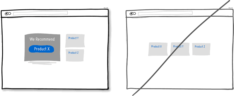

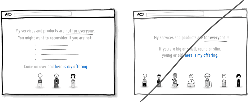
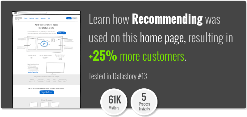

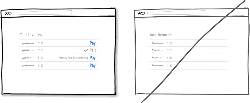
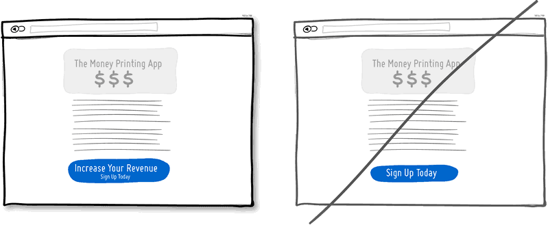
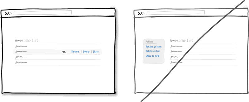

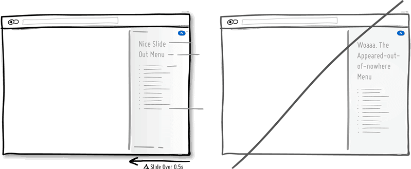
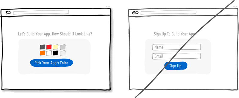
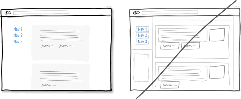
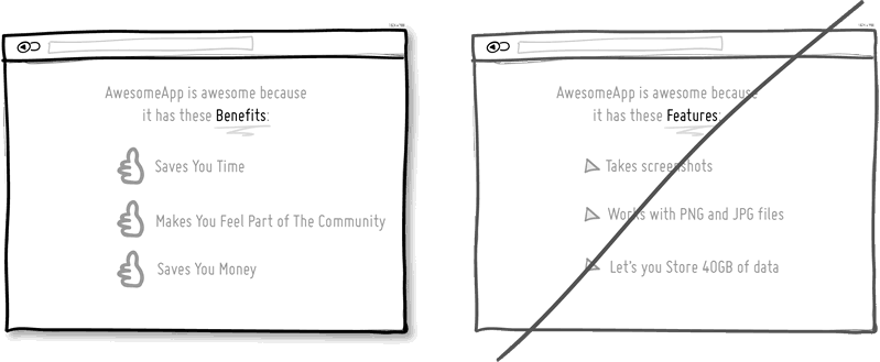
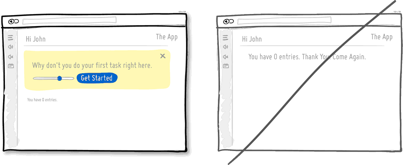
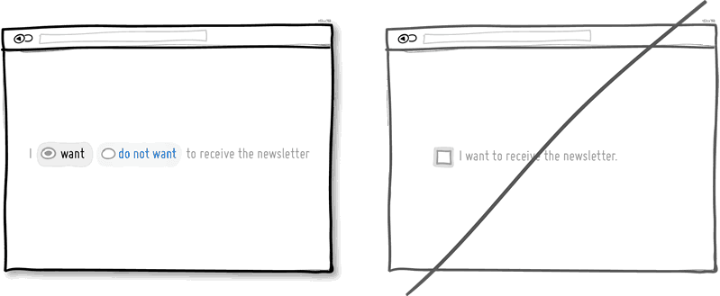
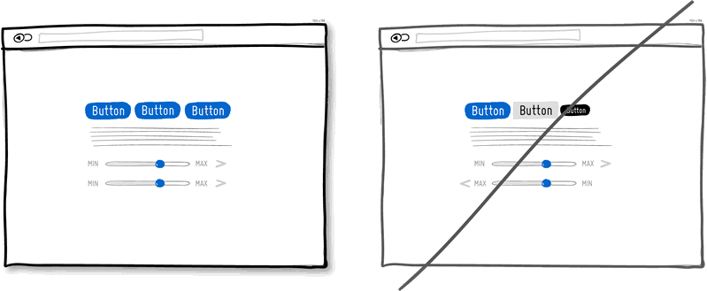
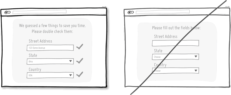
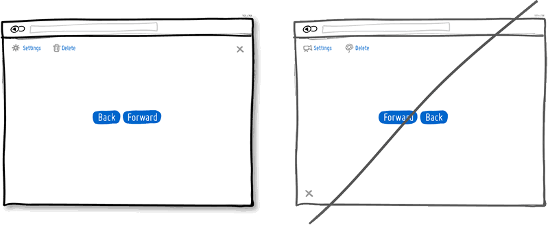
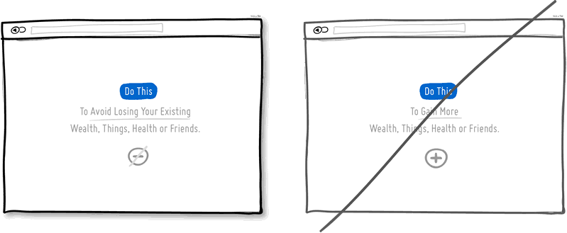
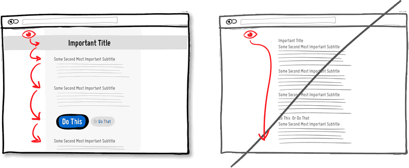
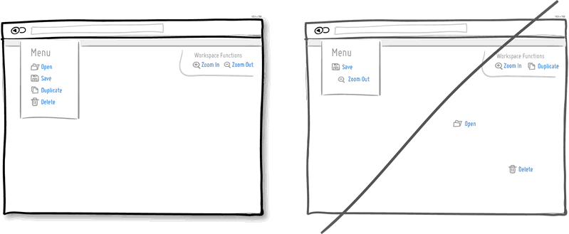
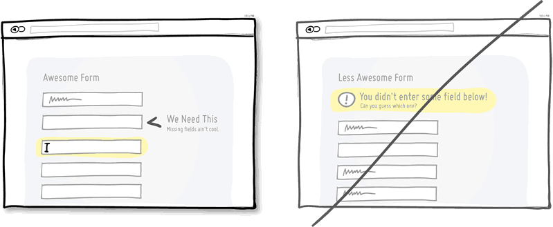
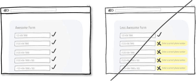
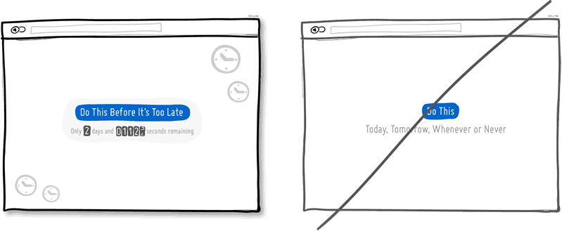

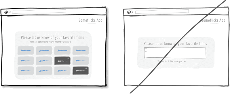
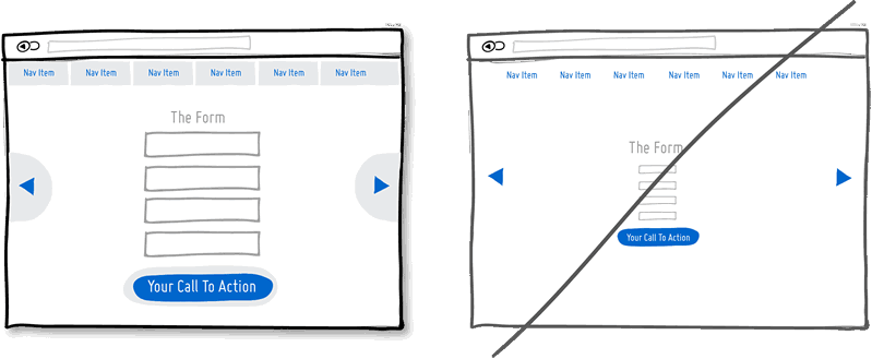
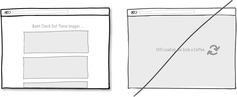
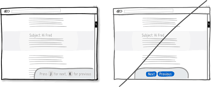


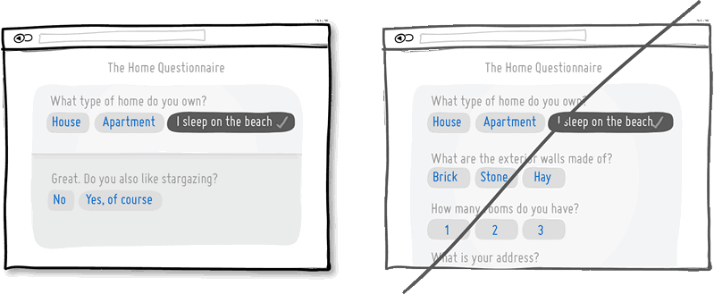
 In the context of pricing, another example can be seen when we ask customers to pay a series of monthly fees instead of an annual one. A related tactic of lowering upfront commitment might also show a “no contract” messaging in order to make customers feel that they can leave anytime which further decreases the barrier to entry.
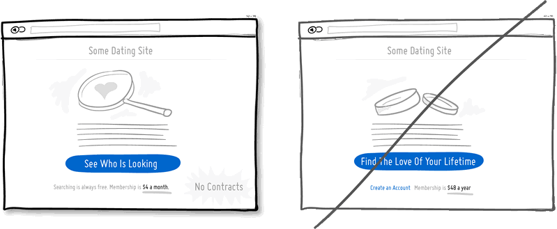
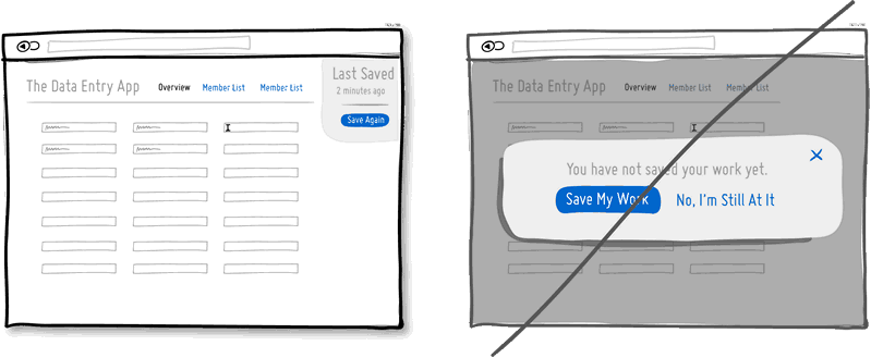


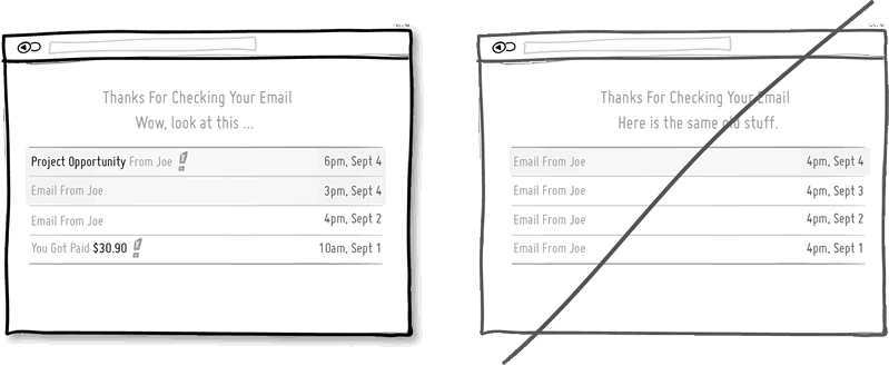
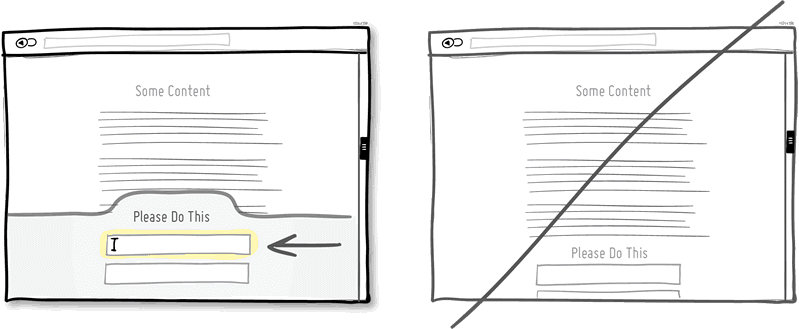

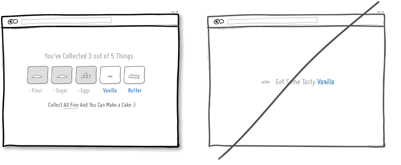
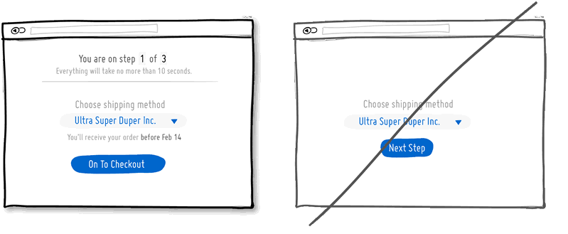


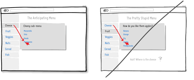
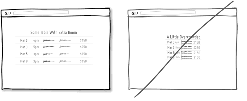


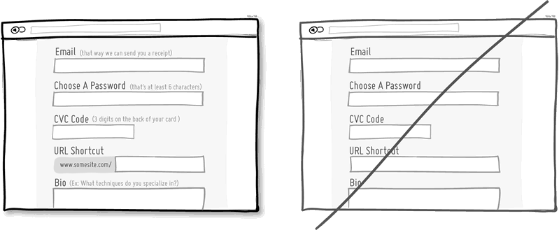

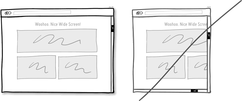
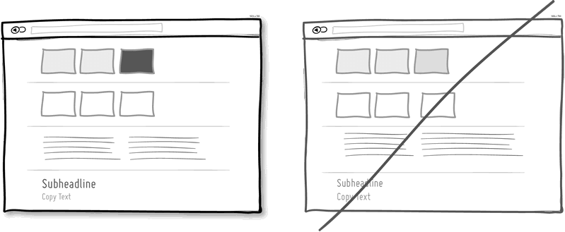
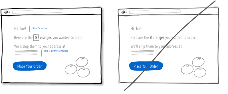
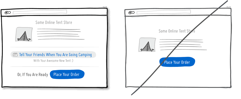
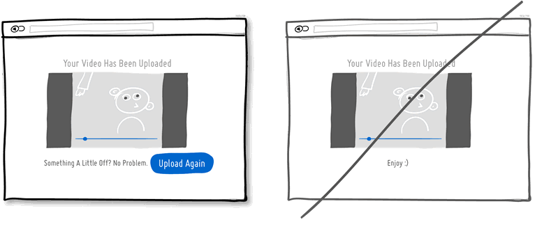
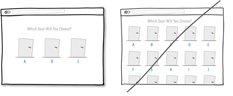
↧